
PACKAGING
Brand Identity and Packaging for Superstate Wines by One Design
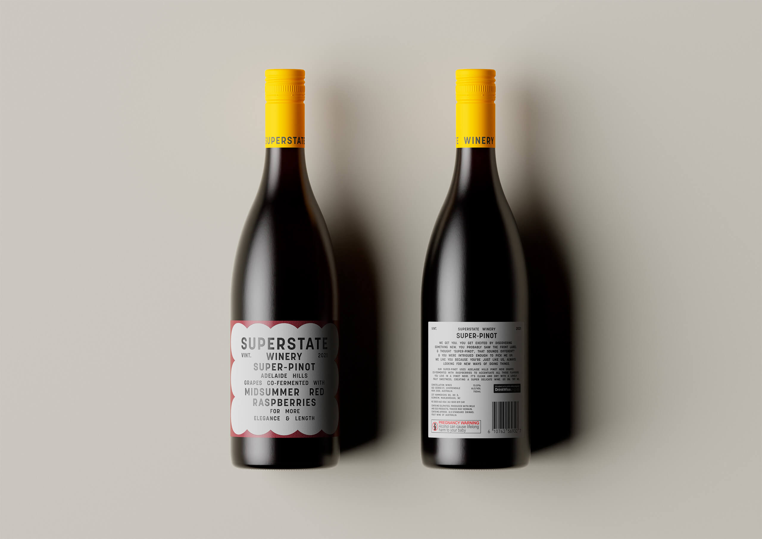
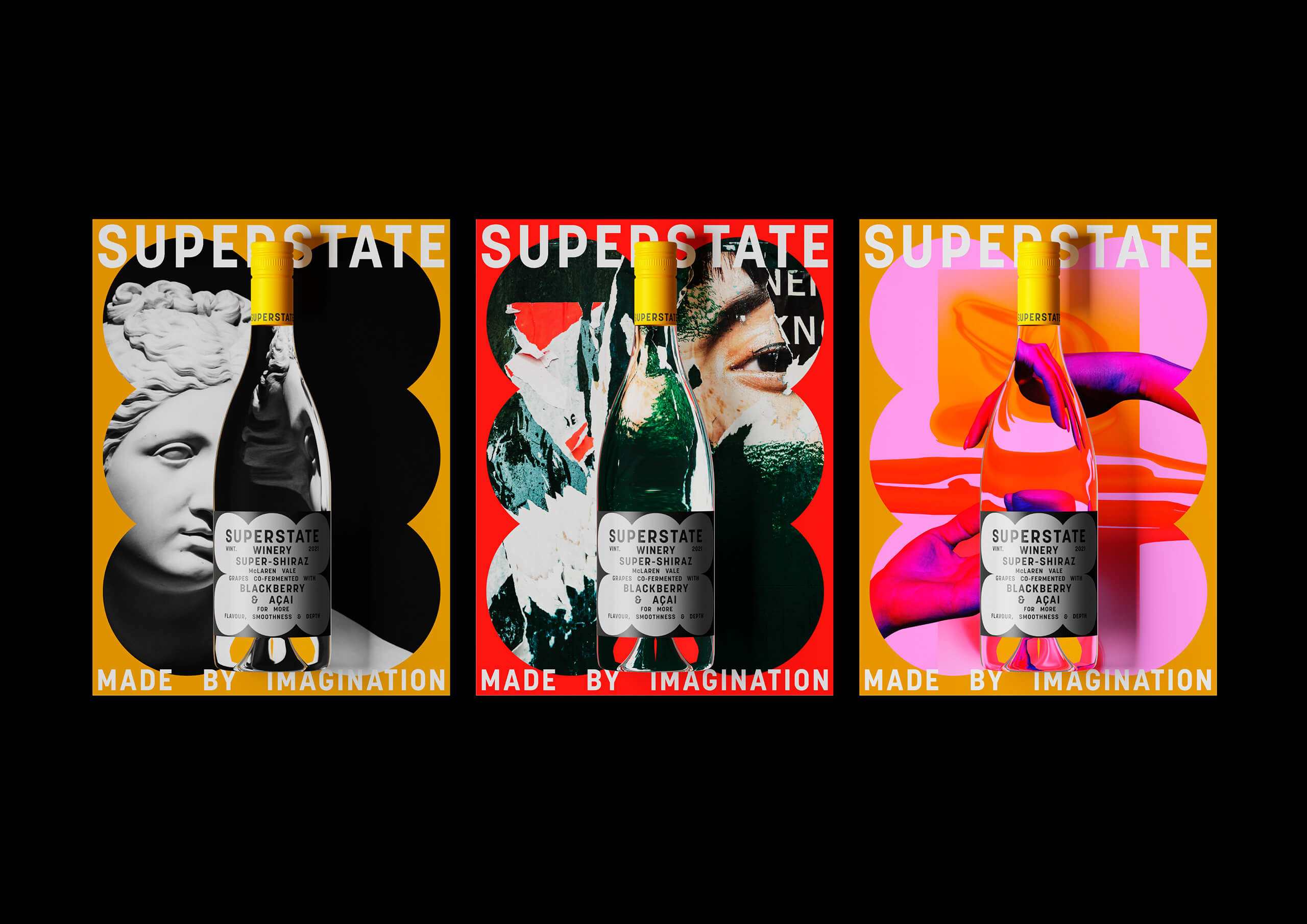
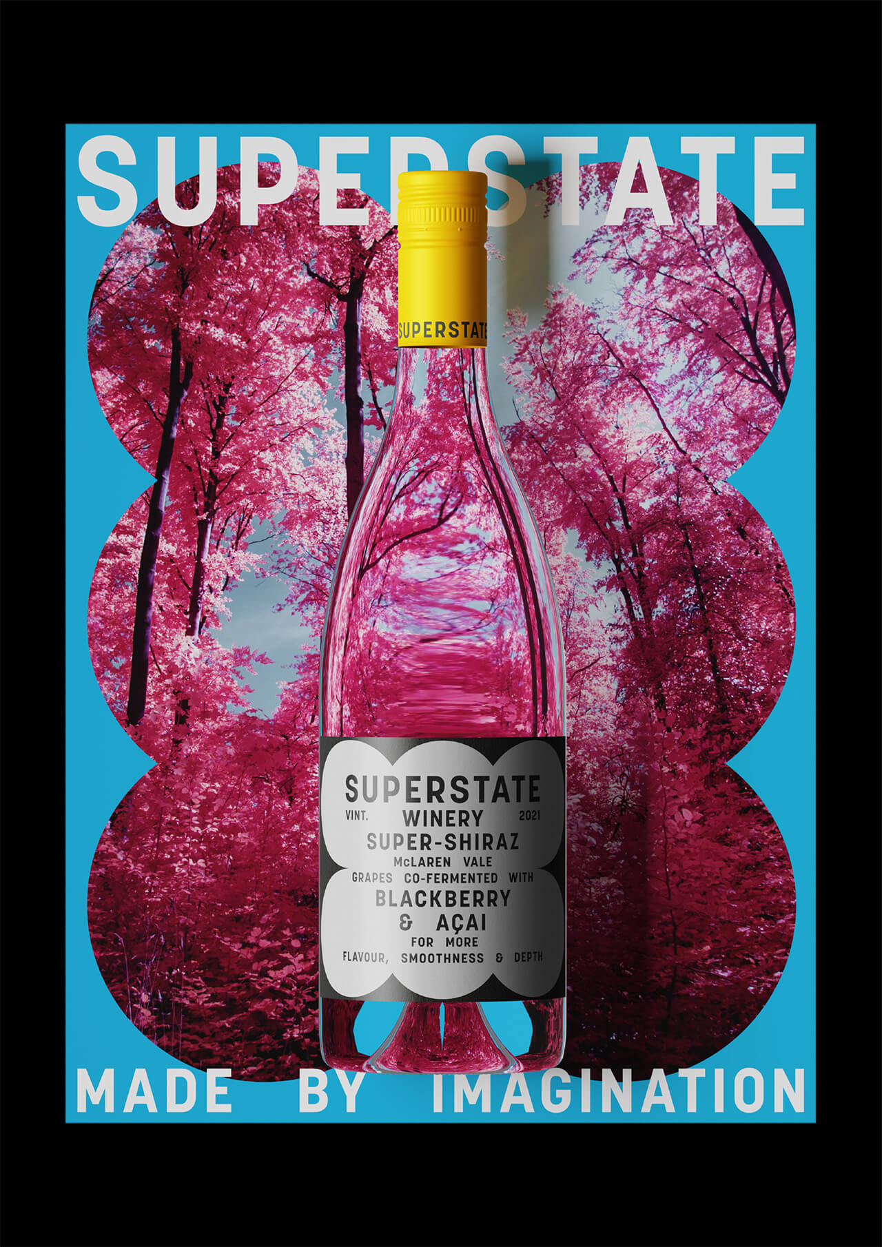
It started with a desire to bring a little innovation into the world of wine. Co-fermenting grapes with the natural goodness of superfoods, resulted in wine which boasted more depth of flavour and punch, not to mention the potential health benefits from superfoods.
Bringing an experimental and expressive wine to fruition meant the offering was more complex to communicate. Therefore, One Design’s frank typography—inspired by functional, utilitarian menu boards found in hospitality establishments—allowed the type to become the primary image to inform the wine’s unique characteristics (just as a menu board describes what is found within each dish).
Bringing an experimental and expressive wine to fruition meant the offering was more complex to communicate. Therefore, One Design’s frank typography—inspired by functional, utilitarian menu boards found in hospitality establishments—allowed the type to become the primary image to inform the wine’s unique characteristics (just as a menu board describes what is found within each dish).
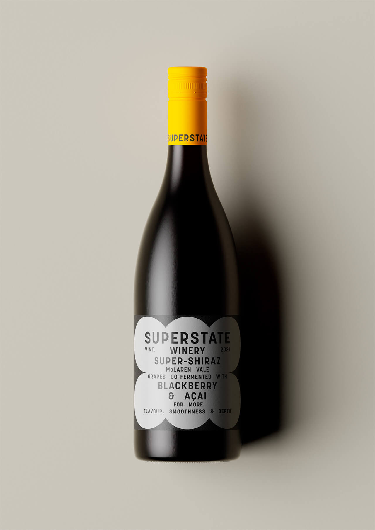

The idiosyncratic letter spacing intrinsic to the menu boards was intentionally adopted to reinforce the idea.
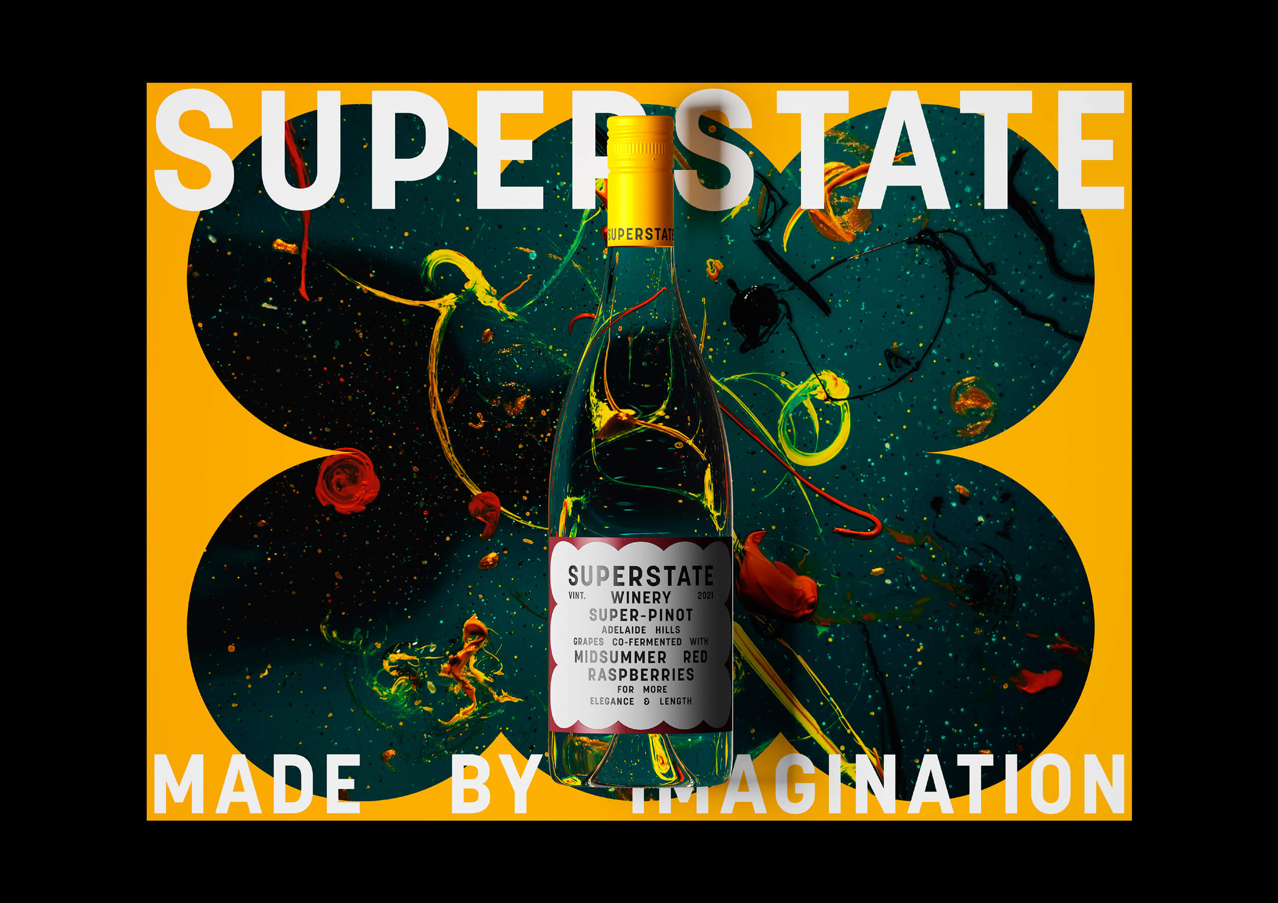
The neoteric approach to the co-fermentation process was brought to life throughout the visual identity using distinctive shapes from the labels to create windows into a world of evocative imagery to support the tagline ‘Made with Imagination’.
The neoteric approach to the co-fermentation process was brought to life throughout the visual identity using distinctive shapes from the labels to create windows into a world of evocative imagery to support the tagline ‘Made with Imagination’.

ABOUT ONE DESIGN
One Design exists to create evocative and enduring brands. They are galvanised by unorthodox thinking. Recognising that style and substance aren’t mutually exclusive, they believe that exceptional design arises from a robust foundational idea.
You Might Also Like


The Design Blog
We highlight and uplift interesting works, ideas, and voices within the creative industry, ranging from graphic design and branding to art, interior, product design, digital and web experiences.
© The Design Blog 2023
All images copyright to their respective owners.
Curated, Designed & Buillt by ONNO