BRANDING
Brand Identity for Superorganism Biodiversity Venture Fund by Goodside
Superorganism is not your typical venture capital firm. In an effort to end today’s mass extinction crisis, conservation technologist, Tom Quigley, and venture capitalist, Kevin Webb, teamed up to build Superorganism: the first venture fund for biodiversity.
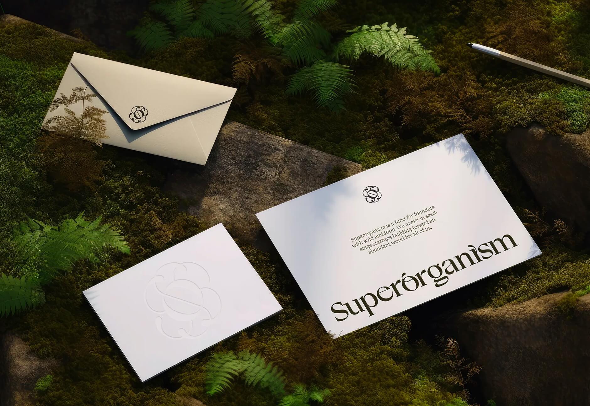
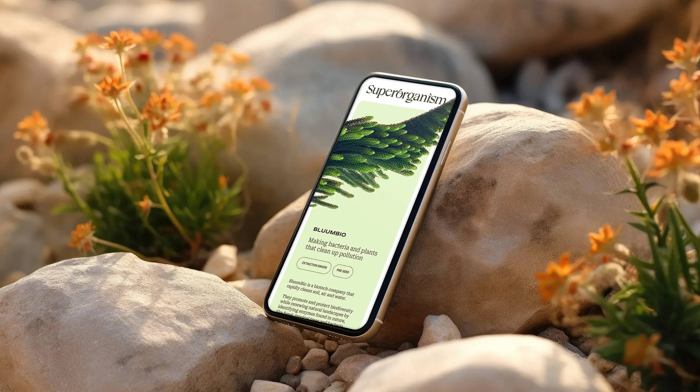
Superorganism invests in seed-stage startups working to benefit biodiversity while generating venture-scale returns. With their second fund fast approaching, Superorganism reached out to Goodside to create a brand identity as unique as they are.
Inspired by the wonder of nature and the ambition of their vision, Goodside developed a strategy and identity that did exactly that.
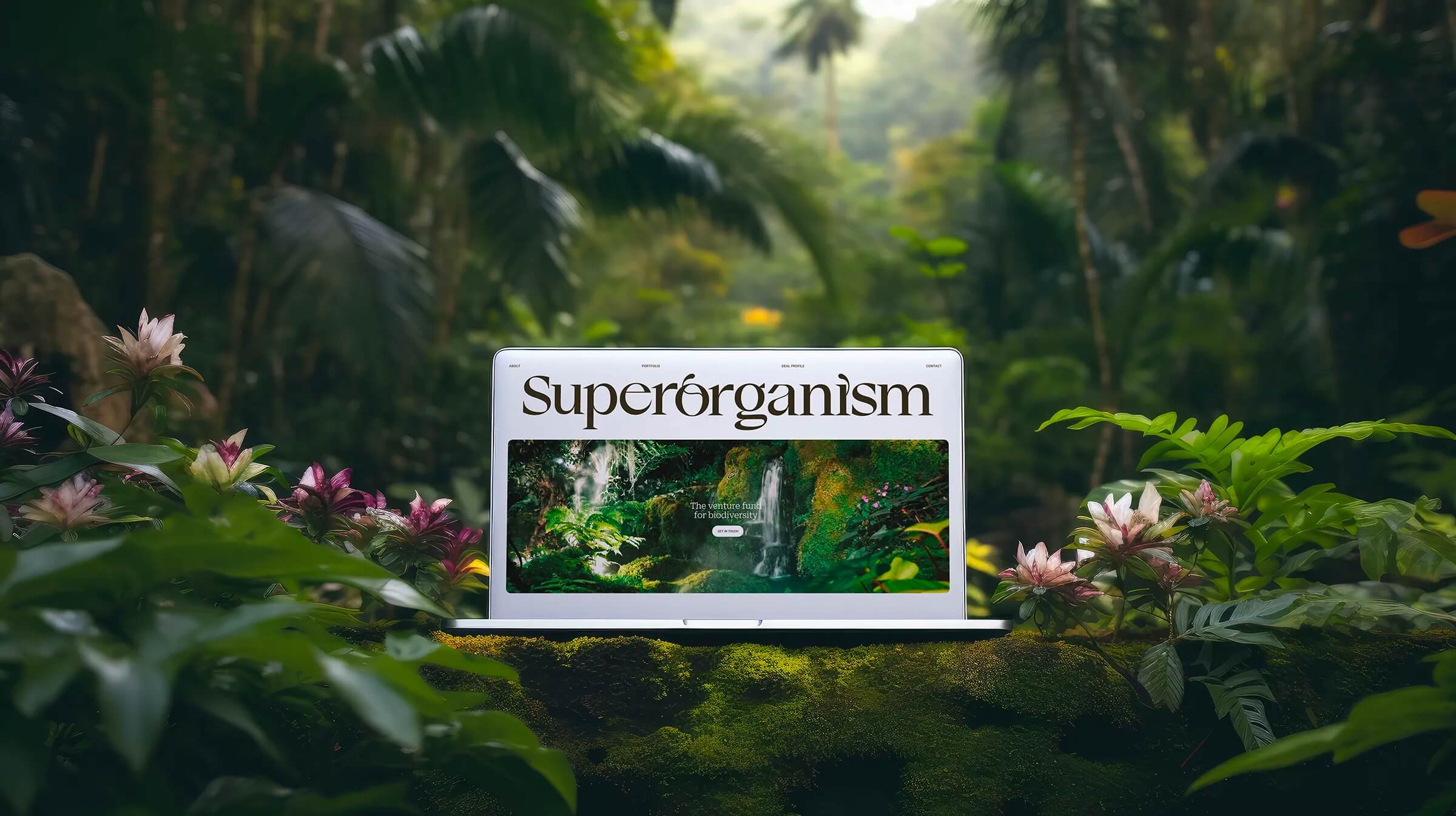

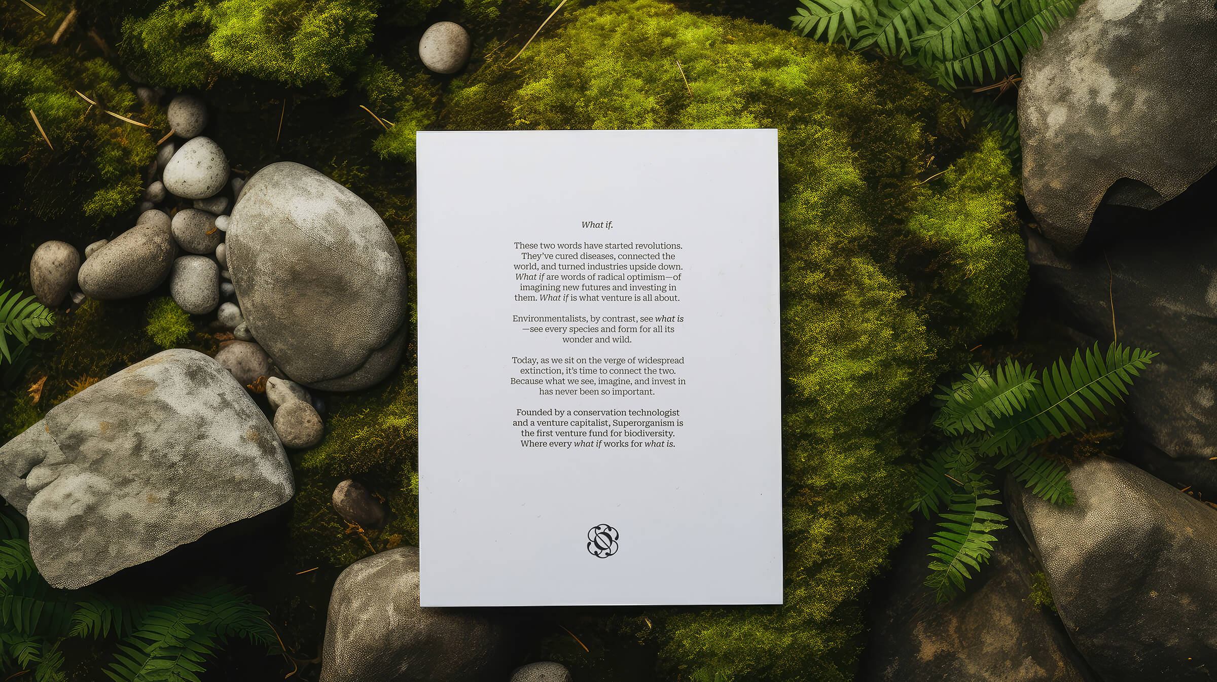
Understanding Superorganism meant understanding equally the worlds of venture capital and environmentalism. The contrasts between the two disciplines inspired Goodside to play with the concepts of present and future, reality and possibility, what is and what if.
A superorganism is a collection of agents that acts in concert to produce phenomena governed by the larger collective—think ant colonies, bee hives, and coral reefs.
Beyond the obvious community connection, the name is a nod to the notion that our entire planet of species and ecosystems exists in a collective balance.
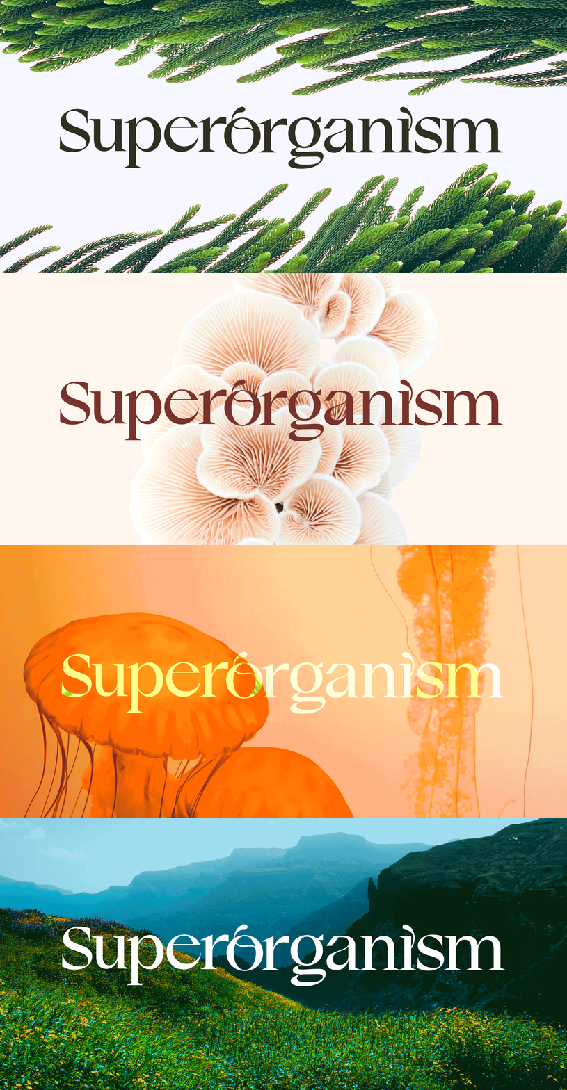
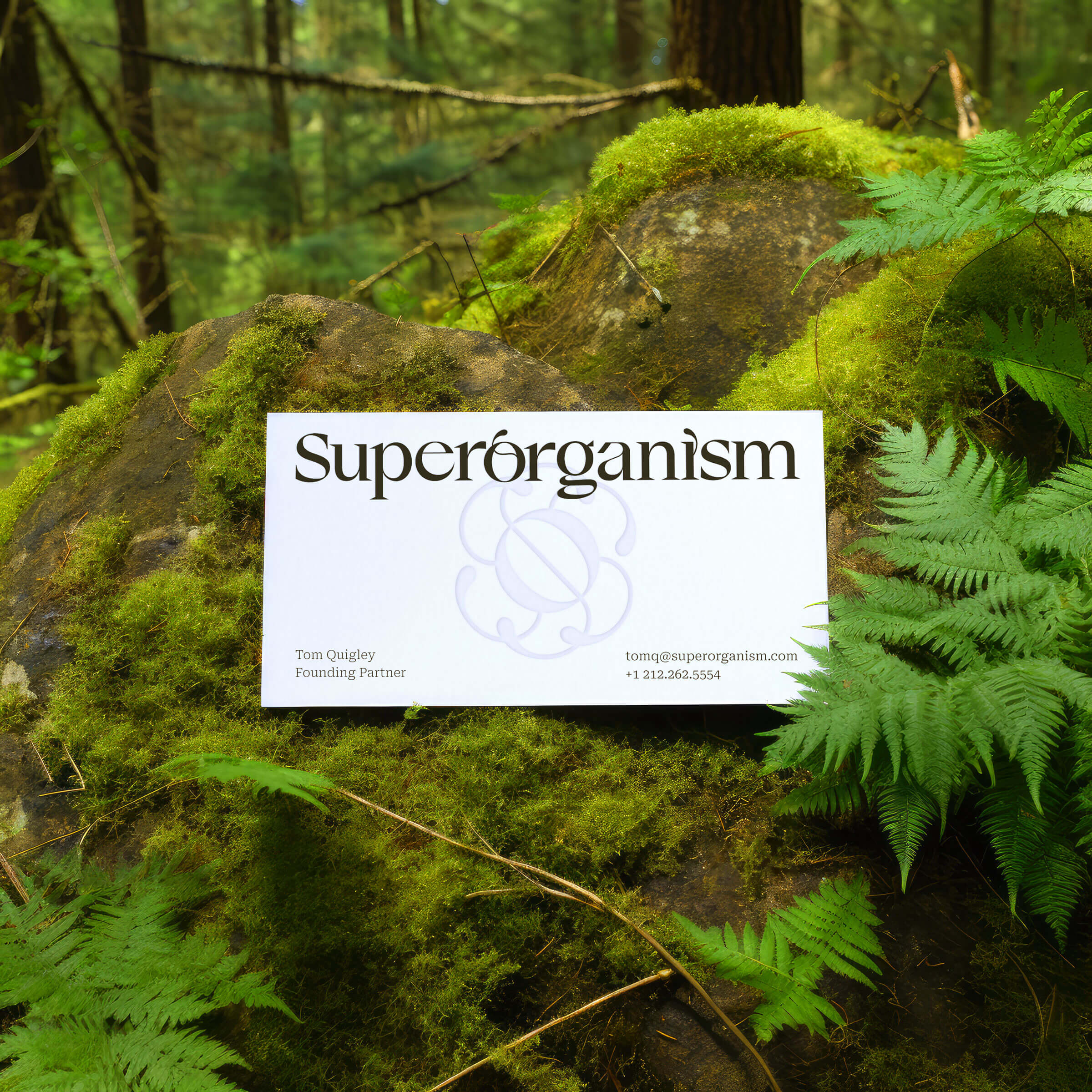
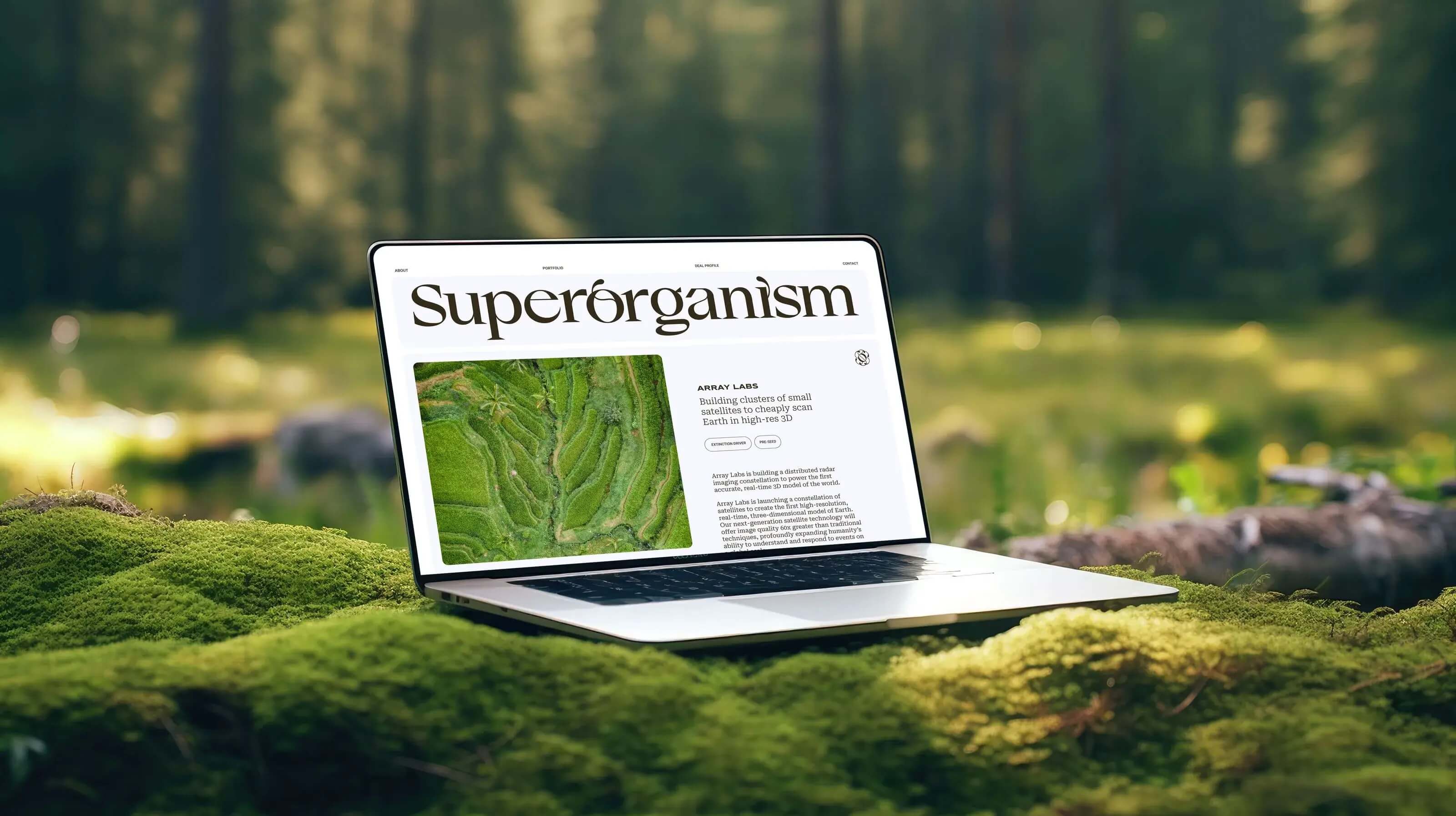
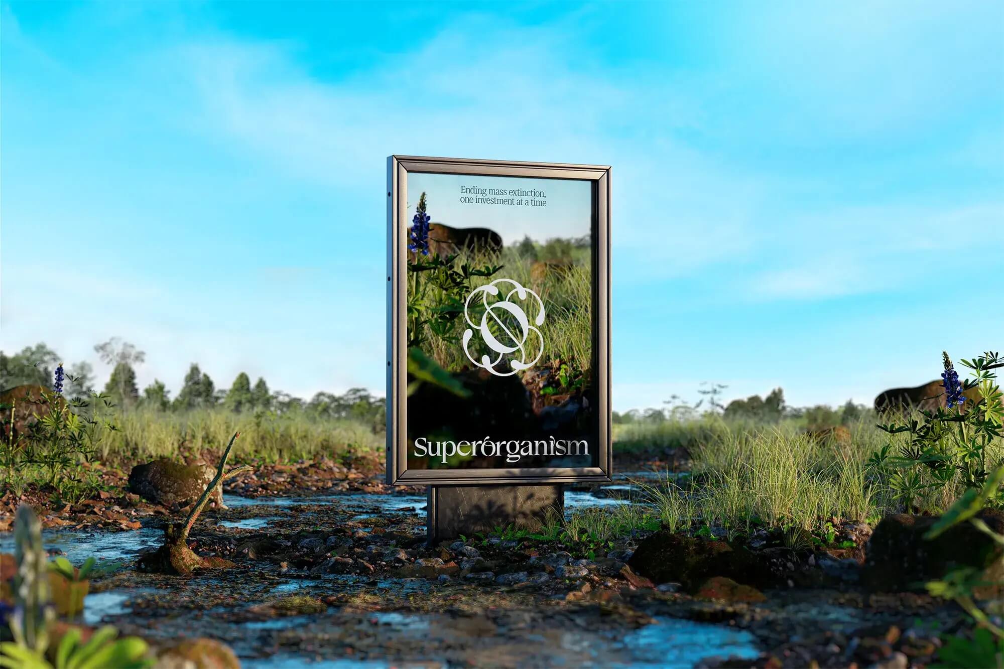
With the new logo, Goodside celebrated this balance with an abstracted monogram-turned-coral polyp with six-fold symmetry and a natural dynamism. The wordmark similarly comes alive with organic details that climb from their letterforms, disrupting, striving, and growing.
CREDITS
Design: Goodside
Team: Jessica Strelioff, Danielle LaRoy,
Hunter Thompson, Tom Quigley, Kevin Webb
Copyright @ Goodside
Design: Goodside
Team: Jessica Strelioff, Danielle LaRoy,
Hunter Thompson, Tom Quigley, Kevin Webb
Copyright @ Goodside
ABOUT GOODSIDE
Goodside is a full-service brand studio led by Jessica Strelioff and Danielle LaRoy. After years working in-house and agency-side, we teamed up to create a new kind of studio. One part visual. One part verbal. Weaving color, concept, and copy into cohesive brand systems that scale.
The Design Blog
We highlight and uplift interesting works, ideas, and voices within the creative industry, ranging from graphic design and branding to art, interior, product design, digital and web experiences.
The Design Blog
We highlight and uplift interesting works, ideas, and voices within the creative industry, ranging from graphic design and branding to art, interior, product design, digital, and web experiences.
