
TYPOGRAPHY
Cako Stylistic and Contrasting Typeface by Violaine & Jeremy
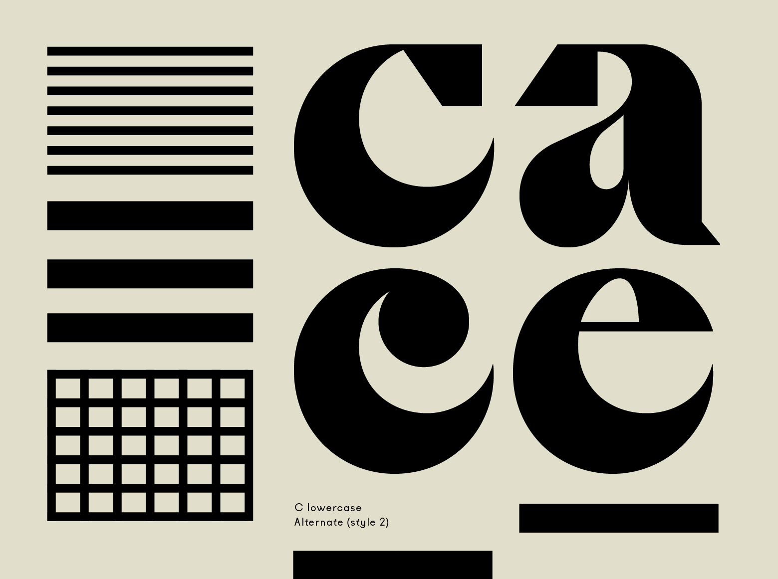
Cako typeface was designed in 2019 in Paris by Jérémy Schneider. What makes Cako unique is its very graphic shapes of letters and serifs and its numerous stylistic alternates - giving the typeface a great rhythm.
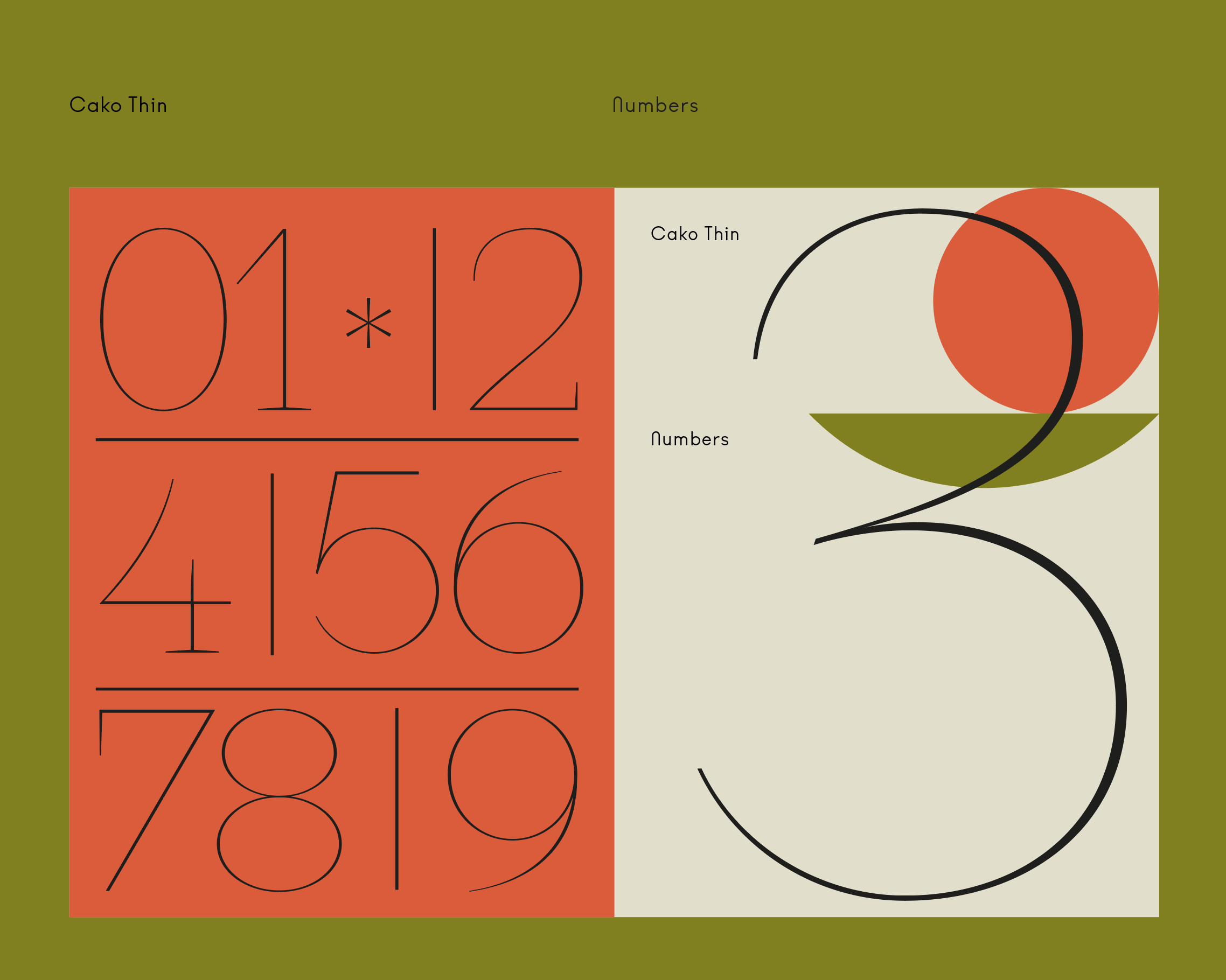
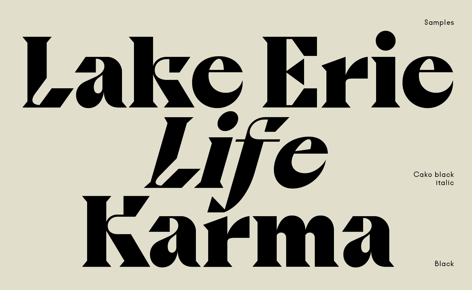
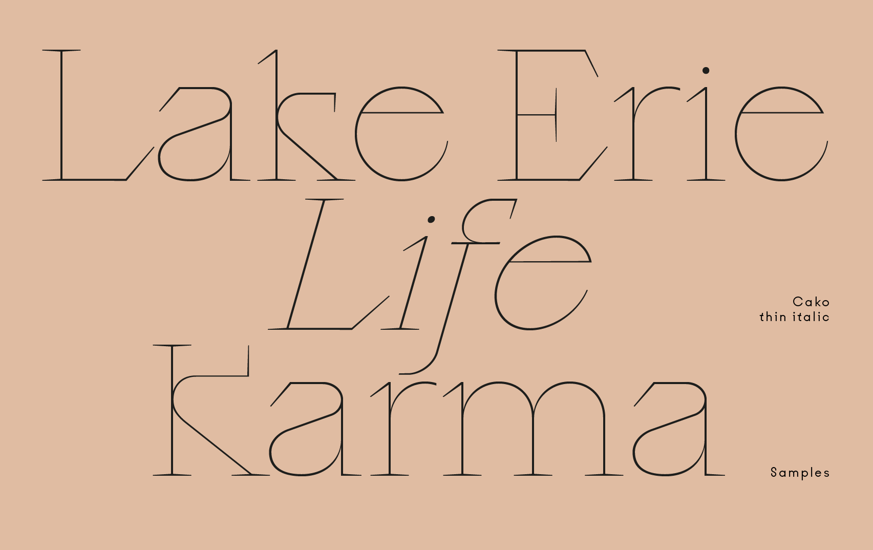
Cako has three contrasted weights, black, regular and thin, offering several degrees of impact. The drawing of Cako black is characterized by big contrasts between thicks and thins, fine details and spiky terminals.
Cako has three contrasted weights, black, regular and thin, offering several degrees of impact. The drawing of Cako black is characterized by big contrasts between thicks and thins, fine details and spiky terminals.


CREDITS
Typeface Design: VJ-Type, Romain Oudin
Other Credits: Zoé Abravanel, Benoit Hody
Copyright @ VJ-Type
Typeface Design: VJ-Type, Romain Oudin
Other Credits: Zoé Abravanel, Benoit Hody
Copyright @ VJ-Type
ABOUT VJ-TYPE
Violaine et Jérémy is an illustration and graphic arts studio currently based in Paris, France. At the studio, they took the habit of designing custom fonts for the graphic design projects they work on. They design fonts like they would design everything else: with their own artistic gesture and sensibility.

Discover more

The Design Blog
We highlight and uplift interesting works, ideas, and voices within the creative industry, ranging from graphic design and branding to art, interior, product design, digital and web experiences.
The Design Blog
We highlight and uplift interesting works, ideas, and voices within the creative industry, ranging from graphic design and branding to art, interior, product design, digital, and web experiences.