BRANDING
Global Rebrand and Strategy for Gaia Fertility by Ragged Edge
Gaia makes IVF the most accessible it’s ever been. With a first-of-its-kind prediction of your unique chances to have a child. And with a personalised insurance plan that eliminates the huge upfront cost typical of treatment.
Gaia came to Ragged Edge for a brand to give people agency over their fertility. A brand to break stigmas as it makes families. RE partnered with them to create a global rebrand, from brand strategy to identity and beyond.
Gaia came to Ragged Edge for a brand to give people agency over their fertility. A brand to break stigmas as it makes families. RE partnered with them to create a global rebrand, from brand strategy to identity and beyond.
Ragged Edge created a strategic brand platform where seeking IVF isn’t a failure. That could realign expectation with reality – predicting what’s probable, rather than promising what’s possible.
That could better reflect parenthood not simply as an instinct we follow, but as a choice we can make that requires strength of character and resilience. And finally a brand platform to crush stigmas surrounding IVF, meaning everyone’s journey to and definition of family is no less natural, no less normal.
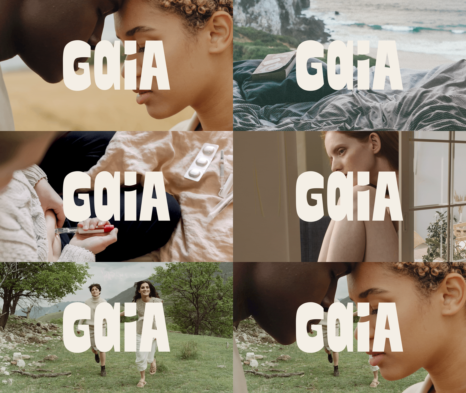
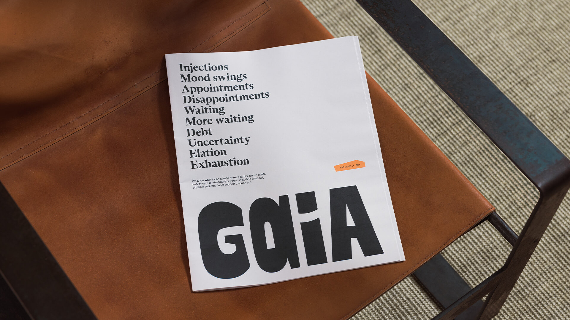
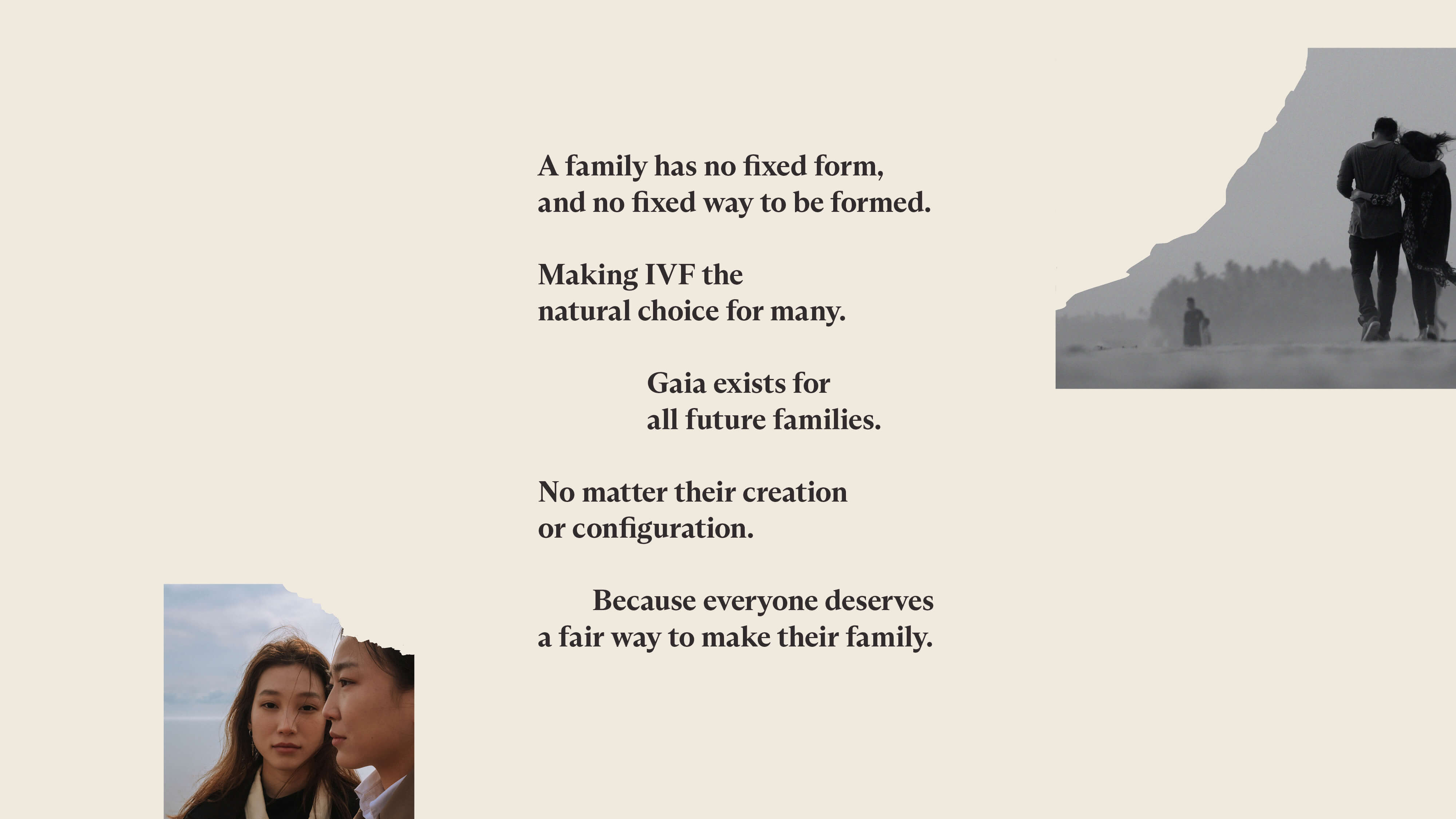
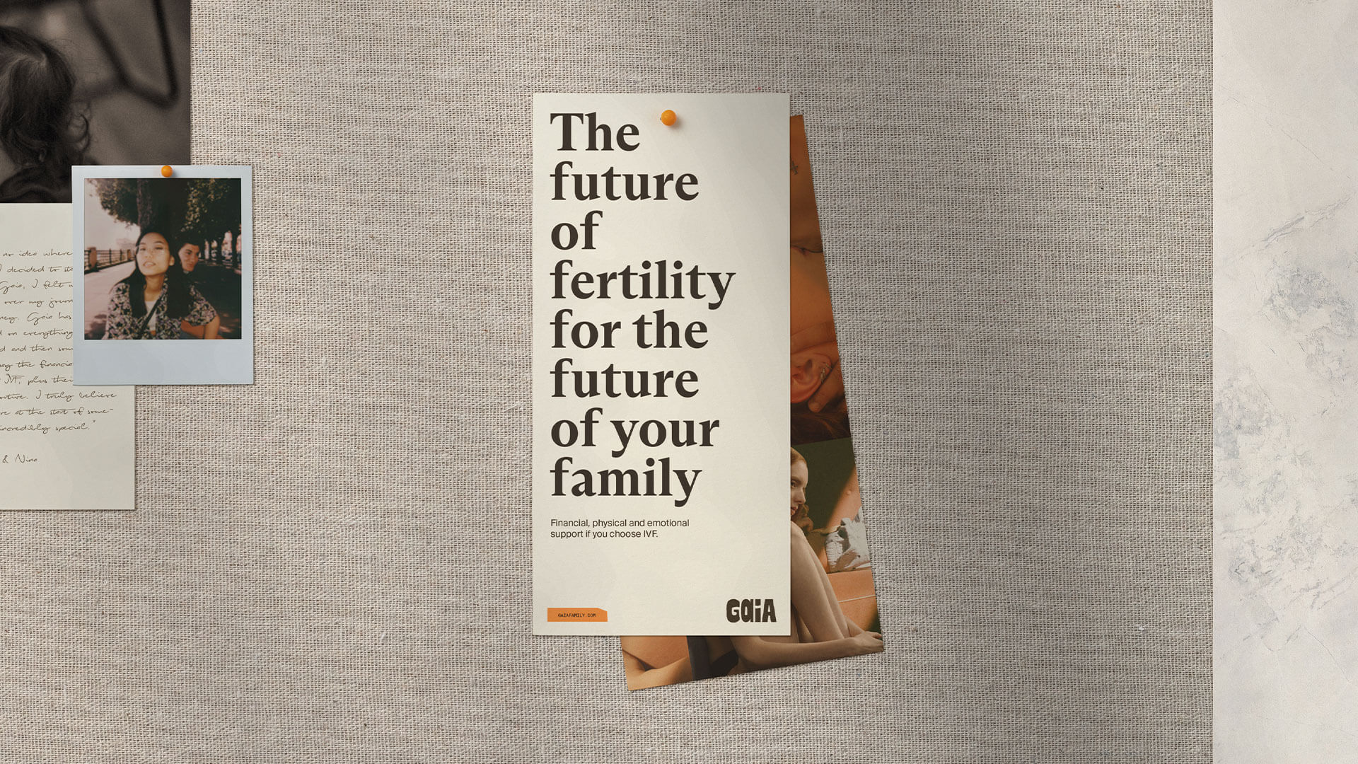
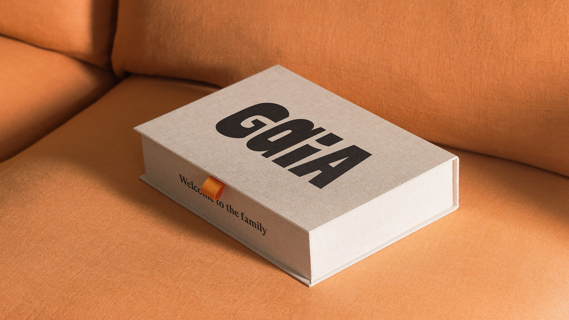
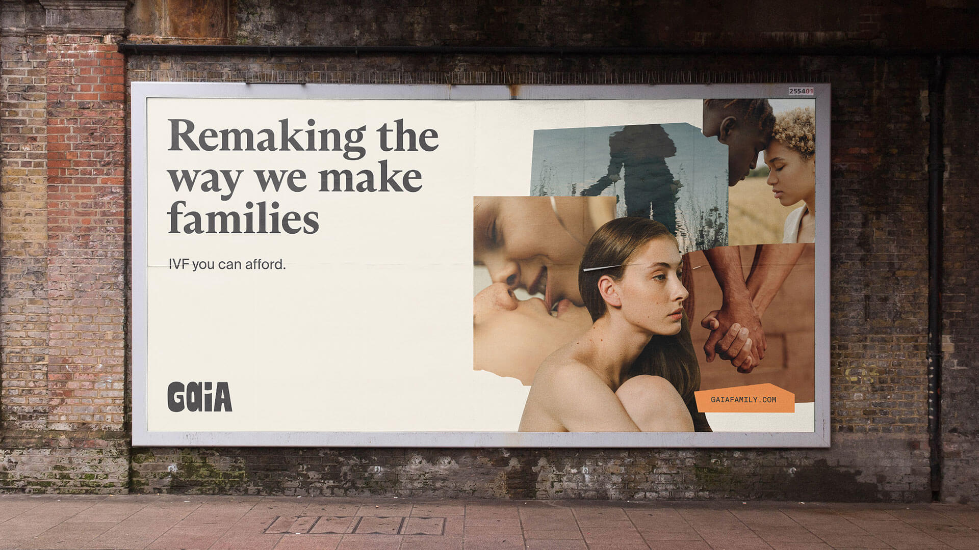
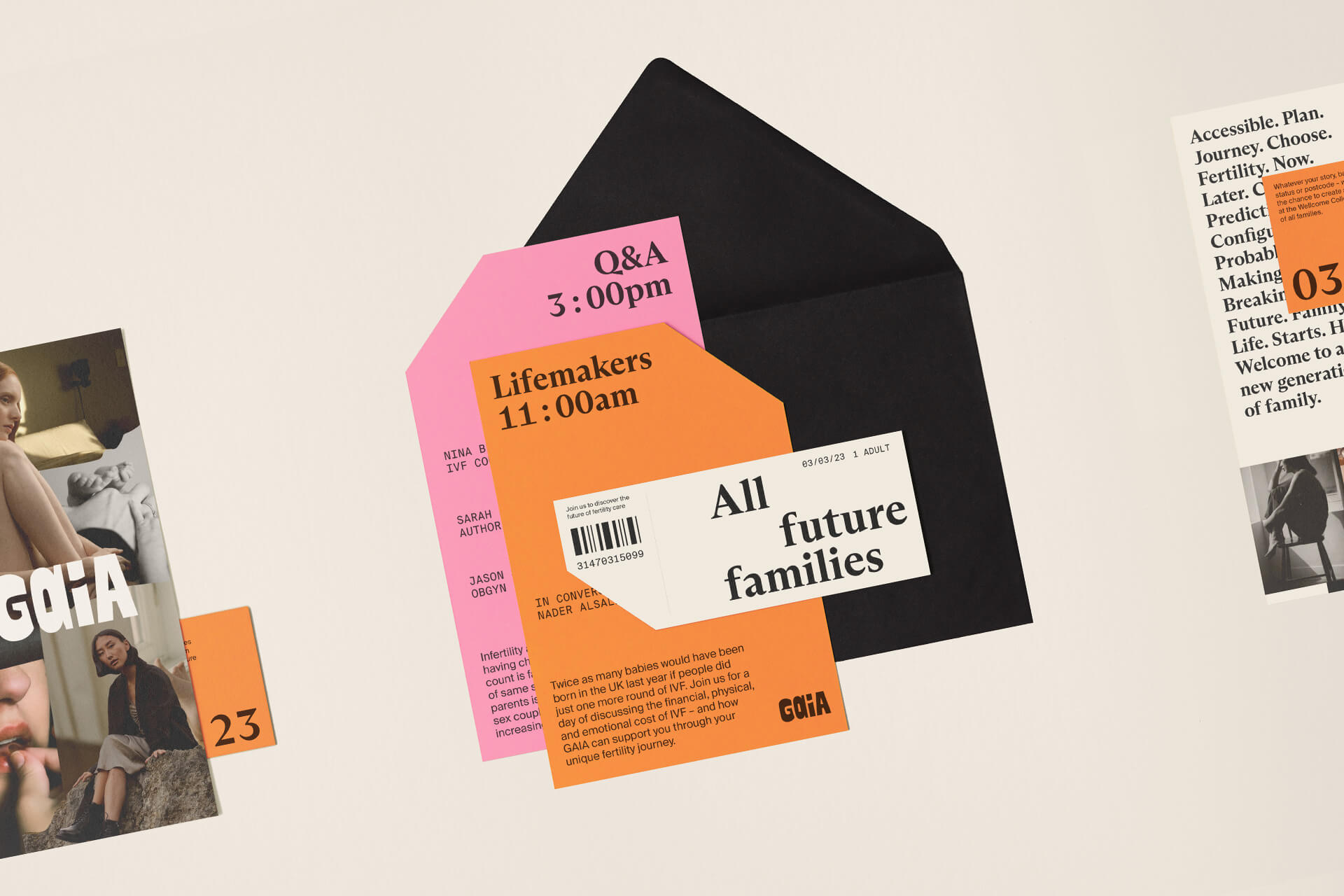
Ragged Edge’s logo signals that Gaia is something distinctly different. With two different letters reflecting how no two families are the same. Their collages show the rich, varied and often imperfect ways we make family. The colour palette captures the hard reality of an IVF journey, always with a touch of optimism.
And the brand voice is bold with good bedside manner – allowing Gaia to assert its point of view in the world while always supporting individual members. Together, this is a brand for the future of fertility care, for the future of all families.
ABOUT RAGGED EDGE
Ragged Edge is a branding agency for people trying to achieve the improbable. Industry leaders, start ups, anyone with the conviction to challenge the status quo. Anyone who believes branding has the power to change organisations, change industries, change perceptions, and change behaviours.
The Design Blog
We highlight and uplift interesting works, ideas, and voices within the creative industry, ranging from graphic design and branding to art, interior, product design, digital and web experiences.
The Design Blog
We highlight and uplift interesting works, ideas, and voices within the creative industry, ranging from graphic design and branding to art, interior, product design, digital, and web experiences.
