BRANDING
Mud-Inspired Brand Identity for Lodoso by Wikka Studio
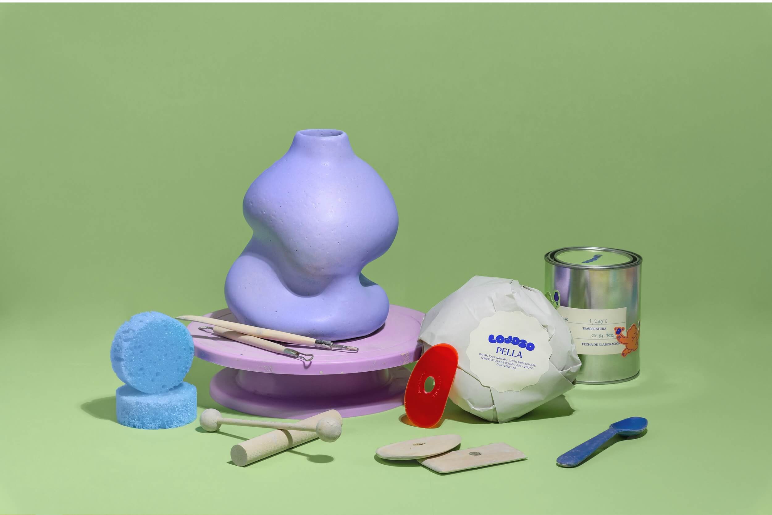
Lodoso (as in muddy) is a space where experiences are shared through the creation of pottery. Split between the workshop that teaches pottery-making and a store that sells final products such as vases.
Lodoso has a relaxed and casual mood where students go to escape and hang out with each other. It's a fun place where everyone gets their hands dirty while creating beautiful pottery pieces.
Lodoso has a relaxed and casual mood where students go to escape and hang out with each other. It's a fun place where everyone gets their hands dirty while creating beautiful pottery pieces.
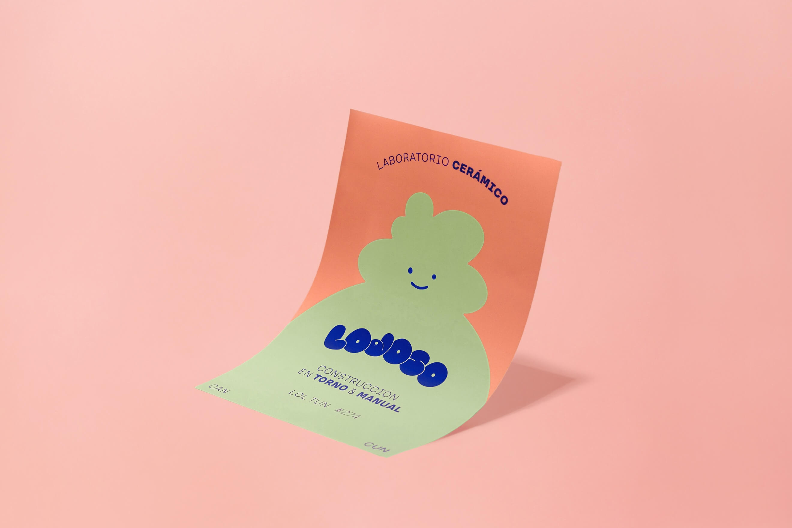
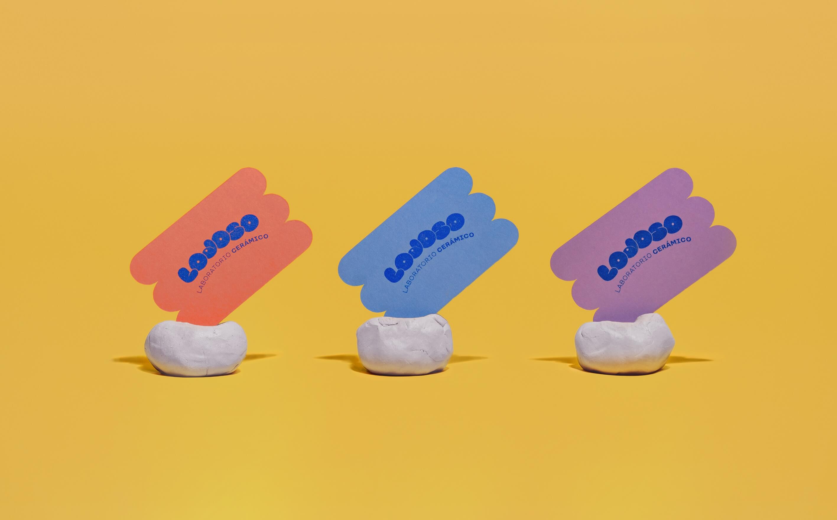
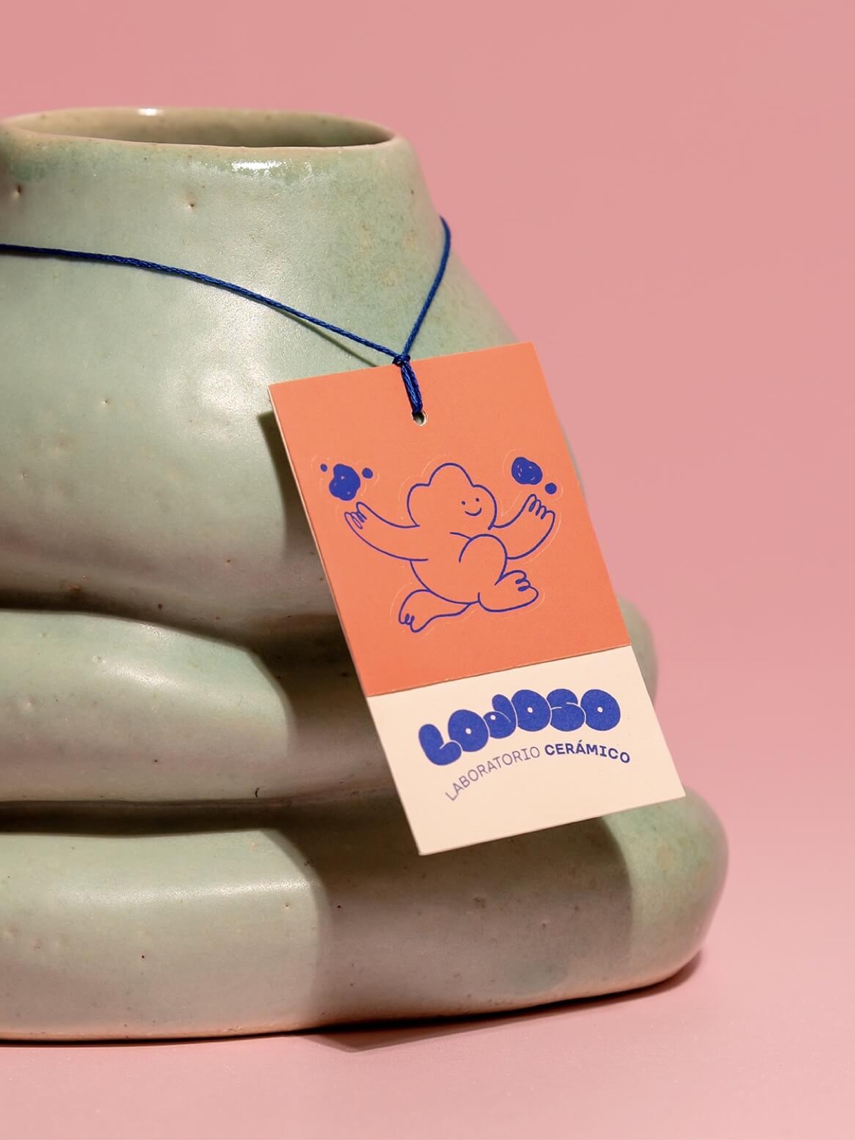
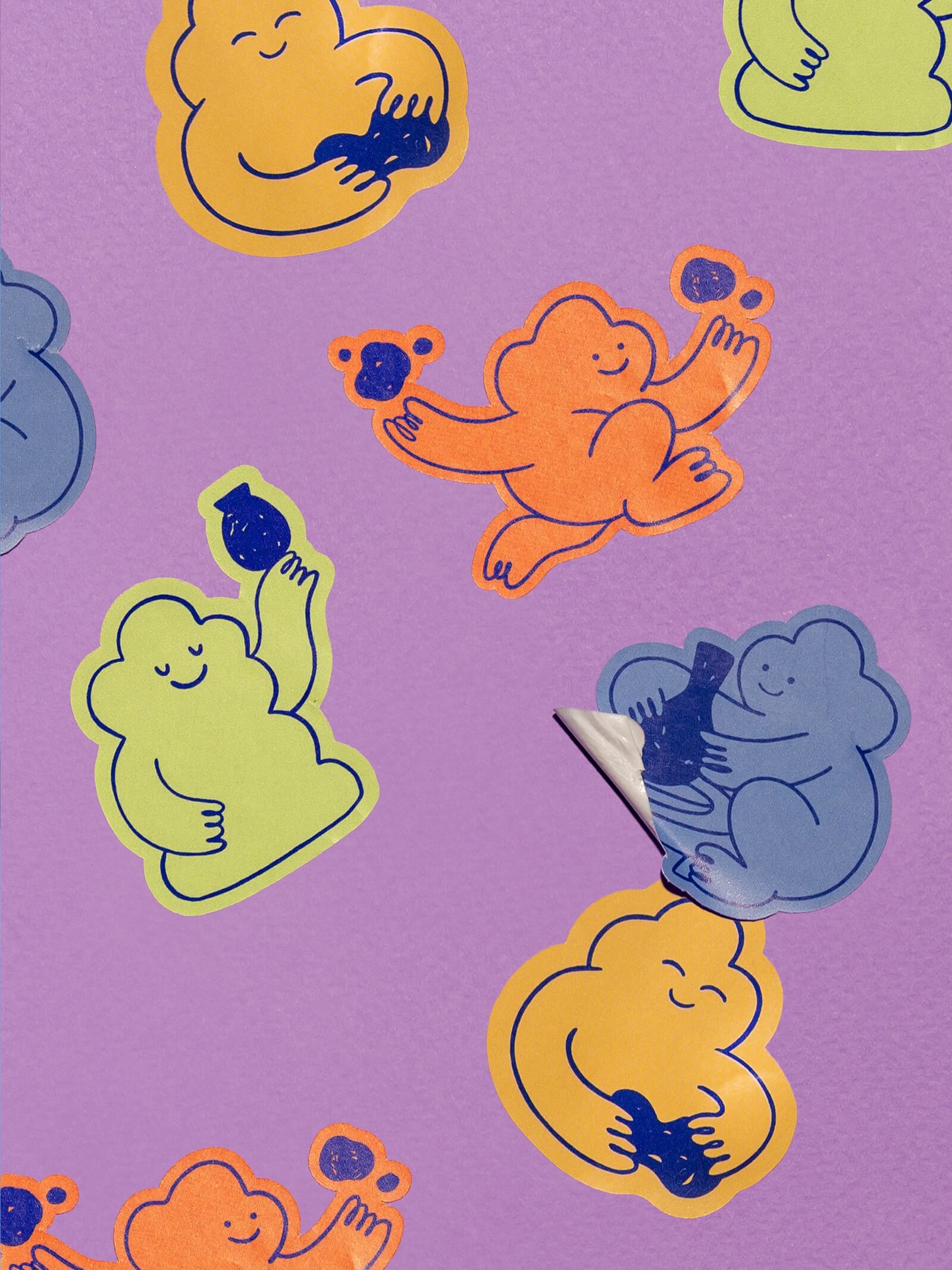
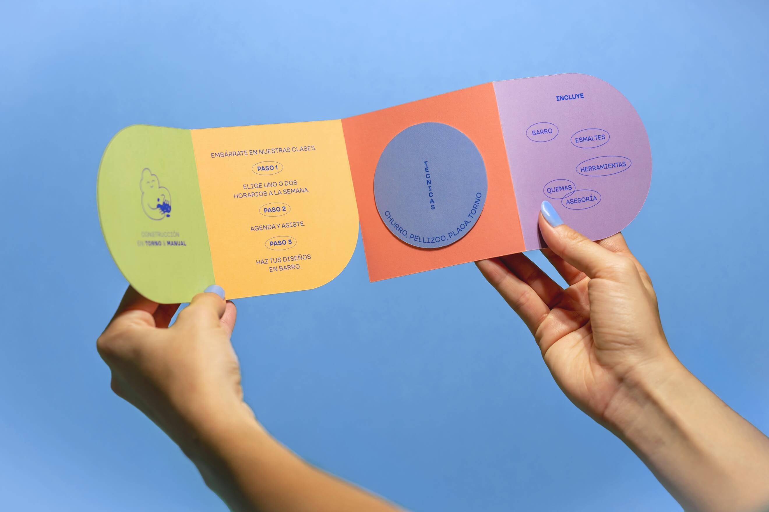
Studio Wikka sought to create a fun, casual, and happy brand identity in which the logo and the pictogram emulate the idea of being made with mud or clay.
They also developed a fresh and fun chromatic palette that complements the logo and the printed collateral.
They also developed a fresh and fun chromatic palette that complements the logo and the printed collateral.



ABOUT WIKKA
Creative studio directed by Andrea & Jimena. They are located in Barcelona and Cancun, but since 2016 the studio works with clients all over the world. Wikka likes great ideas, challenges, cool projects and good vibes.
The Design Blog
We highlight and uplift interesting works, ideas, and voices within the creative industry, ranging from graphic design and branding to art, interior, product design, digital and web experiences.
The Design Blog
We highlight and uplift interesting works, ideas, and voices within the creative industry, ranging from graphic design and branding to art, interior, product design, digital, and web experiences.
