PACKAGING
Packaging for Seth Rogen’s Cannabis Brand Houseplant by MA-MA
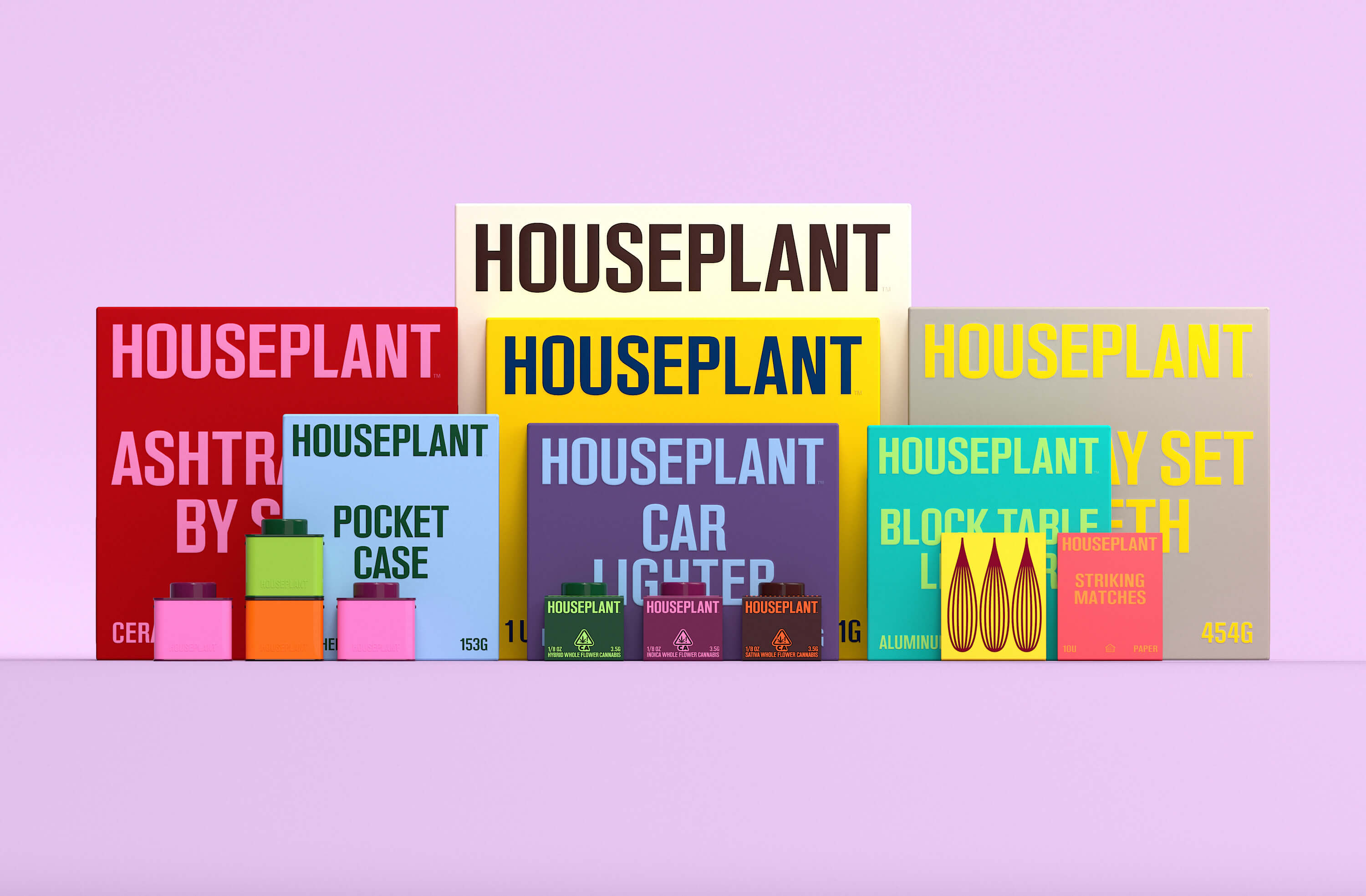
Packaging redesign for Houseplant, a cannabis brand founded by Seth Rogen for its launch into the U.S. market (originally from Canada).
Taking Houseplant’s existing logotype and symbol as the starting point, MA-MA (in collaboration with Pràctica) developed a typographic and illustration system that helped unify and revamp the brand’s new wide range of products and overall communications.
The redesign includes the introduction of a wider typographic system with a custom typeface that is based on the original logotype, a unifying illustration system that helps represent the forms of the products packaged within, and a fresher color palette with brighter hues to convey the vibrancy of the company.
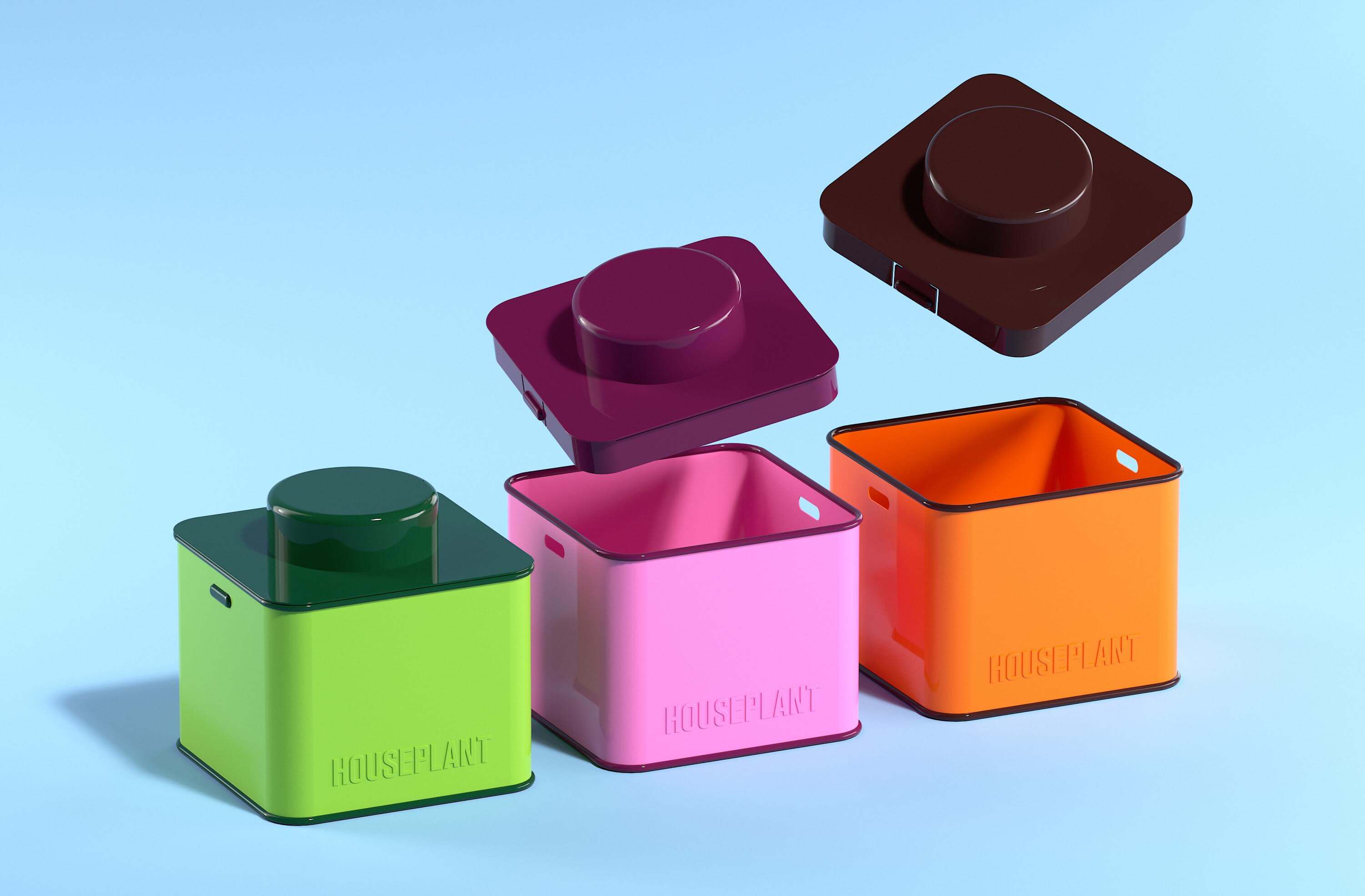
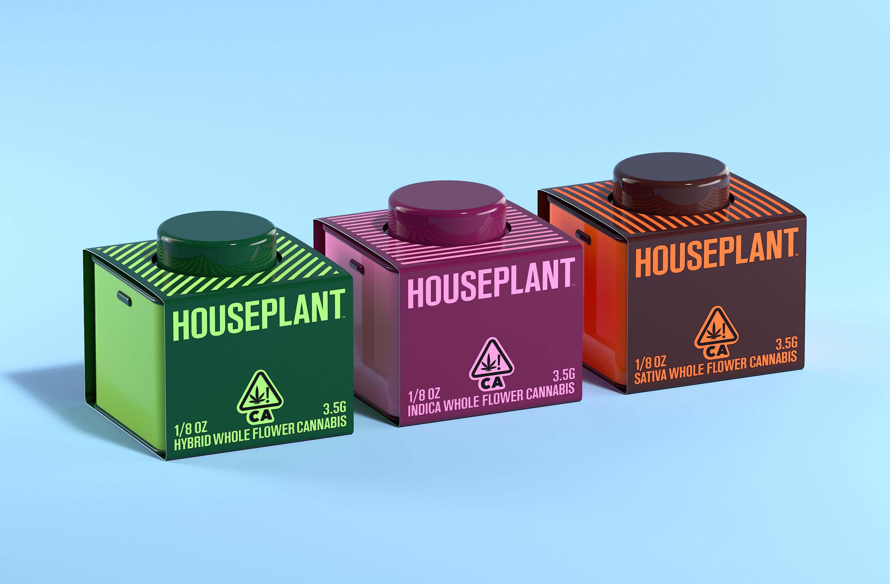
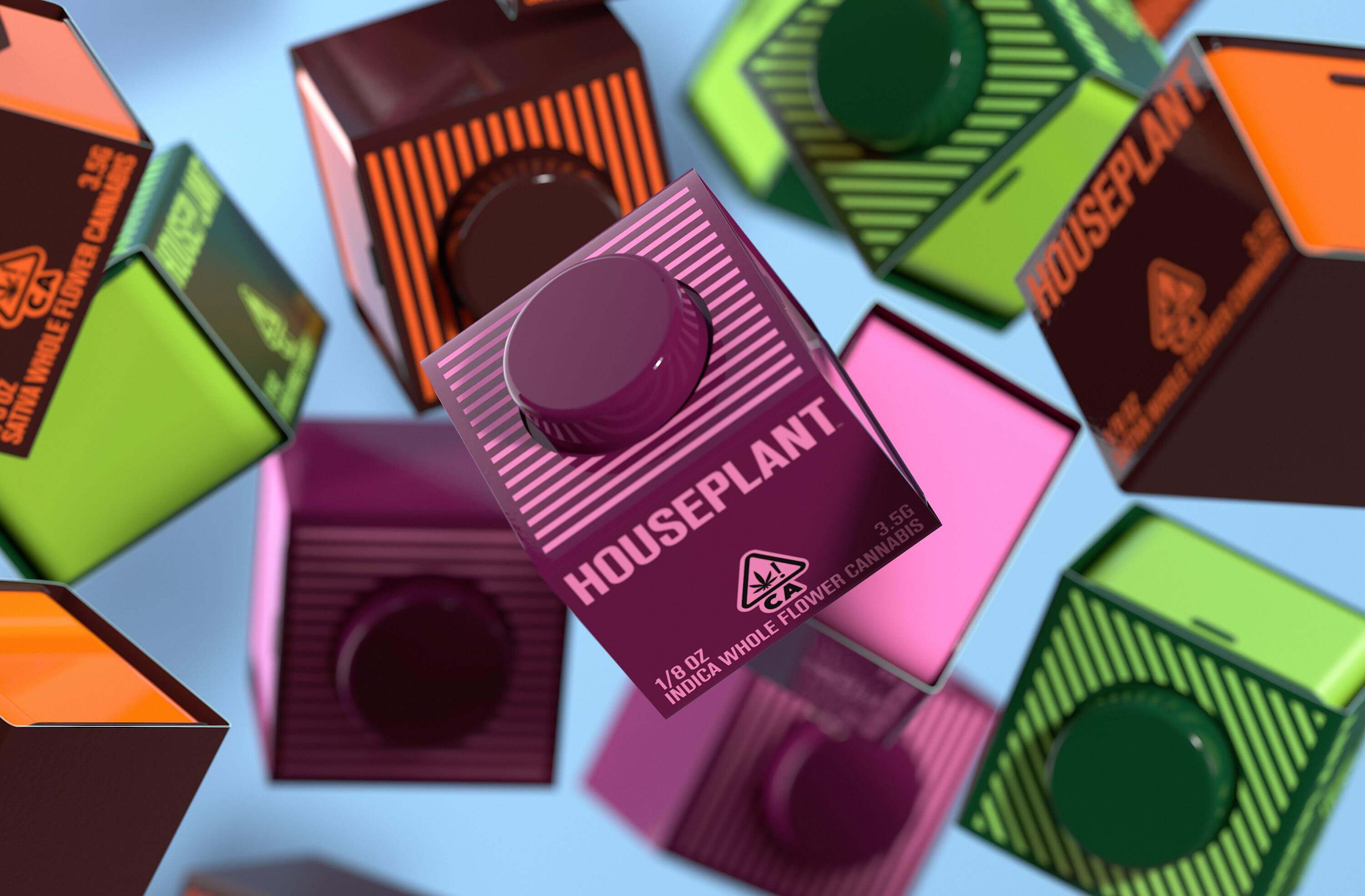
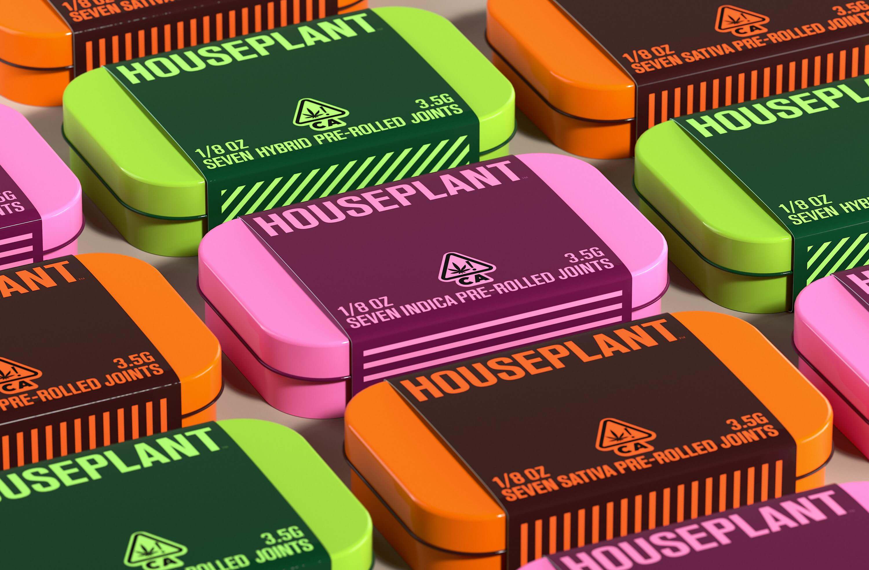
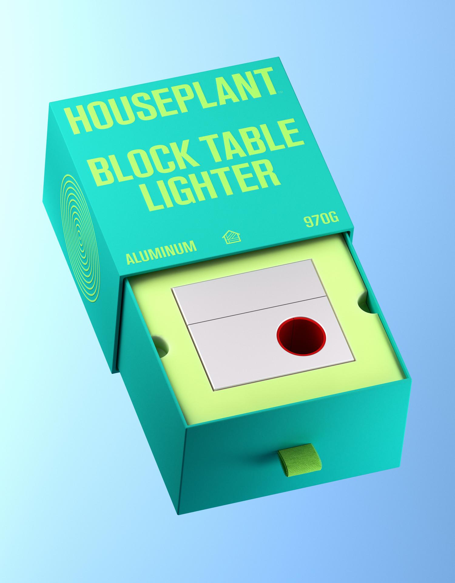
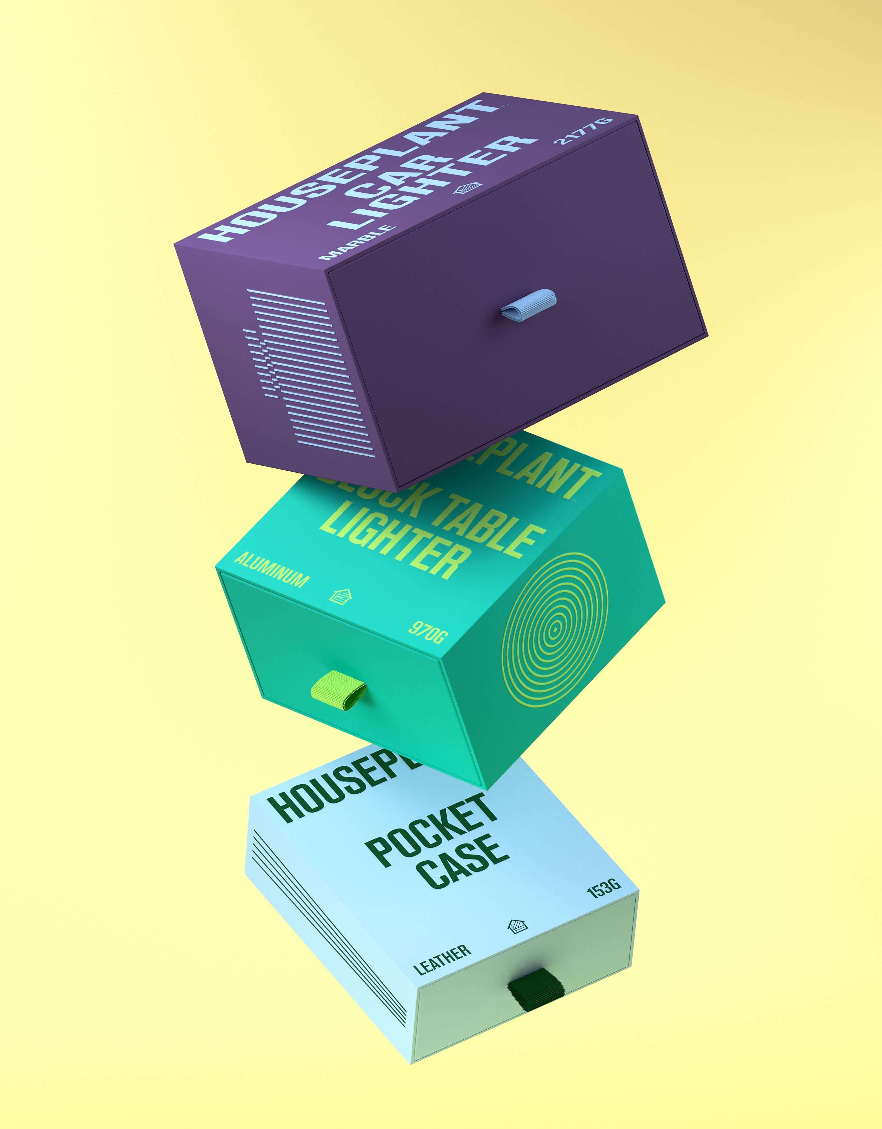
The structural packaging itself maintains a simple design; a solid colored drawer system, in which the complimenting color is featured within the typography, line illustration, pull tab, and eco-foam within. In line with the company’s goal to be more sustainable, we also designed a series of recyclable tin ‘jars’ to house the cannabis goods, as well as, tin cases for pre-roll joints.
The ‘jars’ have been designed such that they can stack like legos, acting as a collectible and reusable keepsake. In efforts to keep the packaging as sustainable and with as little waste as possible, we designed a simple label wrap for the tins made out of cardstock paper with printed graphics.
The ‘jars’ have been designed such that they can stack like legos, acting as a collectible and reusable keepsake. In efforts to keep the packaging as sustainable and with as little waste as possible, we designed a simple label wrap for the tins made out of cardstock paper with printed graphics.
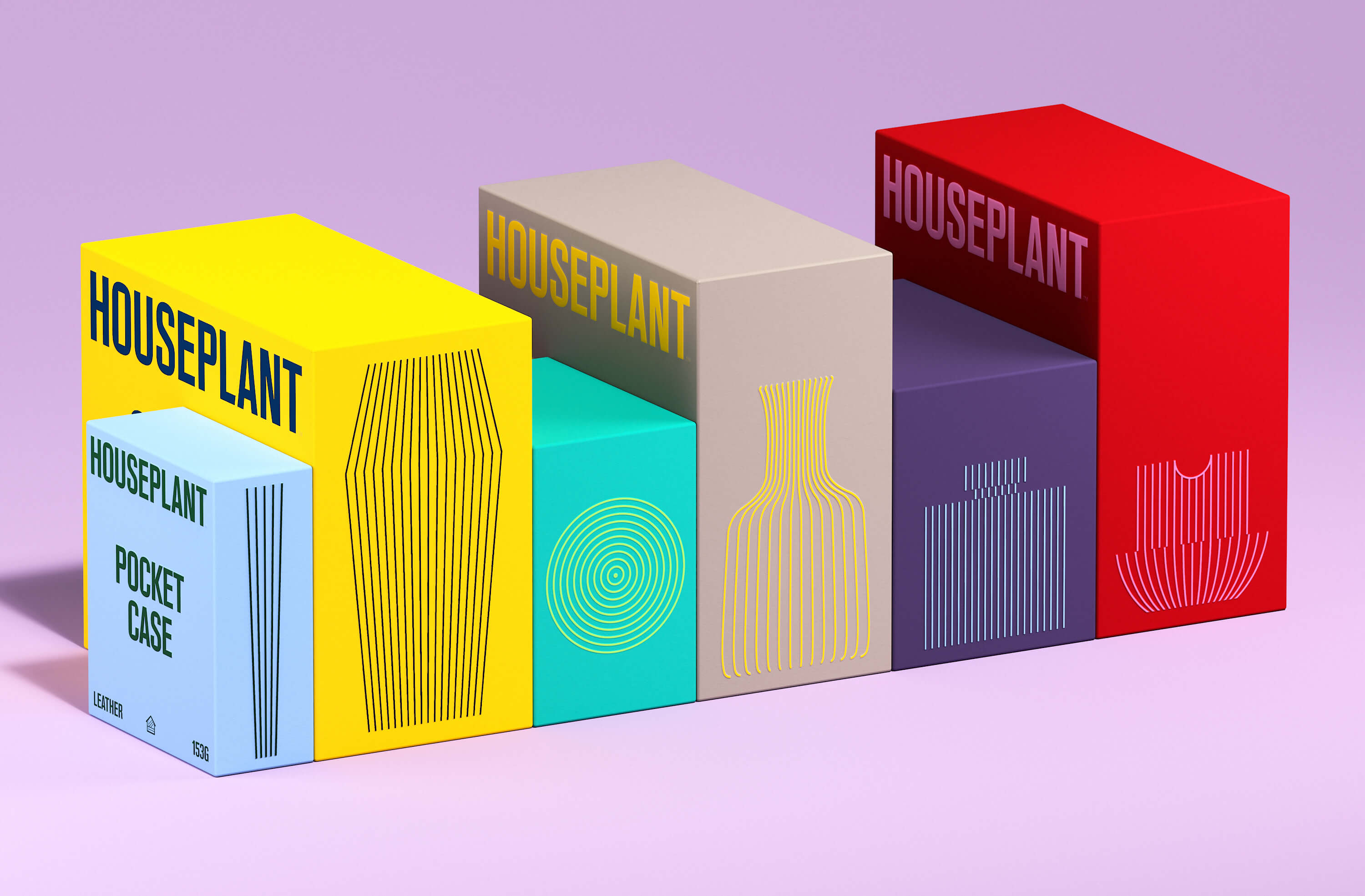
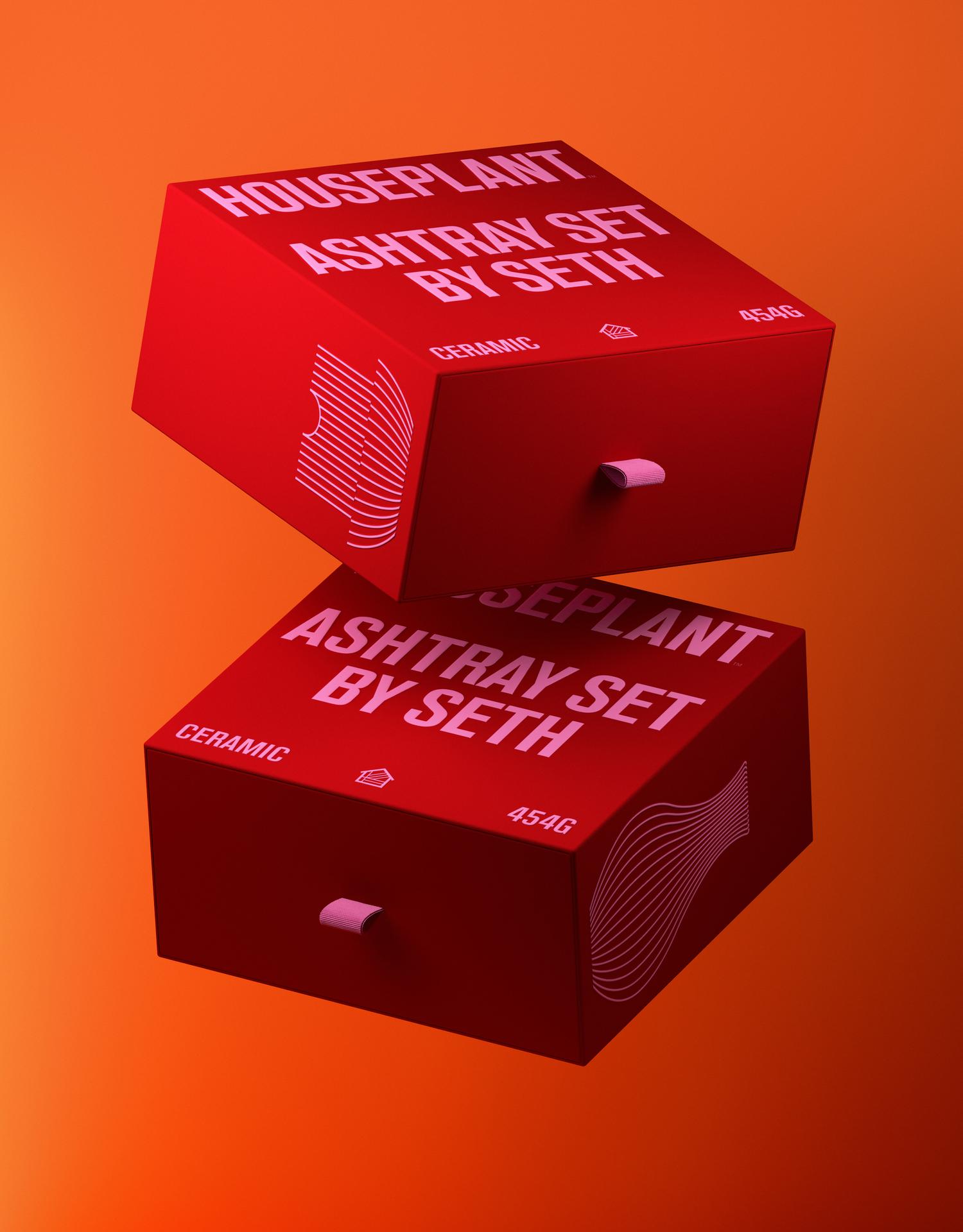
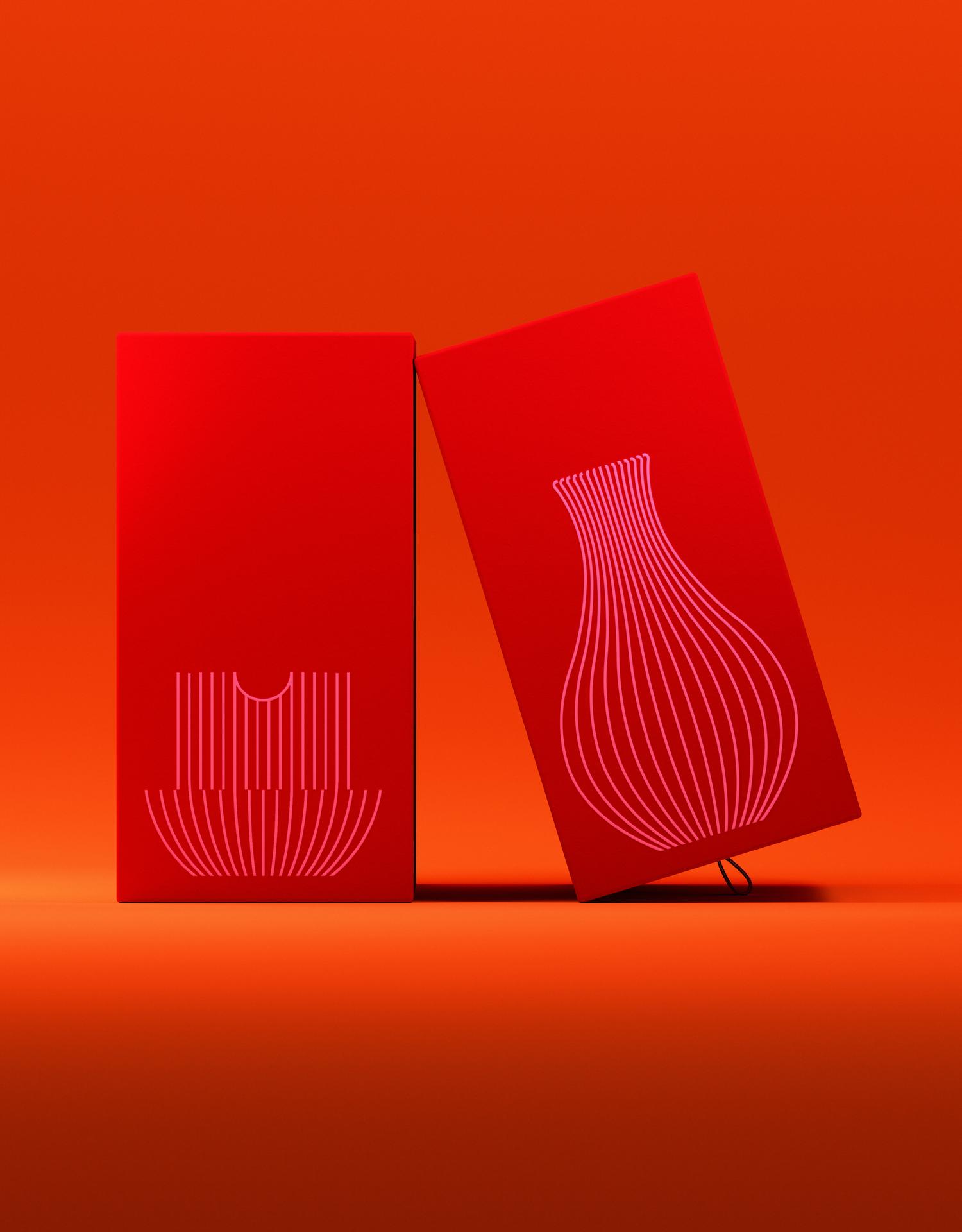
 Photo courtesy of Airbnb
CREDITS
Structural Packaging Design: MA-MA
Product Design for Tin Jars and Pre-Roll: MA-MA
Identity and Packaging System Design: Pràctica
Typeface Creative Direction: Pràctica
Typeface Design and Production: Tipografies
Animations and 3D Renders: Dani Avila
Copyright @ MA-MA
Structural Packaging Design: MA-MA
Product Design for Tin Jars and Pre-Roll: MA-MA
Identity and Packaging System Design: Pràctica
Typeface Creative Direction: Pràctica
Typeface Design and Production: Tipografies
Animations and 3D Renders: Dani Avila
Copyright @ MA-MA
ABOUT MA-MA
Multi-disciplinary design studio based in New York City. MA-MA practices within a wide range of scales of design, offering services in architectural design, scenography, furniture, and product design. The studio was founded by Sanam Salek and Laylee Salek.
The Design Blog
We highlight and uplift interesting works, ideas, and voices within the creative industry, ranging from graphic design and branding to art, interior, product design, digital and web experiences.
The Design Blog
We highlight and uplift interesting works, ideas, and voices within the creative industry, ranging from graphic design and branding to art, interior, product design, digital, and web experiences.
