BRANDING
Vibrant Brand Identity for a Pop-Up Taqueria Mama Mexa by Seachange
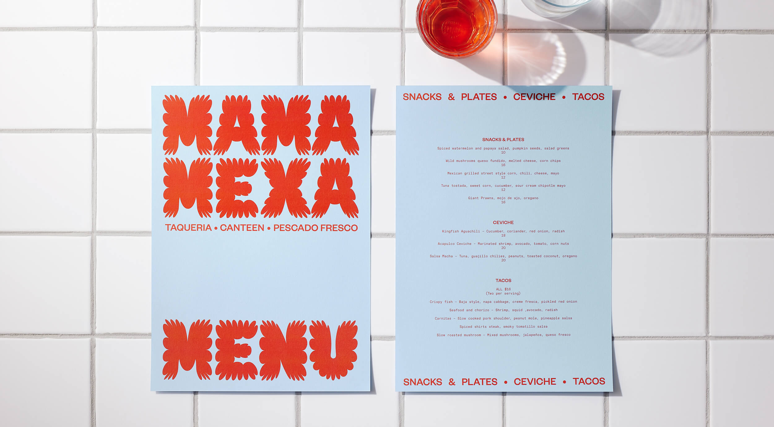
Mama Mexa is a brand new pop-up taqueria, serving up delicious healthy fast food that celebrates family, friends and fun. The menu is a market inspired Mexican offering, including reimagined classics from neighbourhood taquerias and market tostadurias.
The brief was to create an identity that delves into Mexico’s colourful, rich, vibrant culture.
The brief was to create an identity that delves into Mexico’s colourful, rich, vibrant culture.
Seachange wanted to create a strategic solution that embodied the spirit of Mexican culture, but avoided the obvious ‘Mexican pastiche’ that typifies most Mexican canteens because they all seem to look the same.
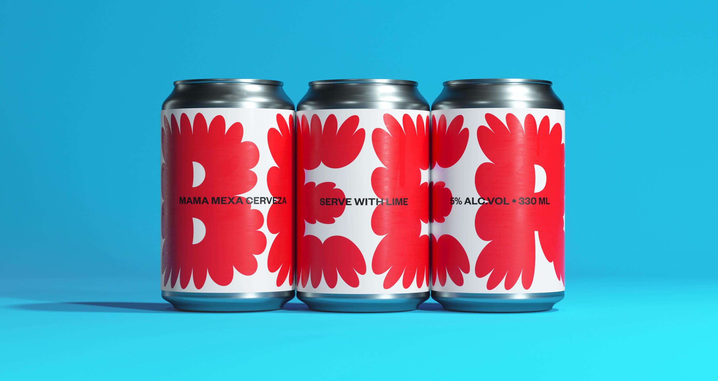
Looking into Mexican history, they discovered the importance of Mexico’s flora and fauna which is home to many of the world's most exotic blooms. In Mexican culture, flowers and flower arranging are steeped in symbolism, rituals, myths and celebration from ancient times to present. Home gardens, markets, shrines and altars come alive with an abundance of colourful bouquets.
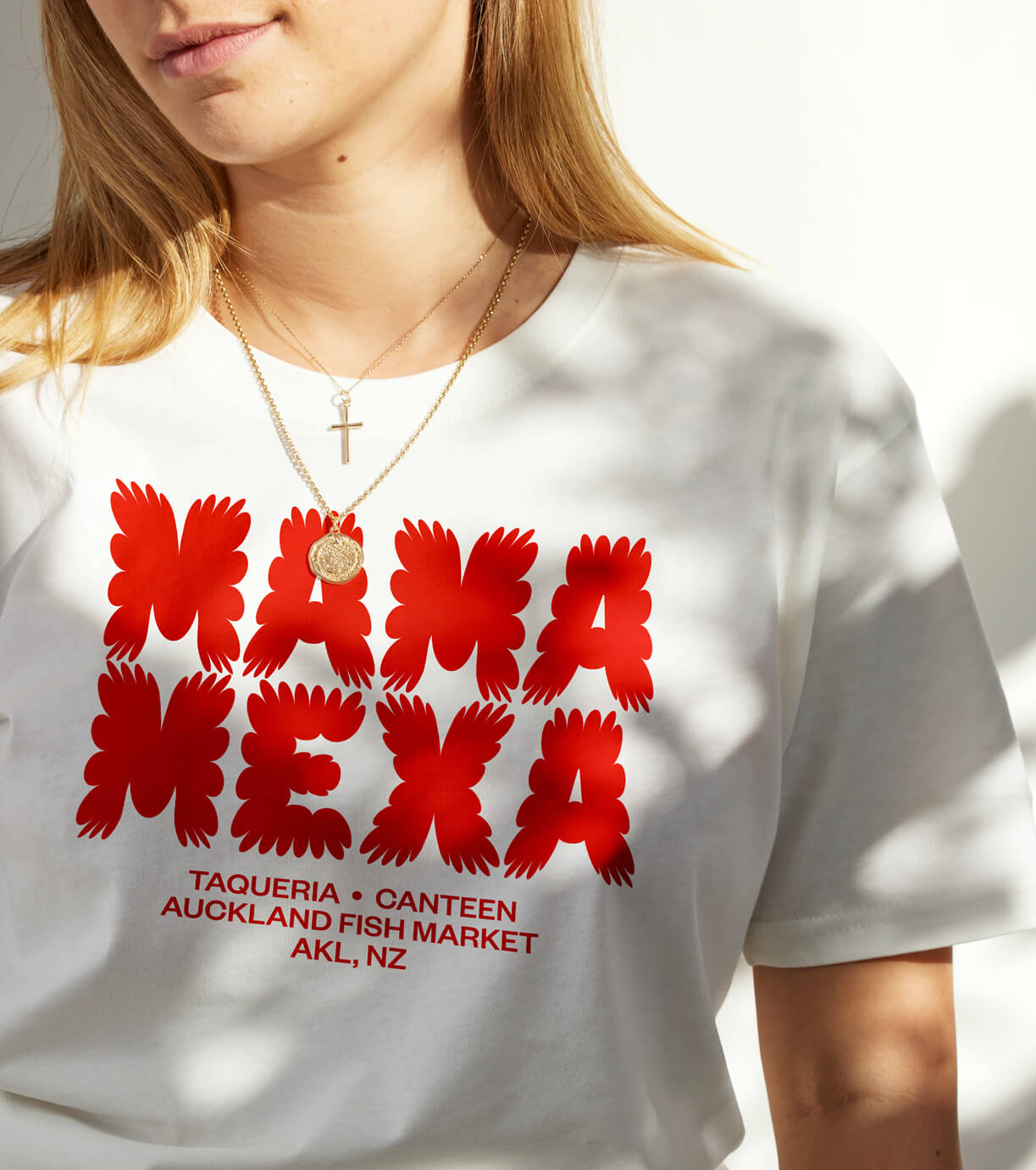
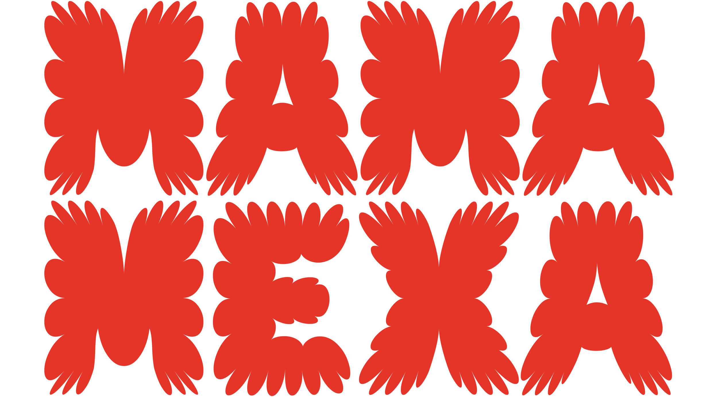
Seachange took inspiration from this, and created a totally bespoke and overly flamboyant wordmark, which evokes a sense of floral bloom, bursting at the seams. Each letter comprises a set of varying width petals, giving it an eccentric energy.
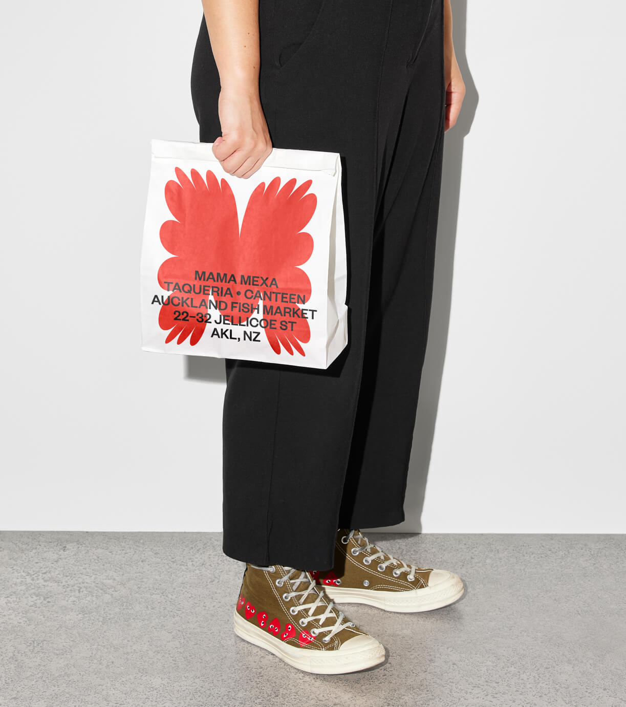
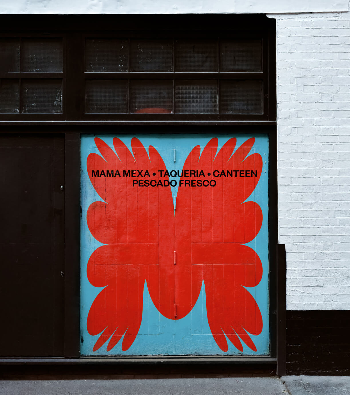
The wordmark can be used in full, and also be abbreviated to just the M, which allows it to scale to fit canvases acting as an illustrative shorthand.
Seachange took inspiration from this, and created a totally bespoke and overly flamboyant wordmark, which evokes a sense of floral bloom, bursting at the seams. Each letter comprises a set of varying width petals, giving it an eccentric energy.
The wordmark can be used in full, and also be abbreviated to just the M, which allows it to scale to fit canvases acting as an illustrative shorthand.
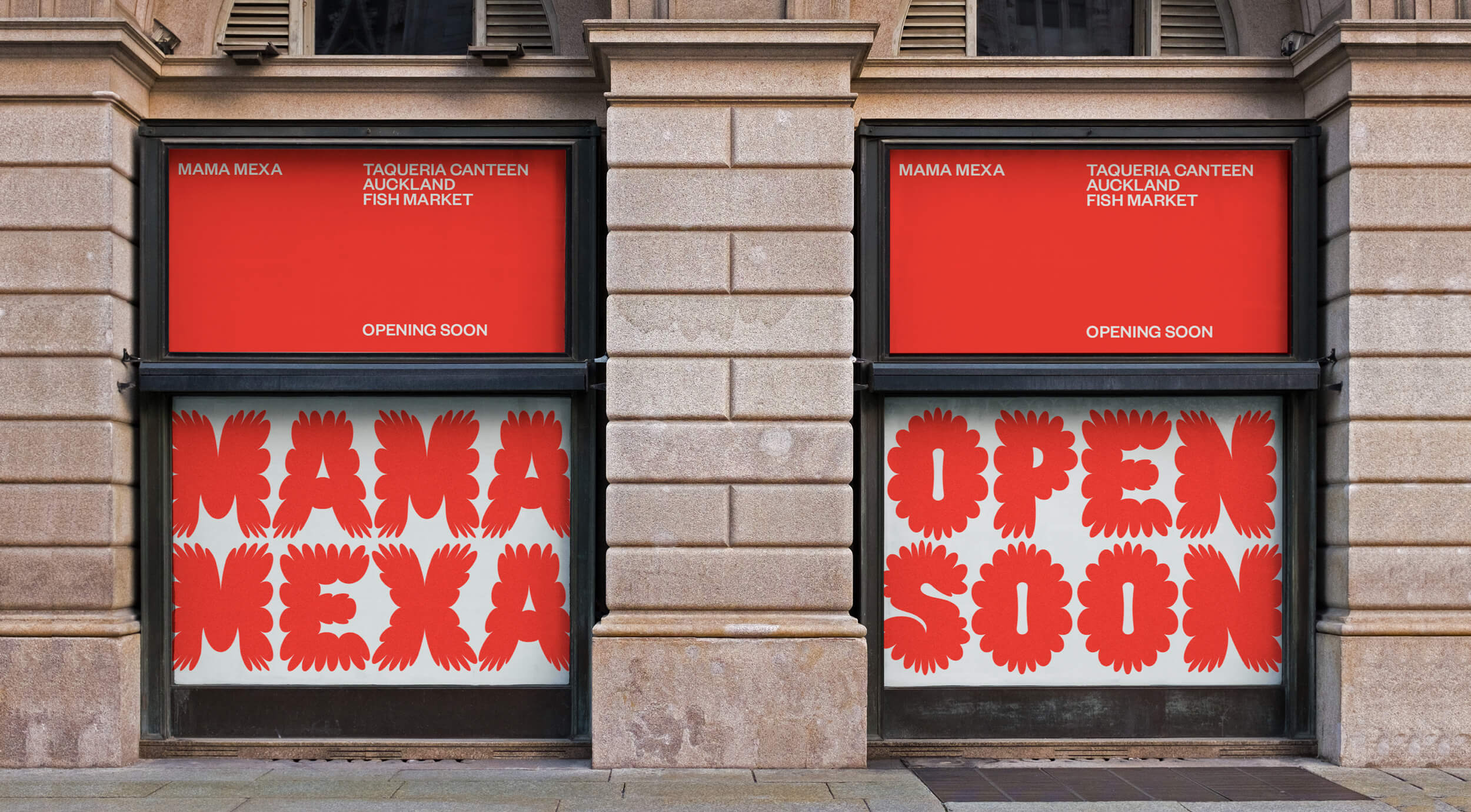
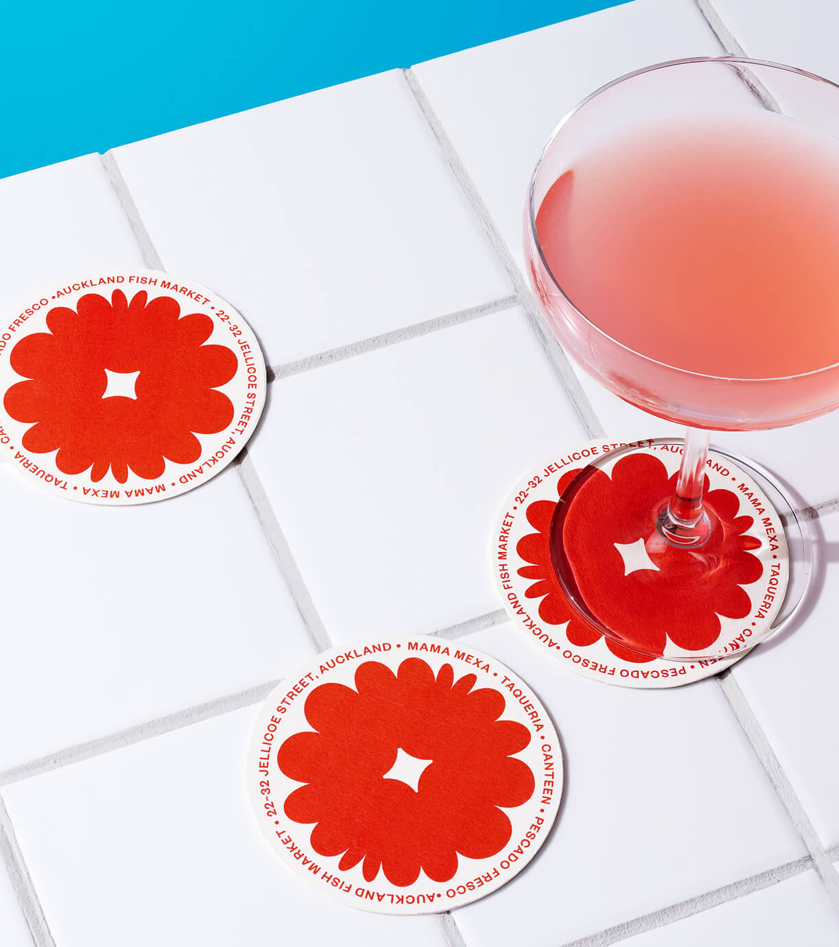
By using the typography as pattern they reference Mexican floral motifs and kitsch tablecloths found in traditional canteens.
Seachange extended this into a typeface complete with decorative glyphs which form the backbone to the identity. Each character, painstakingly crafted, aims to strike the perfect balance of ‘bloom’ and a floral explosion while still remaining legible.
By creating such a highly distinctive typeface, the brand becomes instantly recognizable without the inclusion of the name, and successfully plays homage to Mexican culture but in a totally fresh and unique way.
ABOUT SEACHANGE
Brand and design agency driven by bold creativity, exceptional craft and enduring partnerships. They seek to shift perceptions, challenge conventions, and champion positive change. Their work is thoughtful, yet unexpected and often described as category breaking.
Discover more
The Design Blog
We highlight and uplift interesting works, ideas, and voices within the creative industry, ranging from graphic design and branding to art, interior, product design, digital and web experiences.
The Design Blog
We highlight and uplift interesting works, ideas, and voices within the creative industry, ranging from graphic design and branding to art, interior, product design, digital, and web experiences.