
Situated at Scion Research, and nestled at the feet of the majestic Redwood Whakarewarewa Forest, Eastwood is a bustling community-focused cafe.
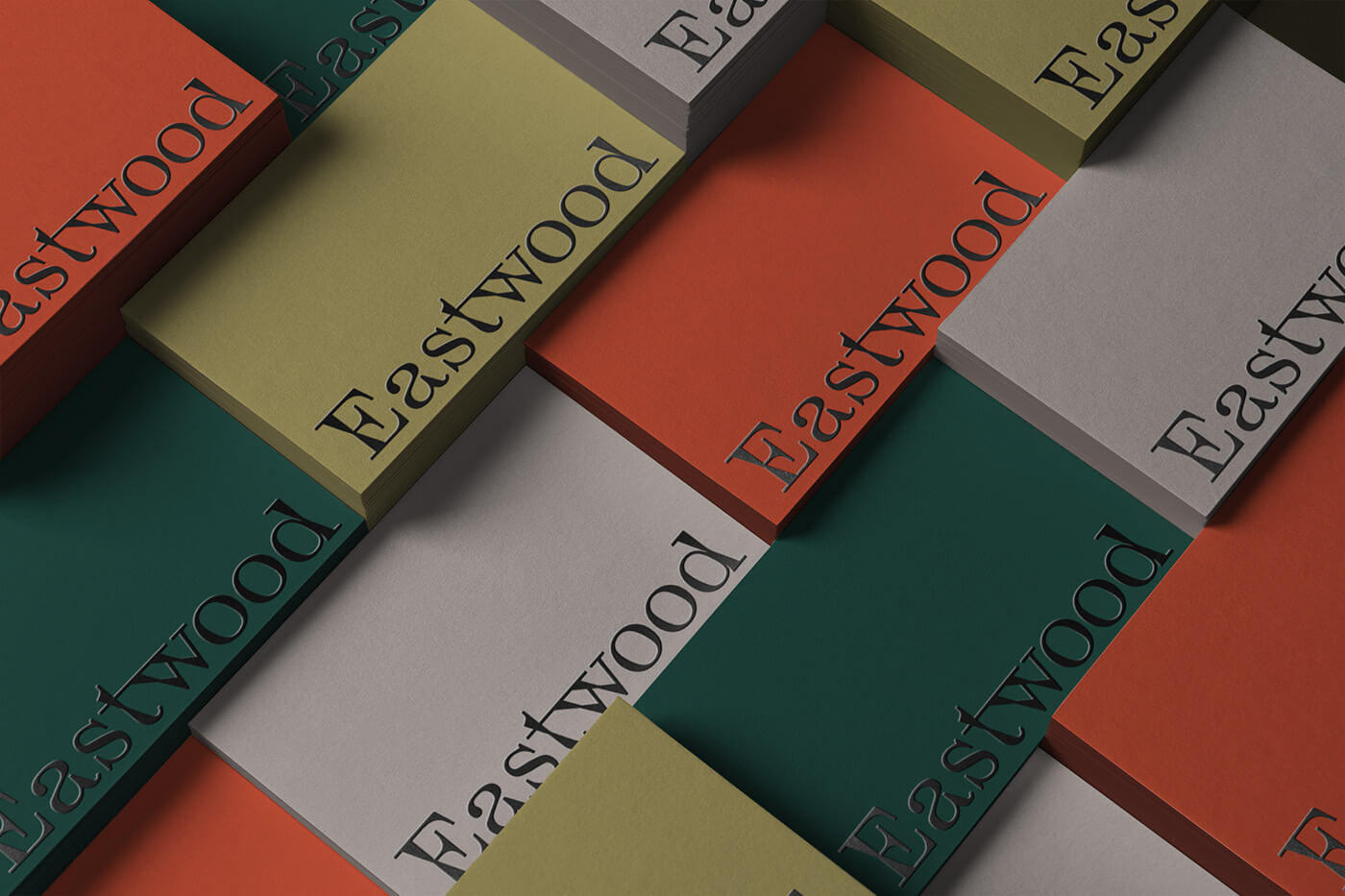
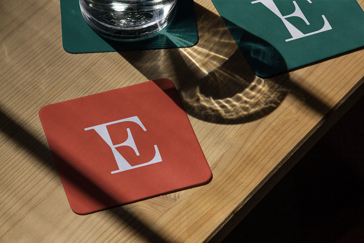
Ryan Romanes Studio created a series of playful illustrations that celebrate its regulars, which became the centerpiece of Eastwood’s new identity. In addition, a vibrant color palette was selected to compliment the unique paneling on the exterior of the building.
Ryan Romanes Studio created a series of playful illustrations that celebrate its regulars, which became the centerpiece of Eastwood’s new identity. In addition, a vibrant color palette was selected to compliment the unique paneling on the exterior of the building.
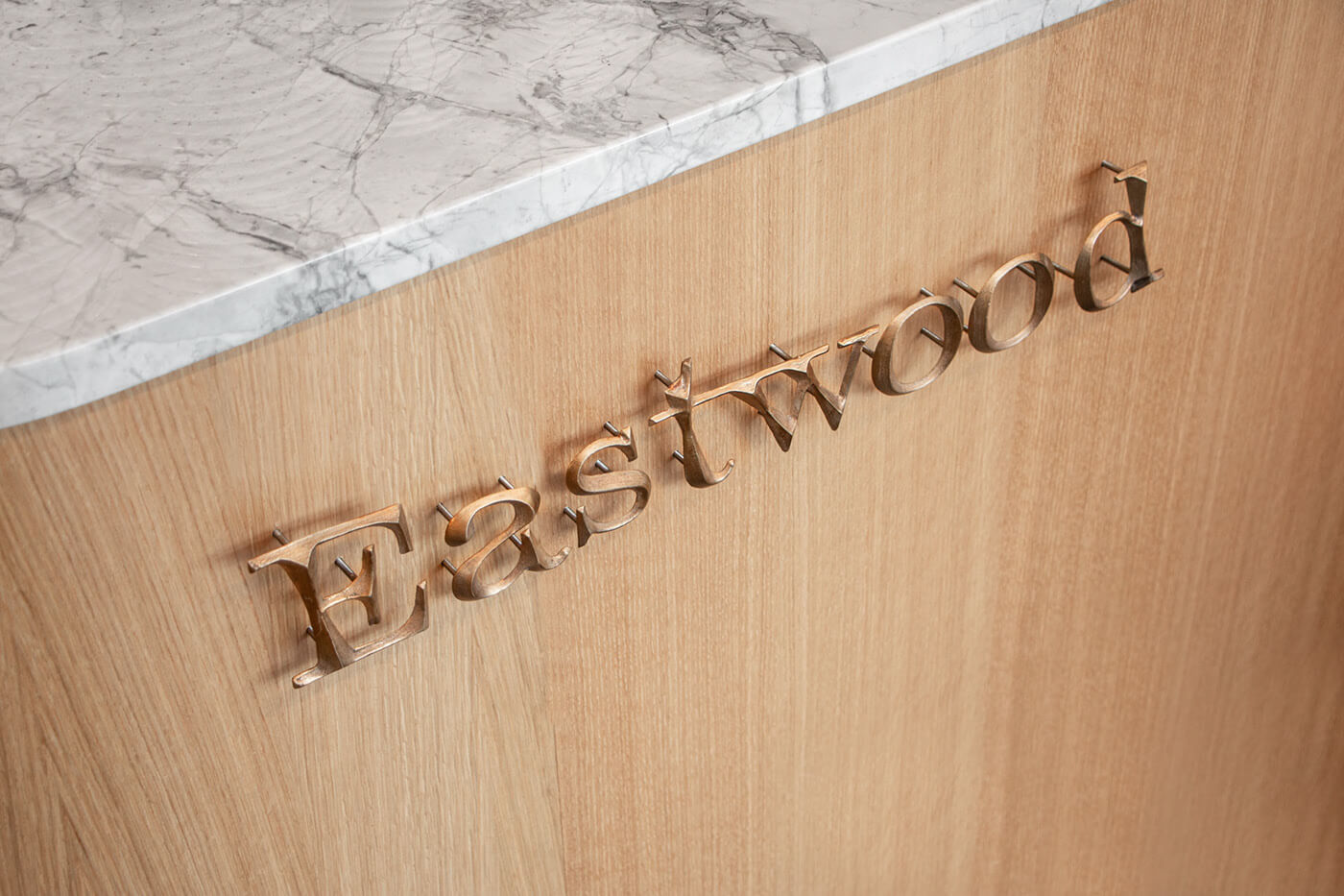


In stark contrast to the whimsical illustrations and organic colour palette is an angular logotype, set in Totentanz by Bureau Brut.
Although an unlikely combination, the sharp geometry of the slanted letter forms reflect the buildings iconic architecture, where a trio of triangular peaks welcomes visitors at the building entrance. The result is an inclusive identity that reflects it’s place and the people that inhabit it.
Although an unlikely combination, the sharp geometry of the slanted letter forms reflect the buildings iconic architecture, where a trio of triangular peaks welcomes visitors at the building entrance. The result is an inclusive identity that reflects it’s place and the people that inhabit it.


CREDITS
Design: Ryan Romanes, Pollyanna Guthrie
Illustrations: Joe Carrington
Signage: Made Visual
Interior Design: Amy Holden
Copyright @ Ryan Romanes
Design: Ryan Romanes, Pollyanna Guthrie
Illustrations: Joe Carrington
Signage: Made Visual
Interior Design: Amy Holden
Copyright @ Ryan Romanes
ABOUT RYAN ROMANES
Ryan Romanes Studio is an independent design and art direction studio based in Melbourne, Australia. They work across various creative disciplines to deliver outcomes ranging from; holistic brand identities to campaign art direction, editorial design and websites.
Discover more
The Design Blog
We highlight and uplift interesting works, ideas, and voices within the creative industry, ranging from graphic design and branding to art, interior, product design, digital and web experiences.
The Design Blog
We highlight and uplift interesting works, ideas, and voices within the creative industry, ranging from graphic design and branding to art, interior, product design, digital, and web experiences.