
BRANDING
Brand Identity for Pan After Celebrates Flexibility & Structure by Never Now
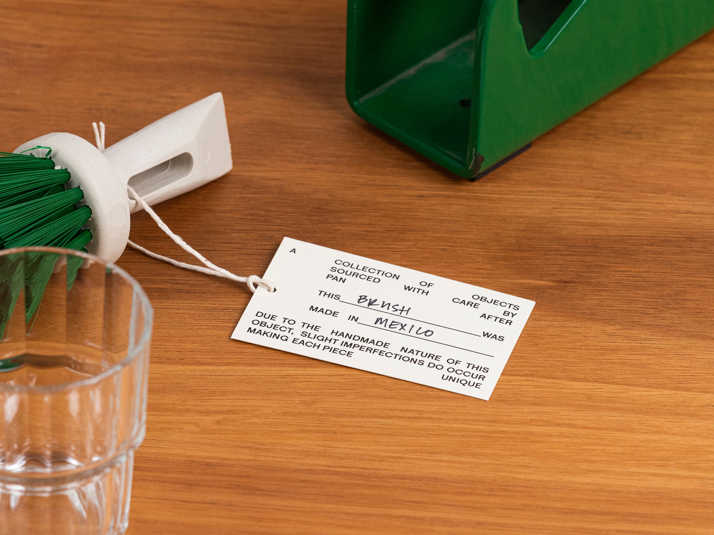
Pan After is a collection of carefully sourced and curated products worldwide. With a focus on handmade, ethically produced, and environmentally conscious products, the Pan After range not only considers an item's aesthetic value but also the process of how it is made, who it is made by, and the materials used.
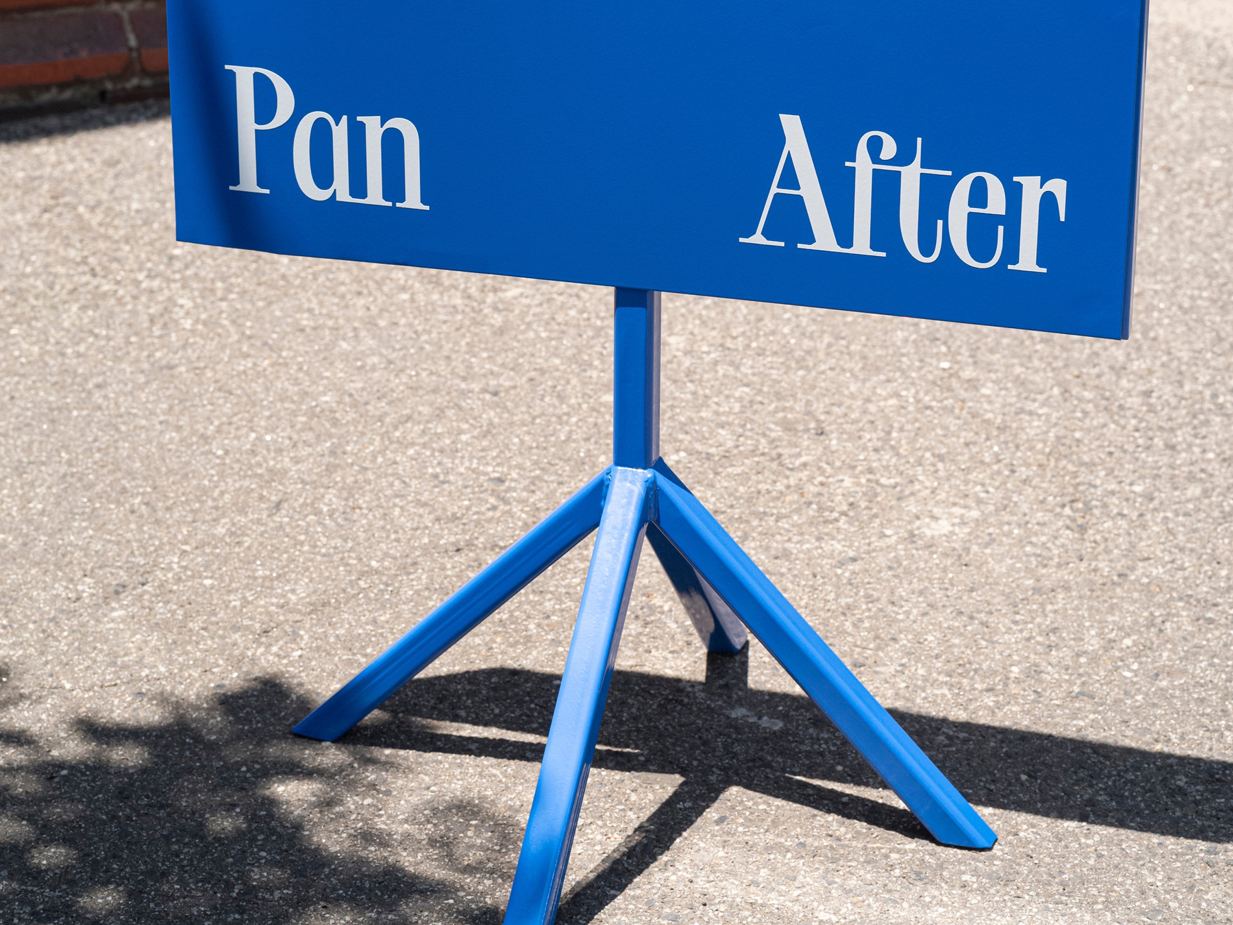
Never Now created a new brand for Pan After that introduces a melting pot of clashing colors, odd typography, and jarring negative space to create a brand that celebrates flexibility and structure — much like the store itself.
Never Now created a new brand for Pan After that introduces a melting pot of clashing colors, odd typography, and jarring negative space to create a brand that celebrates flexibility and structure — much like the store itself.


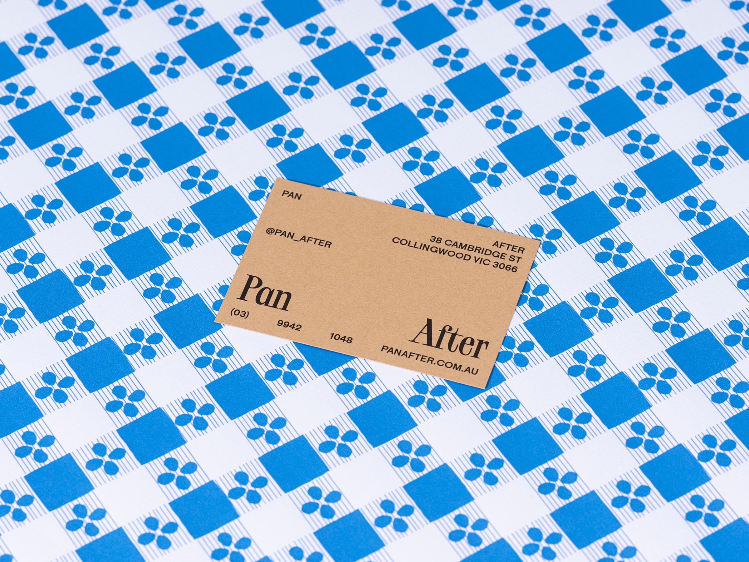
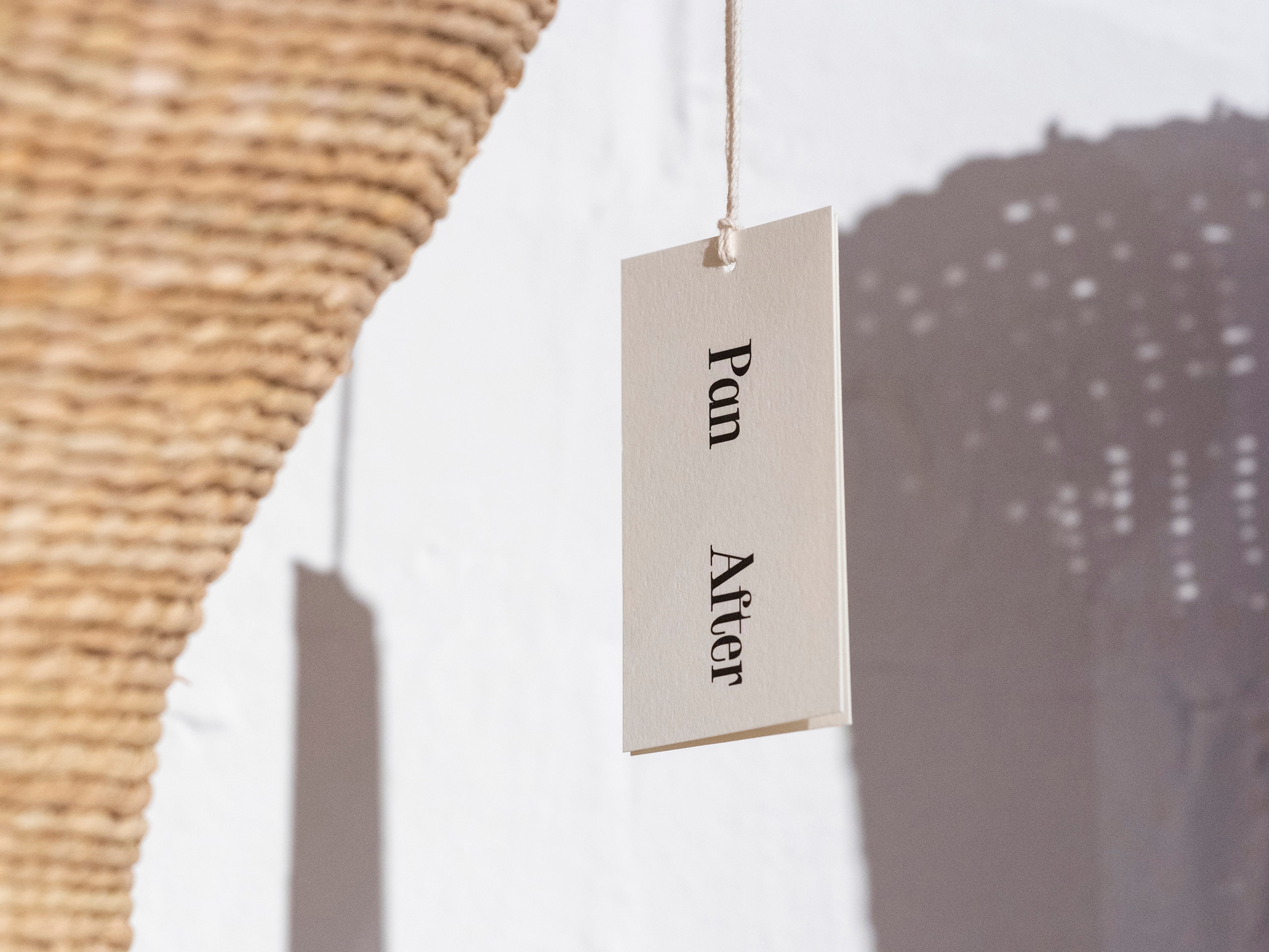

The worldmark is set in TOY by Philipp Herrmann (Out of the Dark), with all other copy set in Maria, a sans-serif by Phil Baber. TOY is compact and feels quite elegant, while Maria is more geometric and brutal.
Combined with irregular spacing and fine margins, the brand speaks to the unique nature of items curated by Pan After.
Combined with irregular spacing and fine margins, the brand speaks to the unique nature of items curated by Pan After.


ABOUT NEVER NOW
Never Now is a Melbourne based design studio specialising in branding and communication. Under the creative direction of Tristan Ceddia, the studio works with a broad network of photographers, architects, artists and thinkers to create diverse approaches and unique outcomes for our projects.
Discover more
The Design Blog
We highlight and uplift interesting works, ideas, and voices within the creative industry, ranging from graphic design and branding to art, interior, product design, digital and web experiences.
The Design Blog
We highlight and uplift interesting works, ideas, and voices within the creative industry, ranging from graphic design and branding to art, interior, product design, digital, and web experiences.