BRANDING
Minimal Brand Identity for GRAU Designed To Be a Carrier of Meaning by Porto Rocha
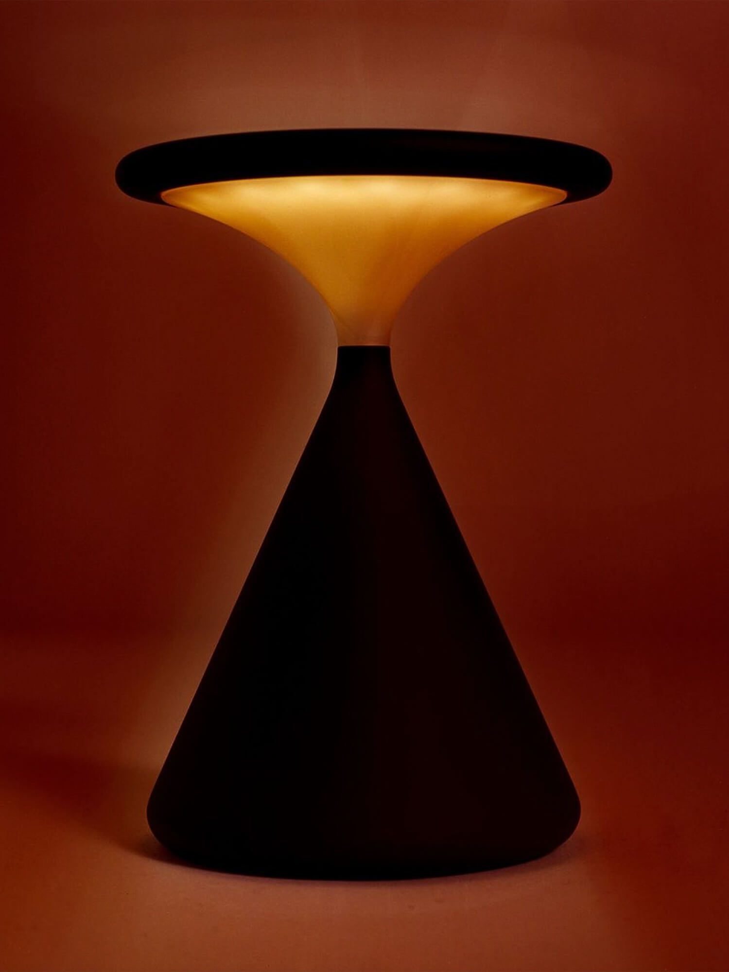
For GRAU, lamps are more than design objects. They are vessels for light, which has the power to shape our inner and outer worlds — how we think and feel, collaborate and connect.
Just as GRAU designs lighting that is stripped back to its essential form, PORTO ROCHA developed an elemental visual identity that becomes activated by its contents.
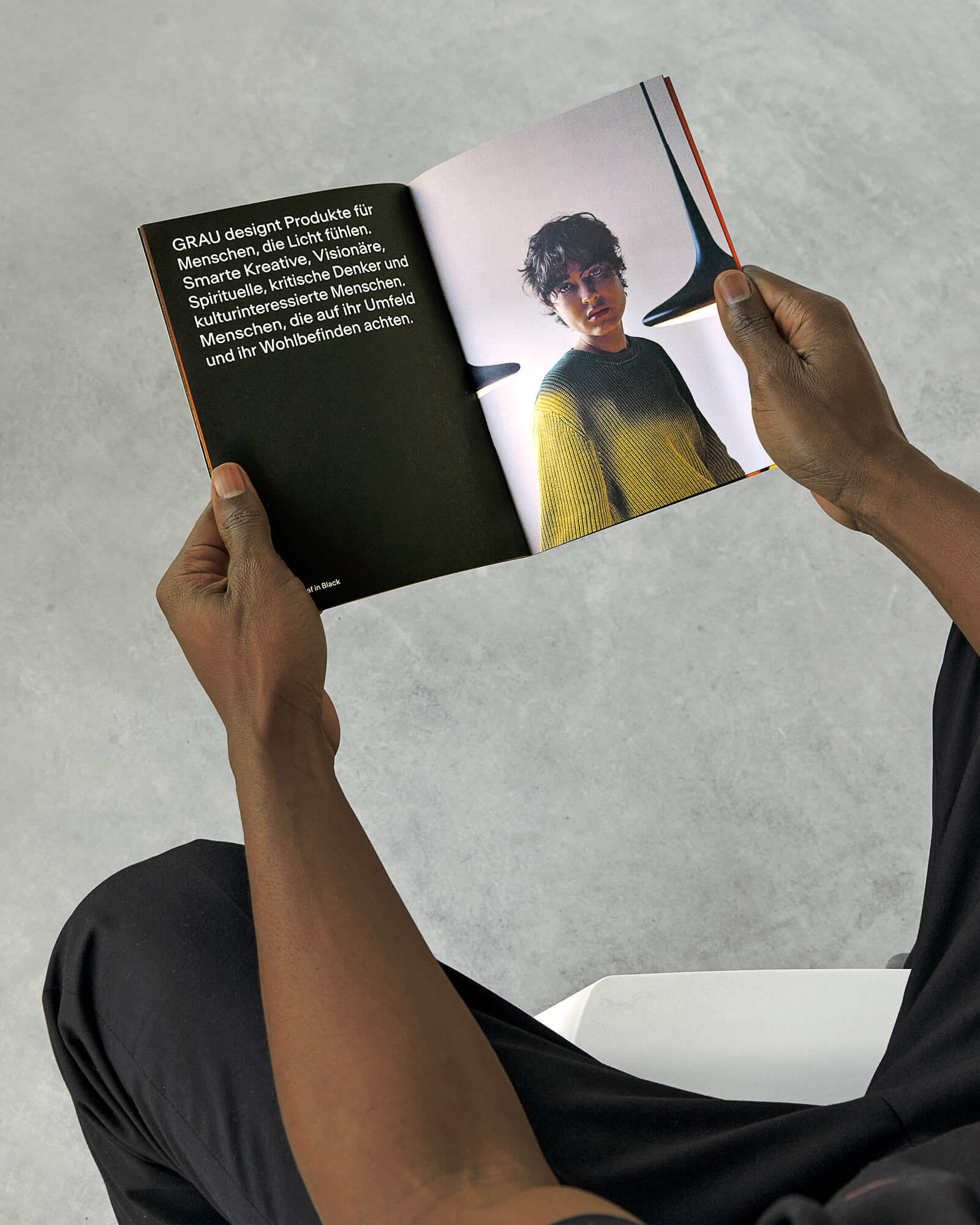
The result is far from bare: visceral, sensorial imagery breathes life into an understated graphic system while capturing the emotional and spiritual qualities of light. Never minimal for its own sake, the brand was designed to be a carrier of meaning.

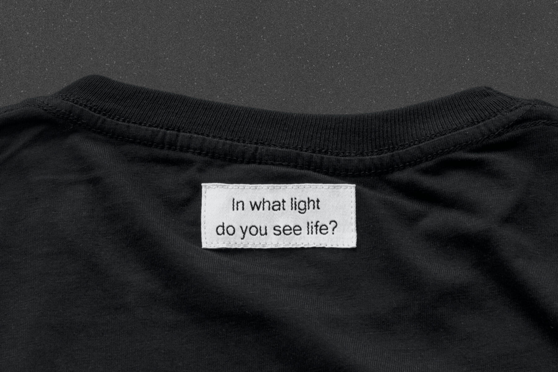

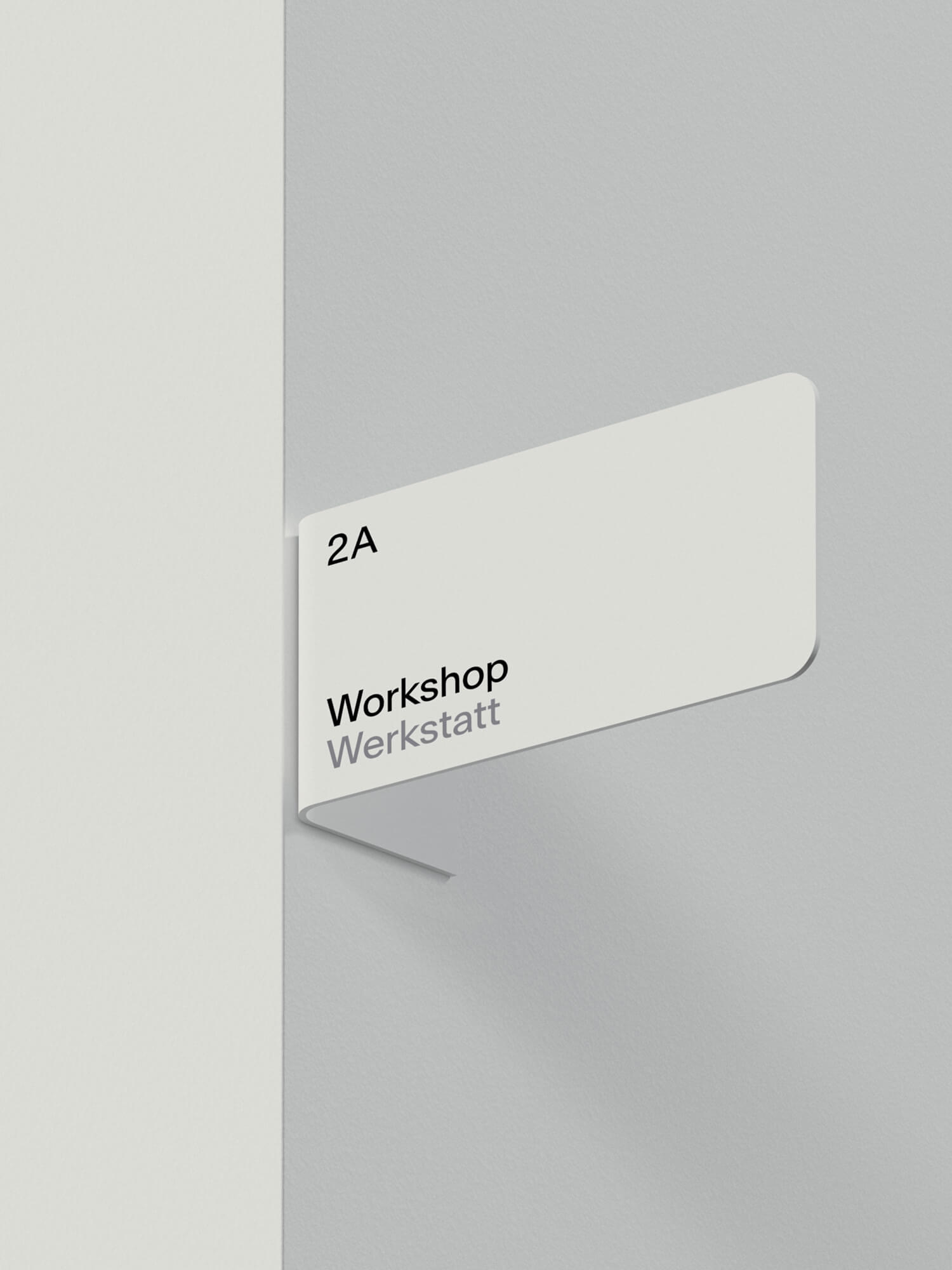
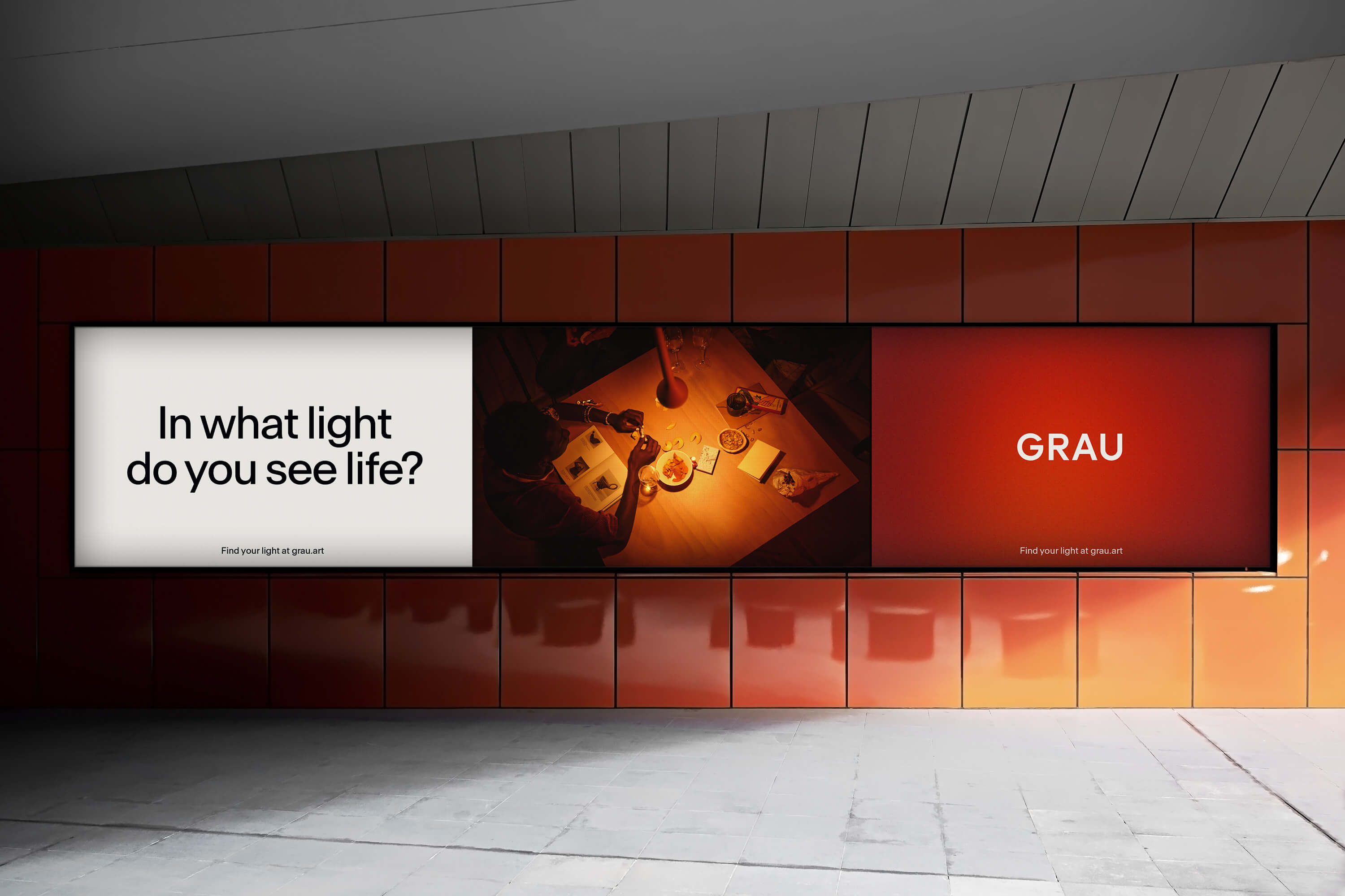

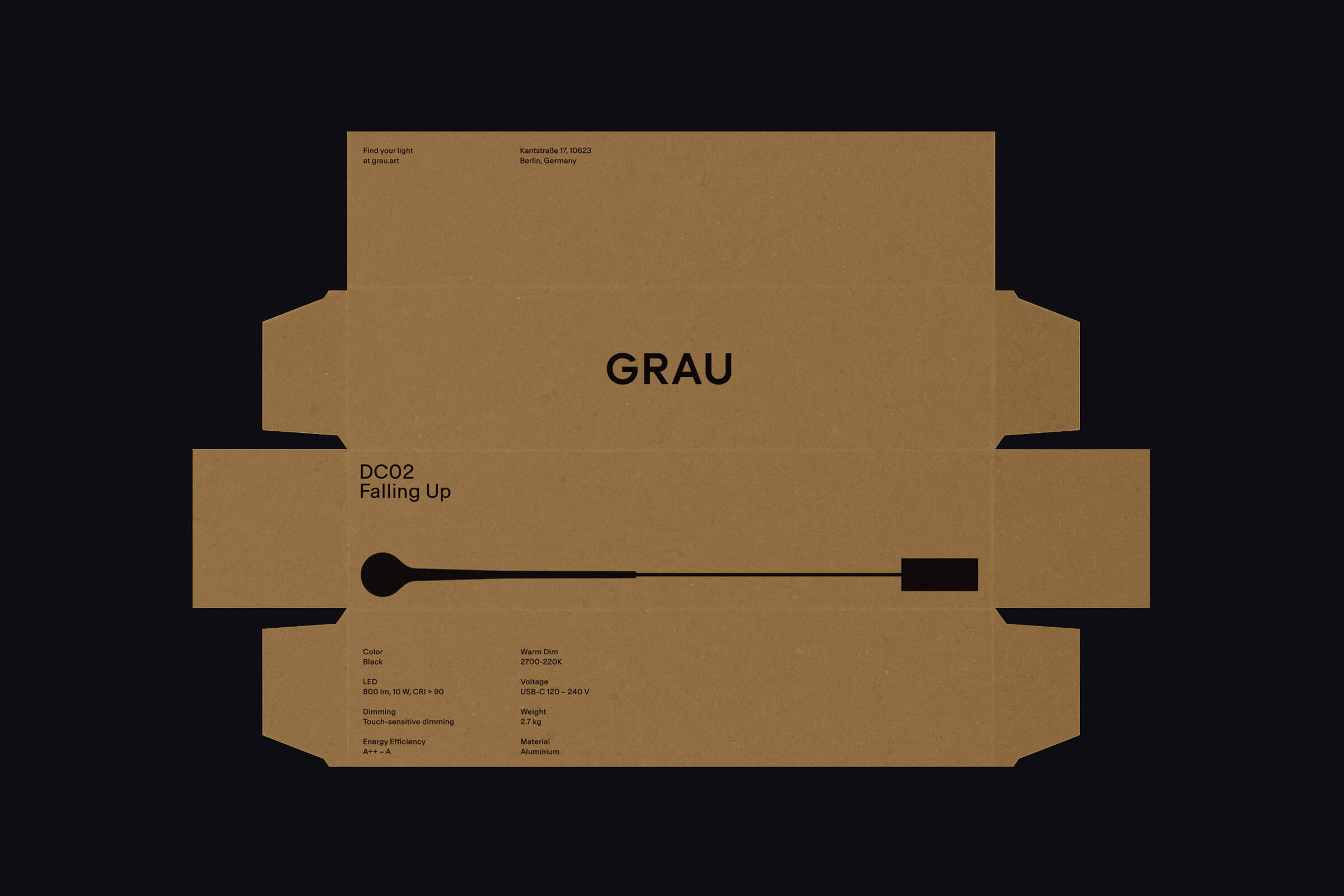
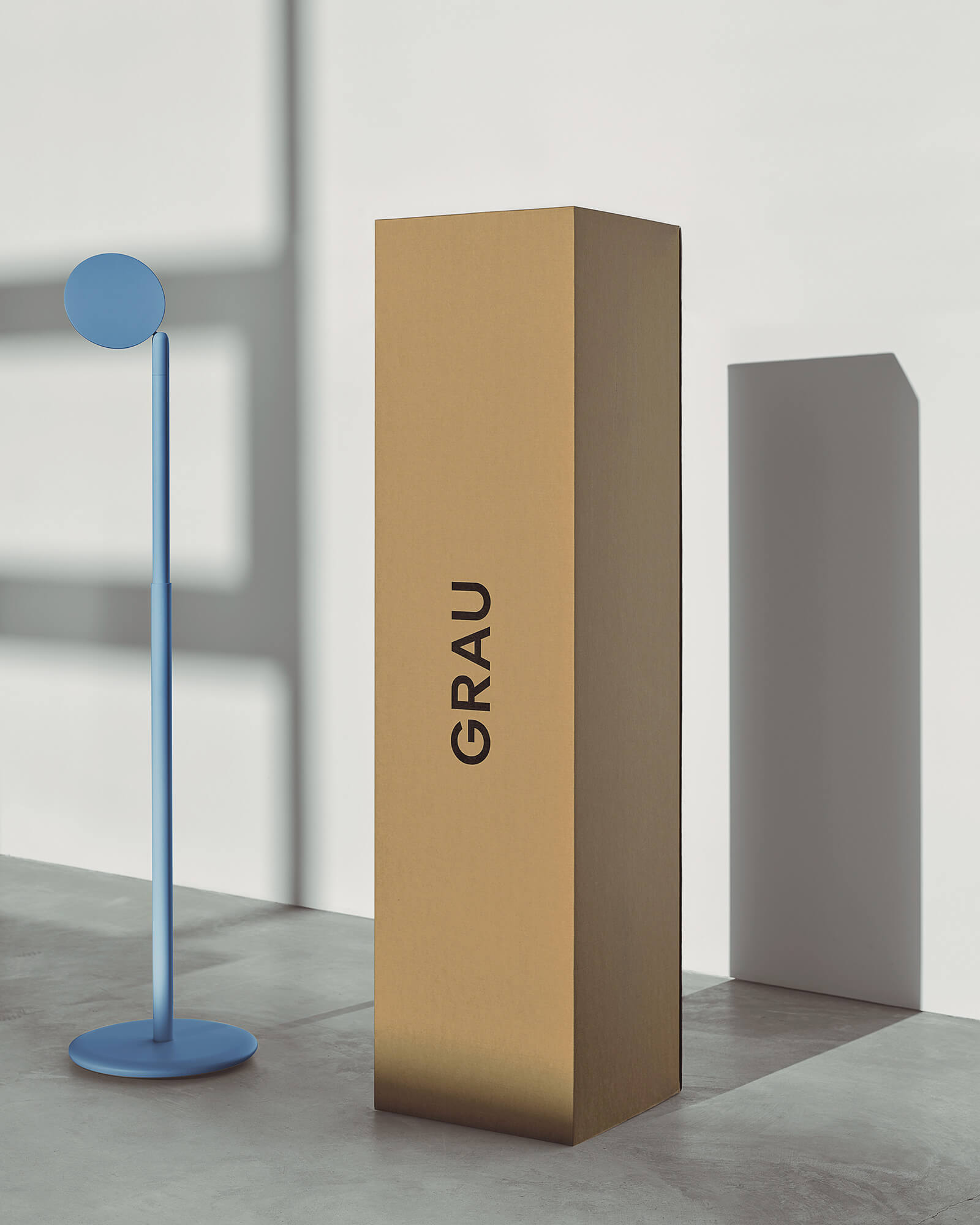
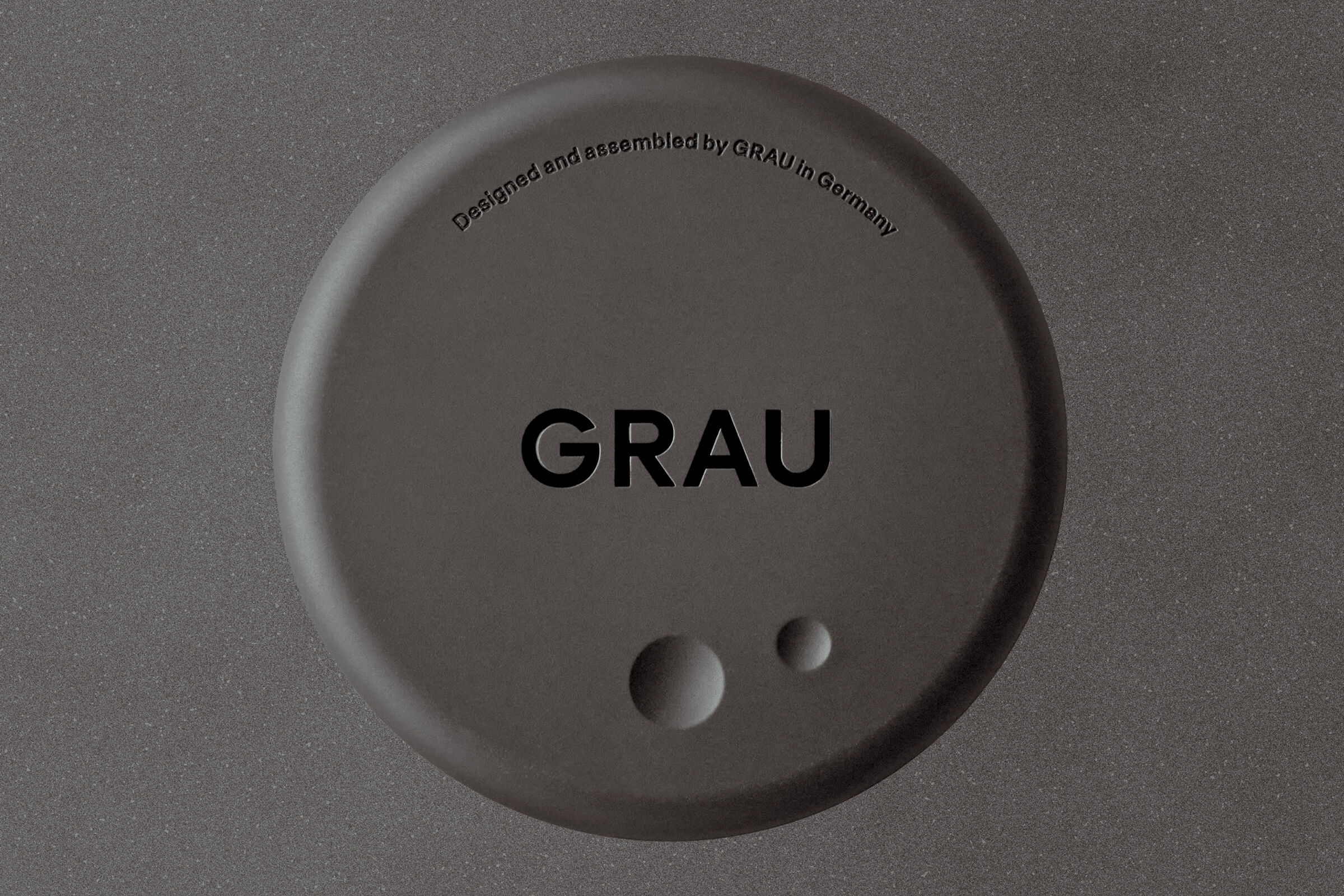
PORTO ROCHA constructed a logo with open geometric forms, engineered to take on new meanings over time. Across physical and digital applications, the mark becomes an iconic signature for GRAU products and art practice. To complement it: Antarctica, a sans serif typeface from Newglyph that is equally utilitarian and conversational.
As an exercise in reduction, the color palette relies on a neutral foundation of black and off-white; accents of red and blue nod to the visible light spectrum’s expressions of warm and cool. Ample negative space, a keystone of digital and analog compositions, becomes its own brand gesture by making room for other elements to artfully coexist.
In GRAU products, cutting-edge digital technology meets the user in responsive, tactile interfaces. PORTO ROCHA mirrored that approach in the brand’s expression on web, including only the essential while allowing digital experiences to come alive through human interaction.



CREDITS
Agency: PORTO ROCHA
Creative Direction: Leo Porto, Felipe Rocha
Design: Joseph Lebus, Chae Park, David Klein, Leo Porto, Felipe Rocha
Motion Design: Thales Muniz, Fionn Breen
Interactive Design: Marcos Rodrigues, Heena Chung
Case Study Production: Annie Carmichael
Website: GRAU, We Make Websites
Copyright @ PORTO ROCHA
ABOUT PORTO ROCHA
New York-based agency uniting strategy and design to make work that evolves with the world they live in. Working closely with people and companies to craft branding systems, products and experiences, they seek to provoke meaningful change through their work, from large-scale projects that reach significant audiences to socially and culturally-motivated initiatives.
The Design Blog
We highlight and uplift interesting works, ideas, and voices within the creative industry, ranging from graphic design and branding to art, interior, product design, digital and web experiences.
The Design Blog
We highlight and uplift interesting works, ideas, and voices within the creative industry, ranging from graphic design and branding to art, interior, product design, digital, and web experiences.
