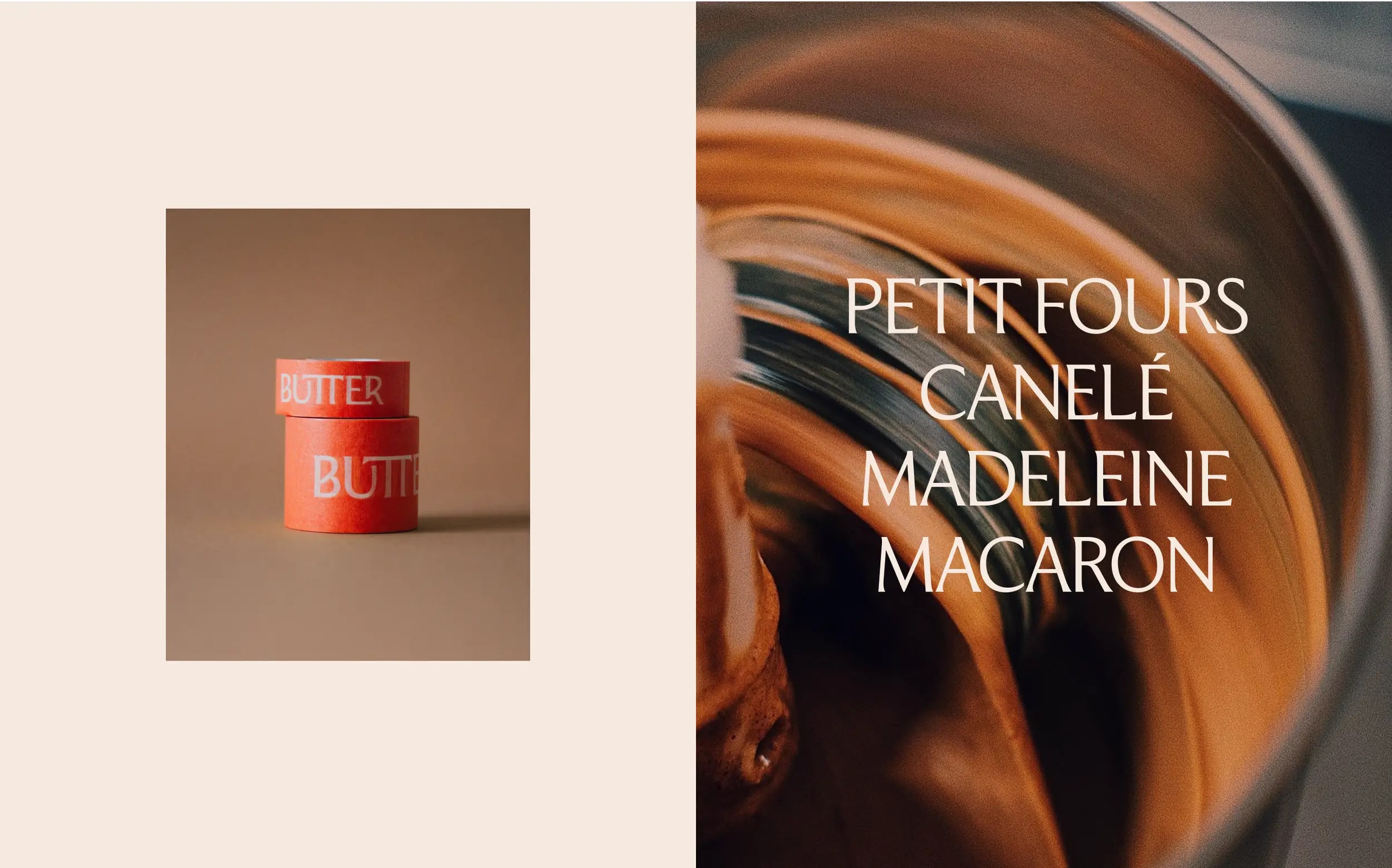
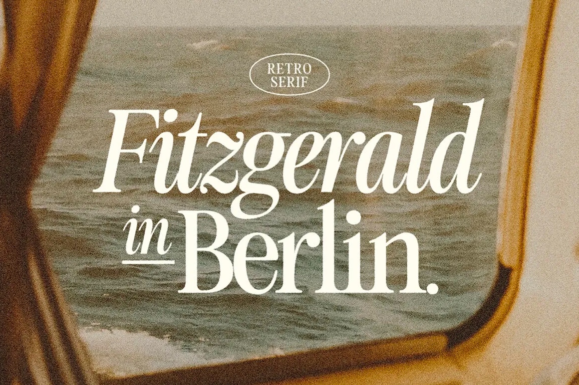
BRANDING
Butter’s identity takes inspiration from traditional woodcuts while honoring French heritage by Daniel Shaskey
Butter is an Ōtautahi-based patisserie owned and operated by Corentin Esquenet, a Reims-born, New Zealand-raised pastry chef.
The challenge called for a visual identity that connected Corentin’s French heritage with the distinct character of his New Zealand-based patisserie.
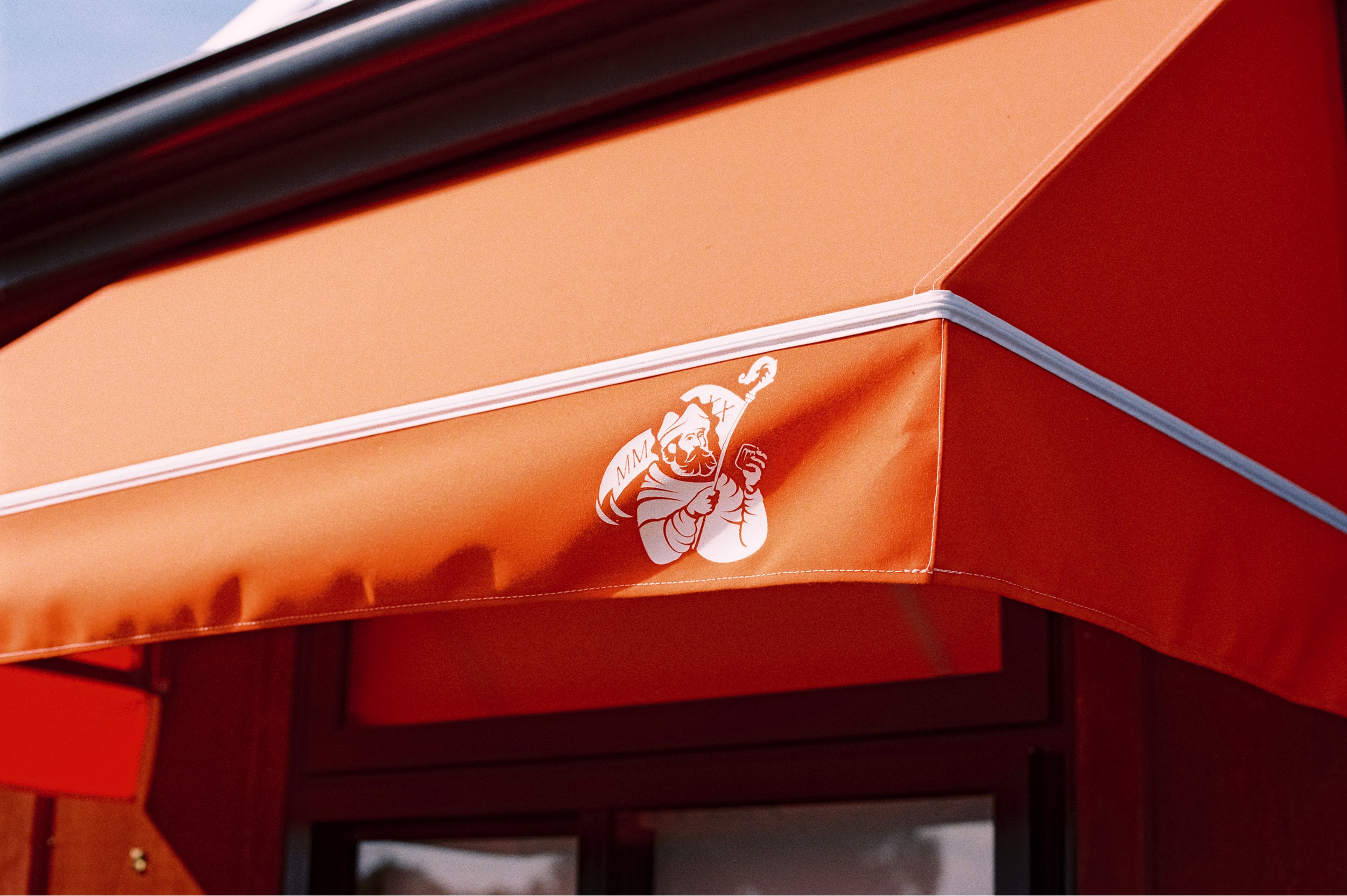
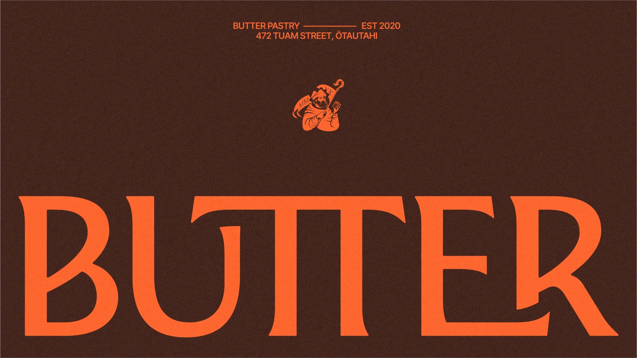
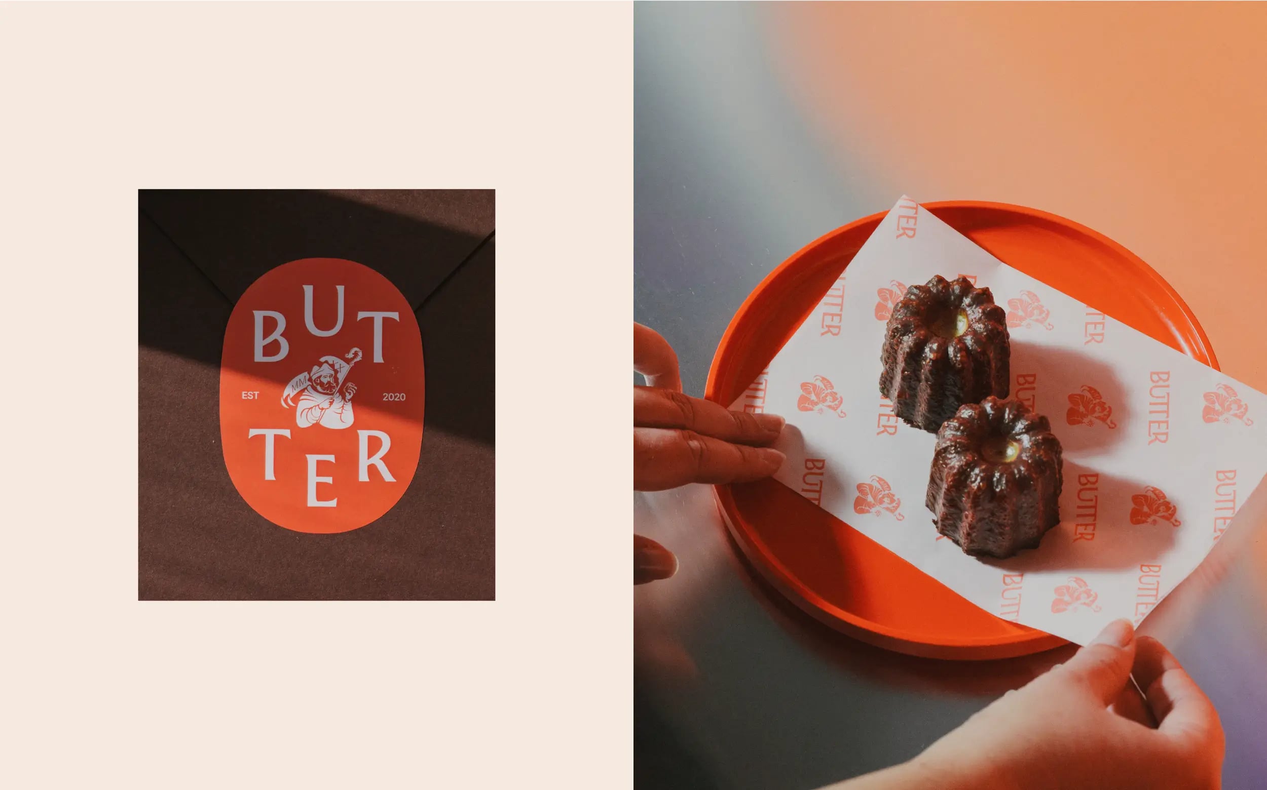
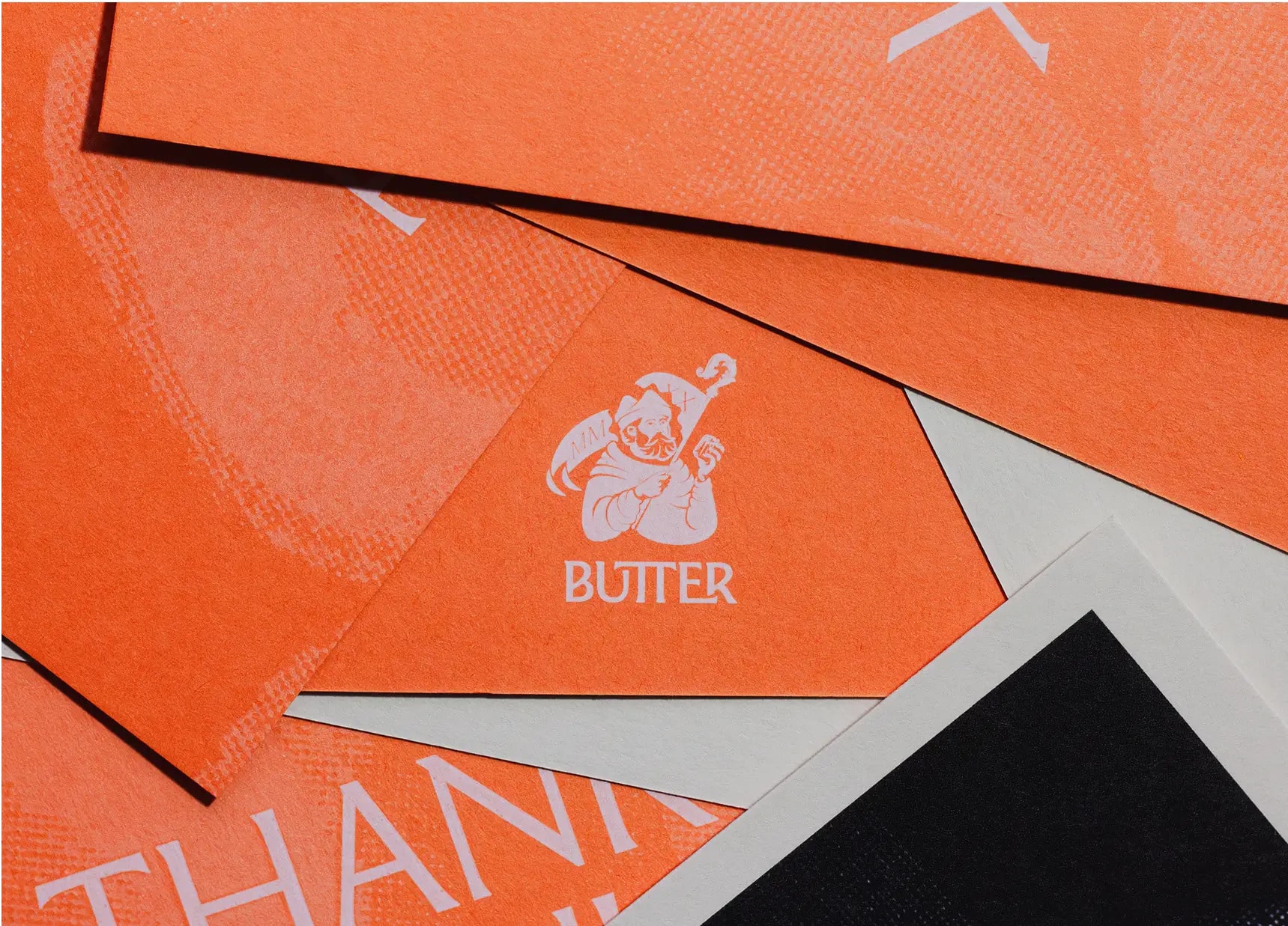
The emblem takes inspiration from traditional woodcut illustrations and features Saint Honoré, the patron saint of bakers and pastry chefs — a nod to both Corentin’s background and his craft. Supporting this, French typefaces by Sandrine Nugue are used across signage, packaging, and digital applications, giving the brand a quiet sense of authenticity.
The challenge called for a visual identity that connected Corentin’s French heritage with the distinct character of his New Zealand-based patisserie.
The emblem takes inspiration from traditional woodcut illustrations and features Saint Honoré, the patron saint of bakers and pastry chefs — a nod to both Corentin’s background and his craft. Supporting this, French typefaces by Sandrine Nugue are used across signage, packaging, and digital applications, giving the brand a quiet sense of authenticity.

CREDITS
Design: Daniel Shaskey, Holly Maitland
Print: Printers Inc
Packaging: No Issue
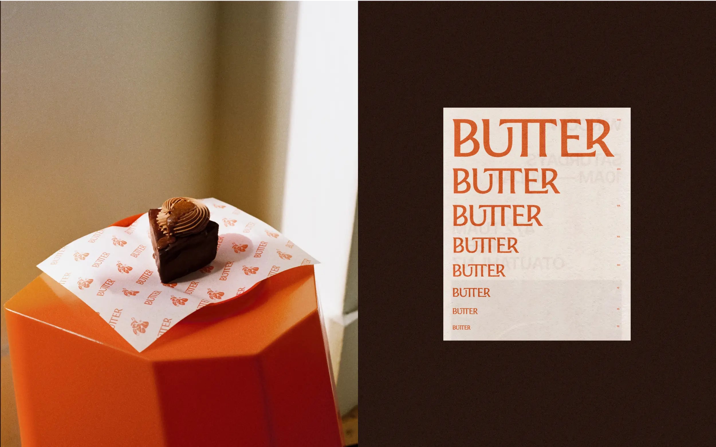
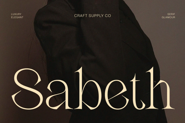
Typeface: Moulin
Copyright @ Daniel Shaskey
Design: Daniel Shaskey, Holly Maitland
Print: Printers Inc
Packaging: No Issue
Typeface: Moulin
Copyright @ Daniel Shaskey
ABOUT DANIEL SHASKEY
Daniel Shaskey is a Ōtautahi-based designer and artists’ publisher. Daniel’s practice bridges the intersection of disciplines among art, design, craft, and literature to produce books that explore ideas around virtuality, physicality, speculation, and cybernetics.
Discover more
The Design Blog
We highlight and uplift interesting works, ideas, and voices within the creative industry, ranging from graphic design and branding to art, interior, product design, digital and web experiences.
The Design Blog
We highlight and uplift interesting works, ideas, and voices within the creative industry, ranging from graphic design and branding to art, interior, product design, digital, and web experiences.