
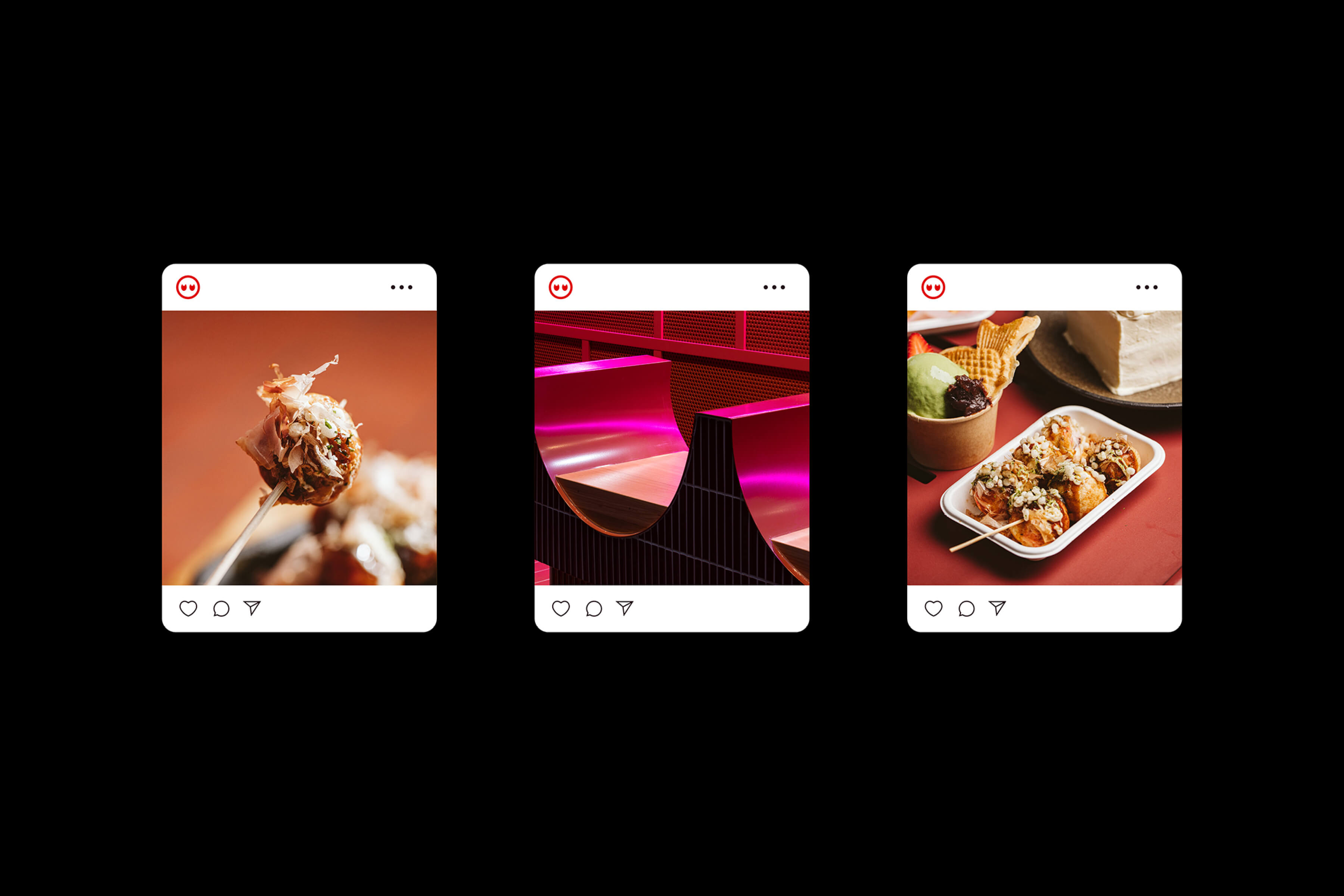
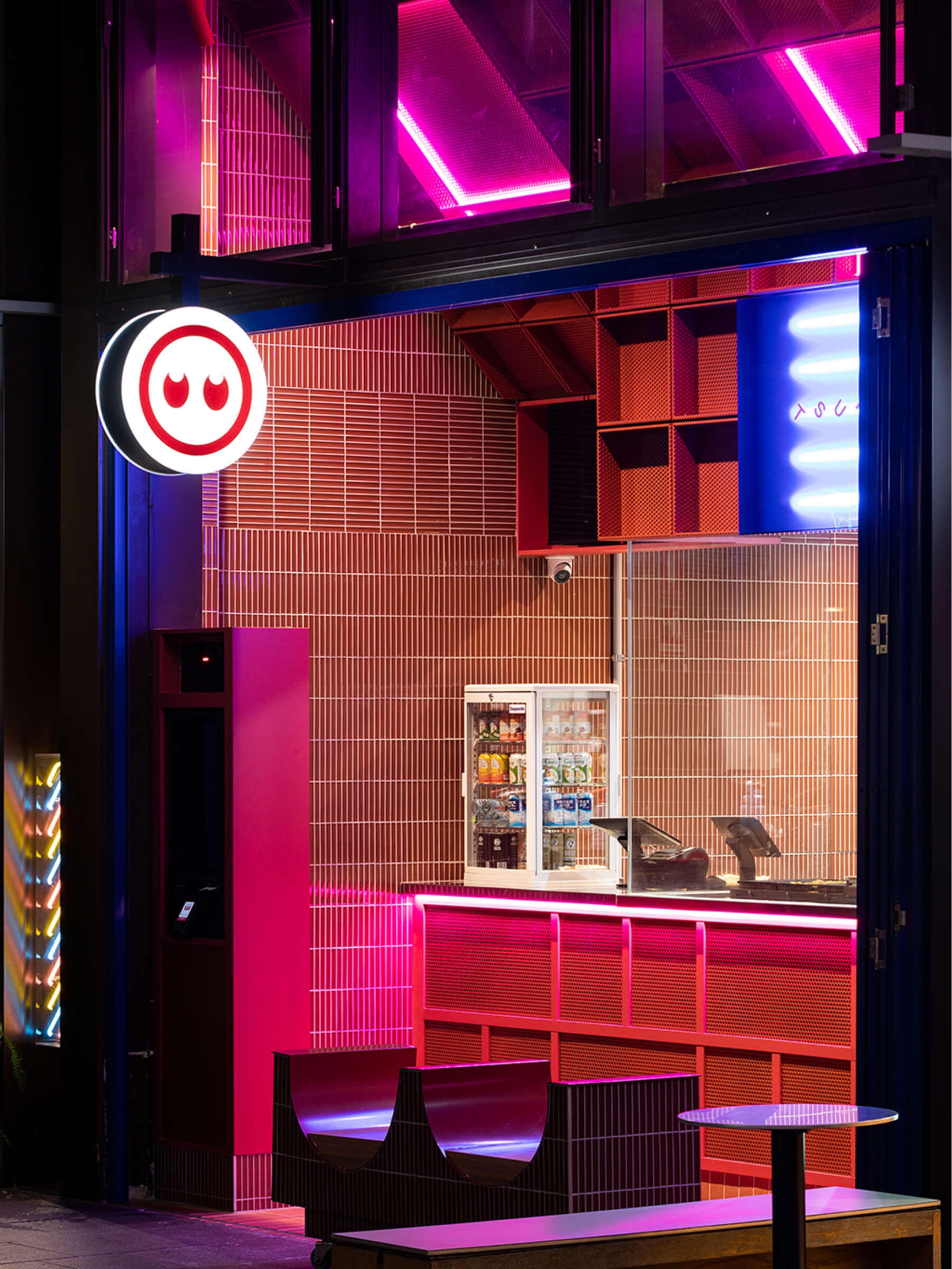
A modern Japanese street food concept that brings the electric atmosphere of Osaka’s Dotonbori district to Sydney. The experience aims to recreate the vibrant nights of Osaka, offering authentic flavours and scents reminiscent of the bustling streets of Dotonbori.
The Colour Club studio’s challenge was to combine Japanese street culture and tradition with a modern twist, giving Tsukiyo a unique identity in Sydney’s competitive food scene.
The Colour Club studio’s challenge was to combine Japanese street culture and tradition with a modern twist, giving Tsukiyo a unique identity in Sydney’s competitive food scene.


We incorporated a moon icon into the logo and used rotating typography to represent the moon’s movement across the sky, drawing inspiration from the celestial theme. The neon signage pays tribute to the iconic streetlights of Osaka and adds excitement to Tsukiyo’s visual identity.
The packaging design features custom boxes for takoyaki, with graphics and colors echoing the experience of dining under the glow of neon lights and gazing upon the moon-inspired logo.
The packaging design features custom boxes for takoyaki, with graphics and colors echoing the experience of dining under the glow of neon lights and gazing upon the moon-inspired logo.


Discover more
The Design Blog
We highlight and uplift interesting works, ideas, and voices within the creative industry, ranging from graphic design and branding to art, interior, product design, digital and web experiences.
The Design Blog
We highlight and uplift interesting works, ideas, and voices within the creative industry, ranging from graphic design and branding to art, interior, product design, digital, and web experiences.