BRANDING
Kunsthalle Basel’s New Identity Reflects a Tension Between Permanence and Change by Porto Rocha
As the oldest contemporary art space in Switzerland, they built their reputation by going against the grain: showing artists before they were known, embracing new media before it was the norm, and opening their doors to the public while peers catered to the elite.
Without a permanent collection, Kunsthalle has always prioritized what’s now and next, giving early platforms to artists who would go on to shape history: from Marcel Duchamp to Anne Imhof.
Porto Rocha’s goal was to create an institutional brand with an anti-institutional spirit. It needed to provide the structure and recognition that the previous identity lacked, establishing a clear mark for KB, while also reflecting avant-garde values by allowing the identity to adapt in a constantly changing art world.
Without a permanent collection, Kunsthalle has always prioritized what’s now and next, giving early platforms to artists who would go on to shape history: from Marcel Duchamp to Anne Imhof.
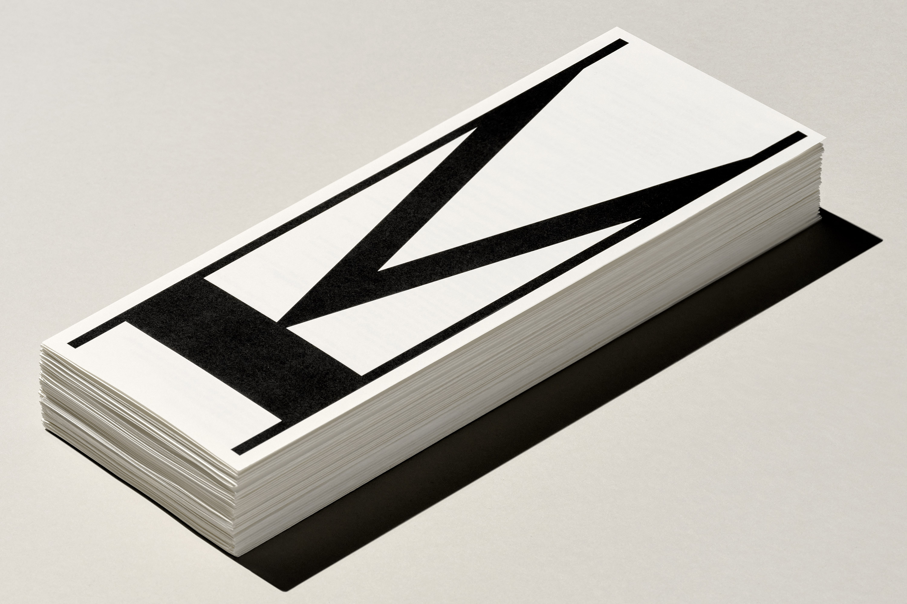

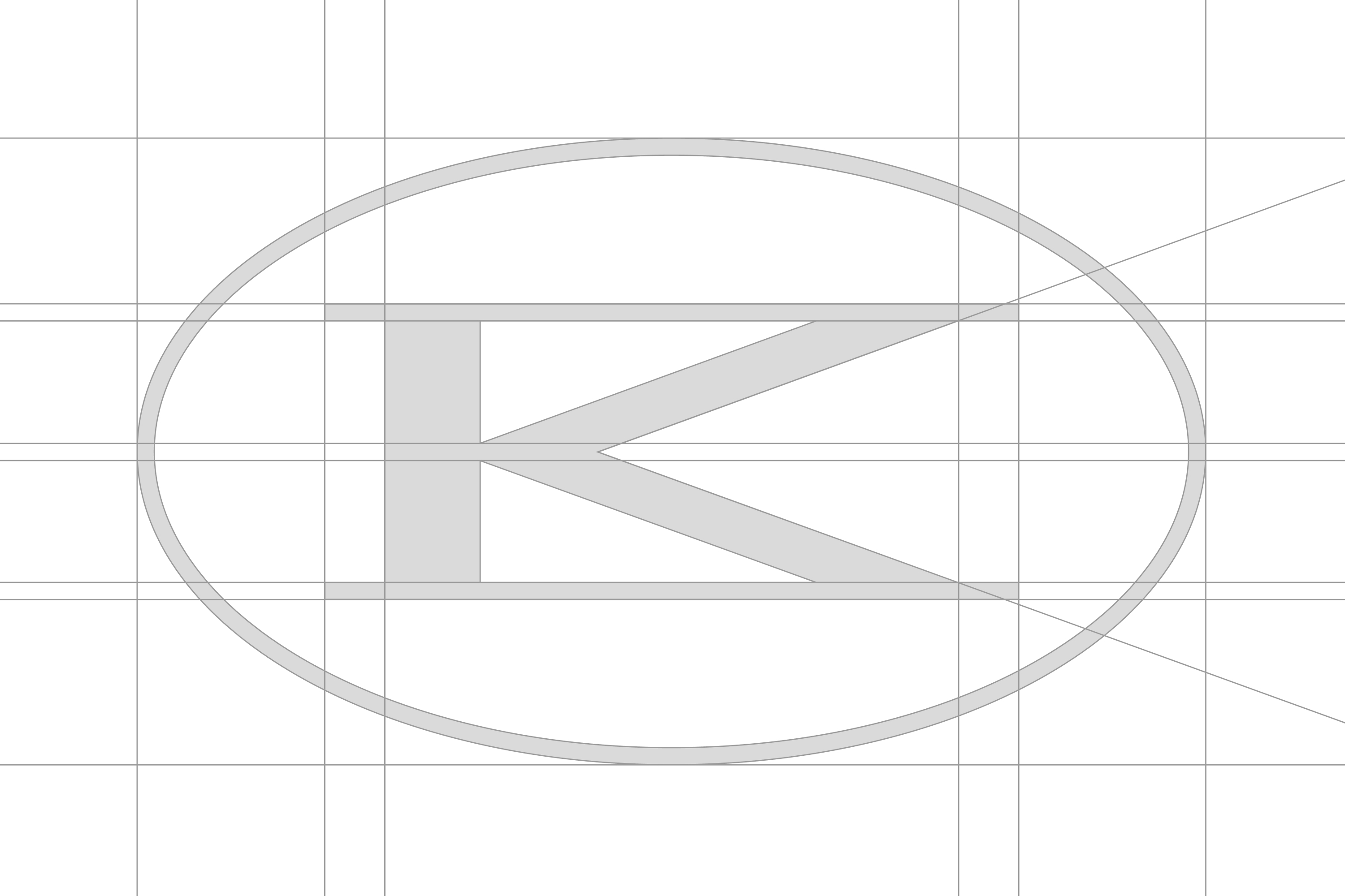
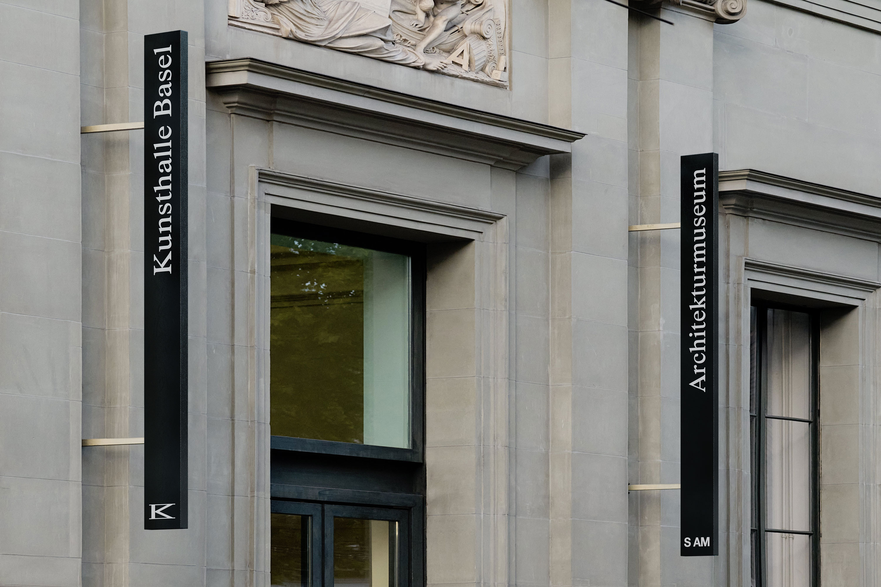
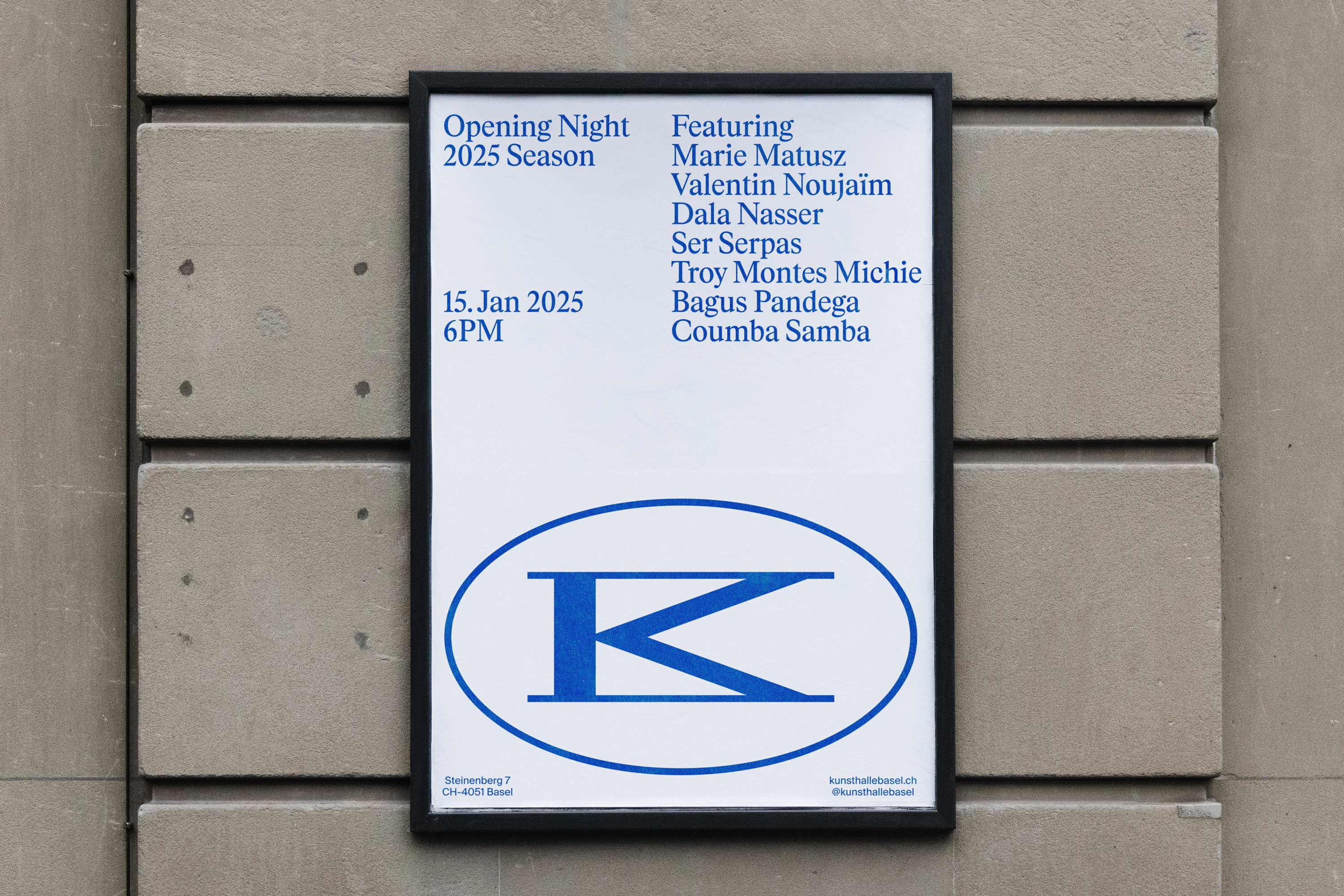
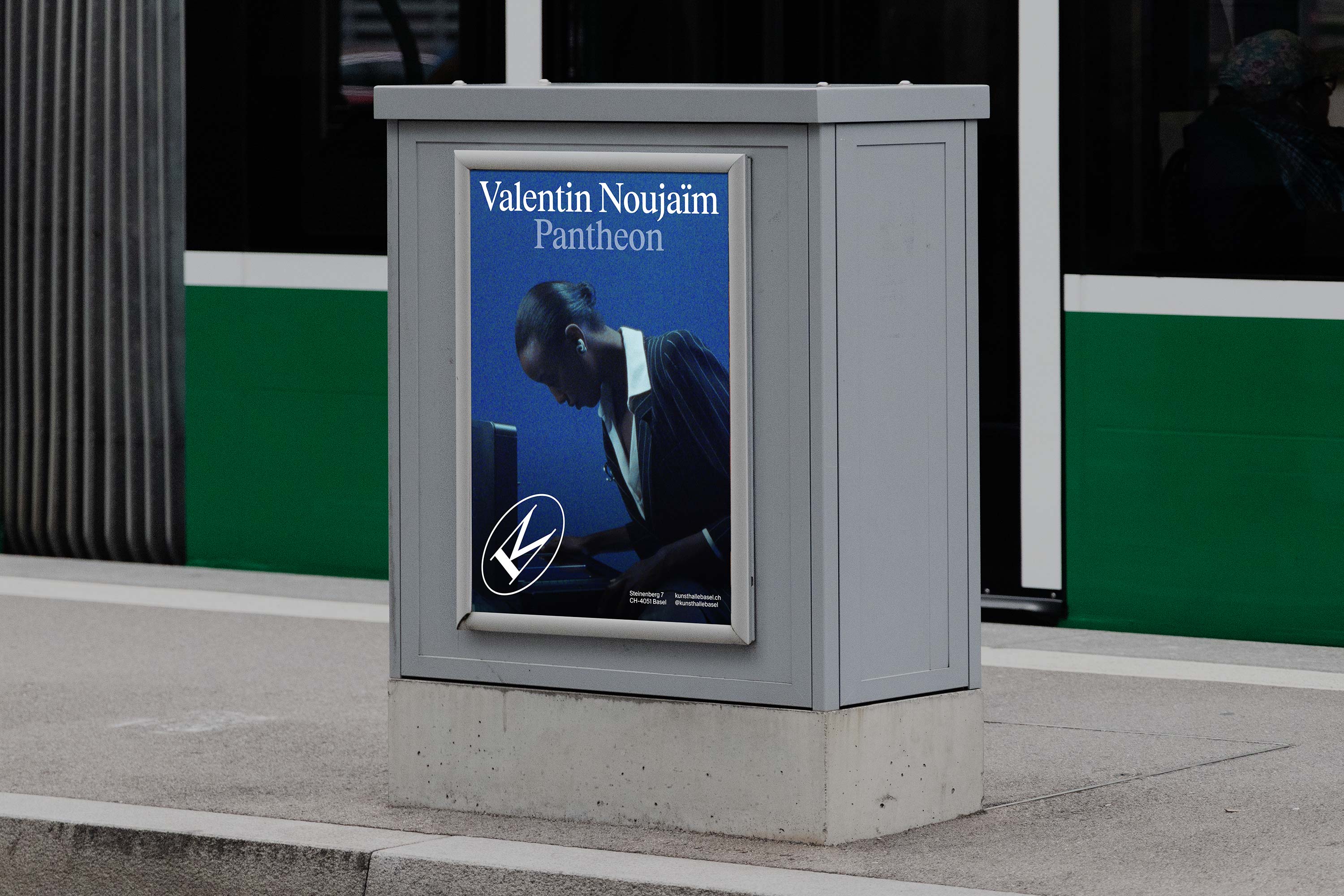
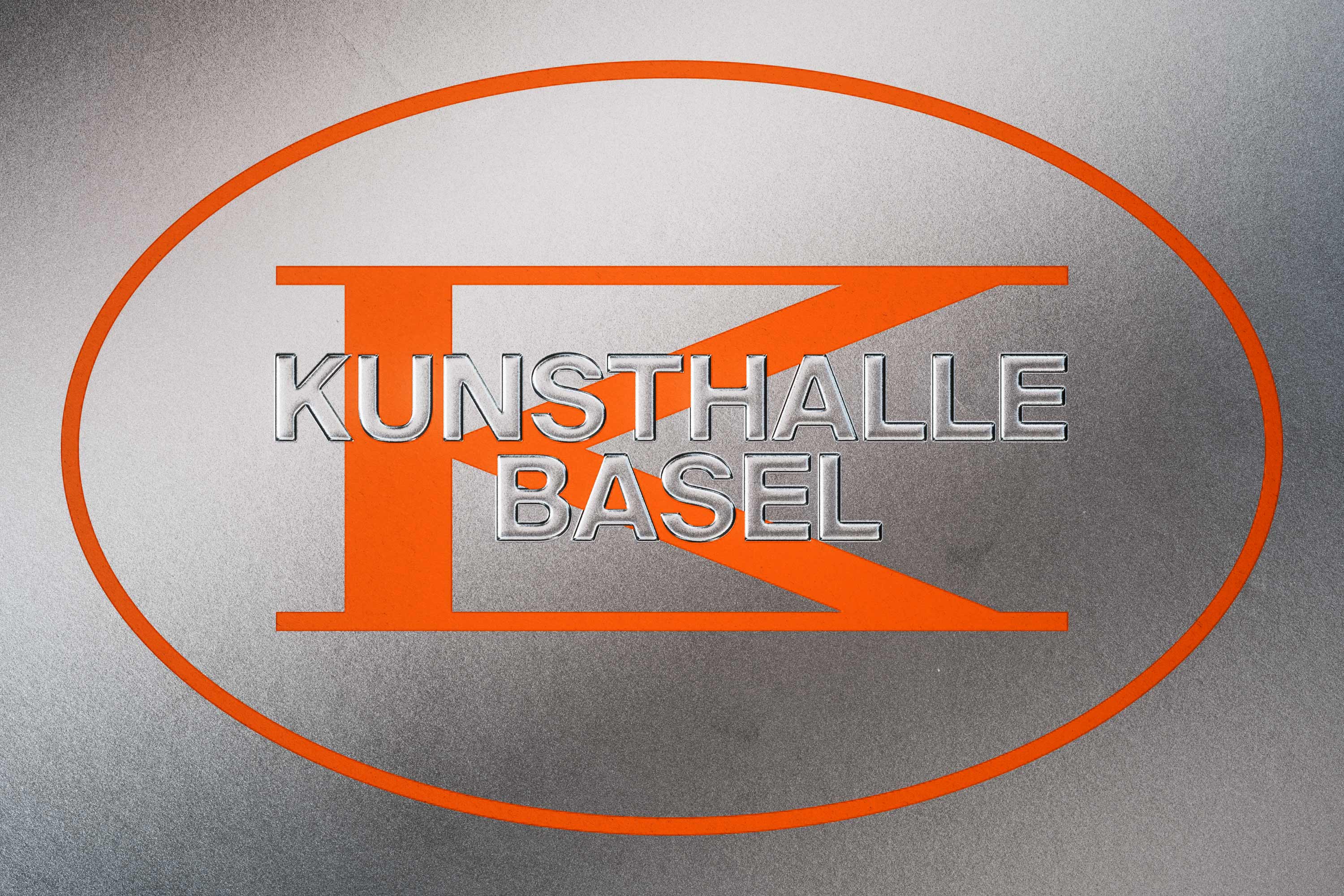
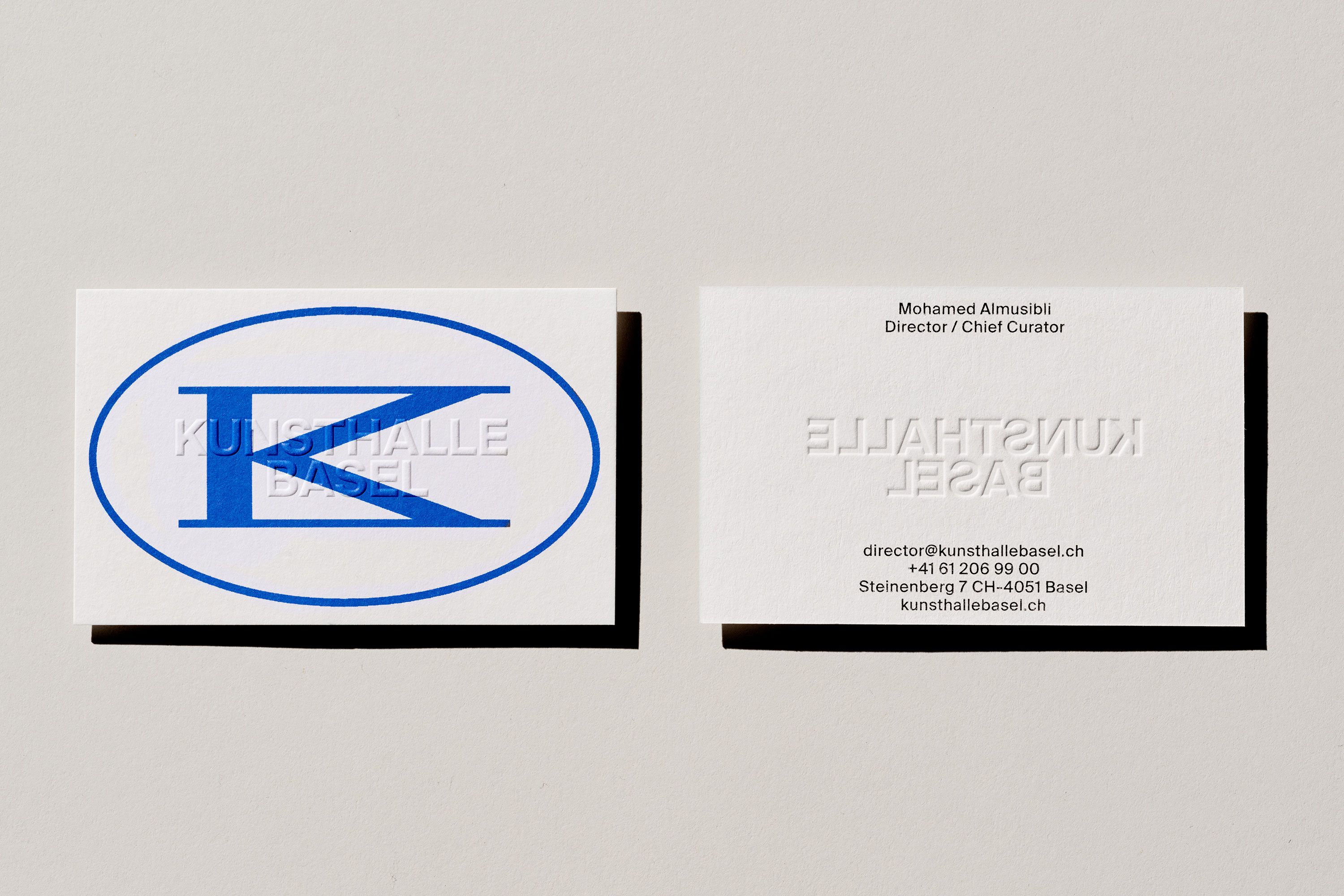
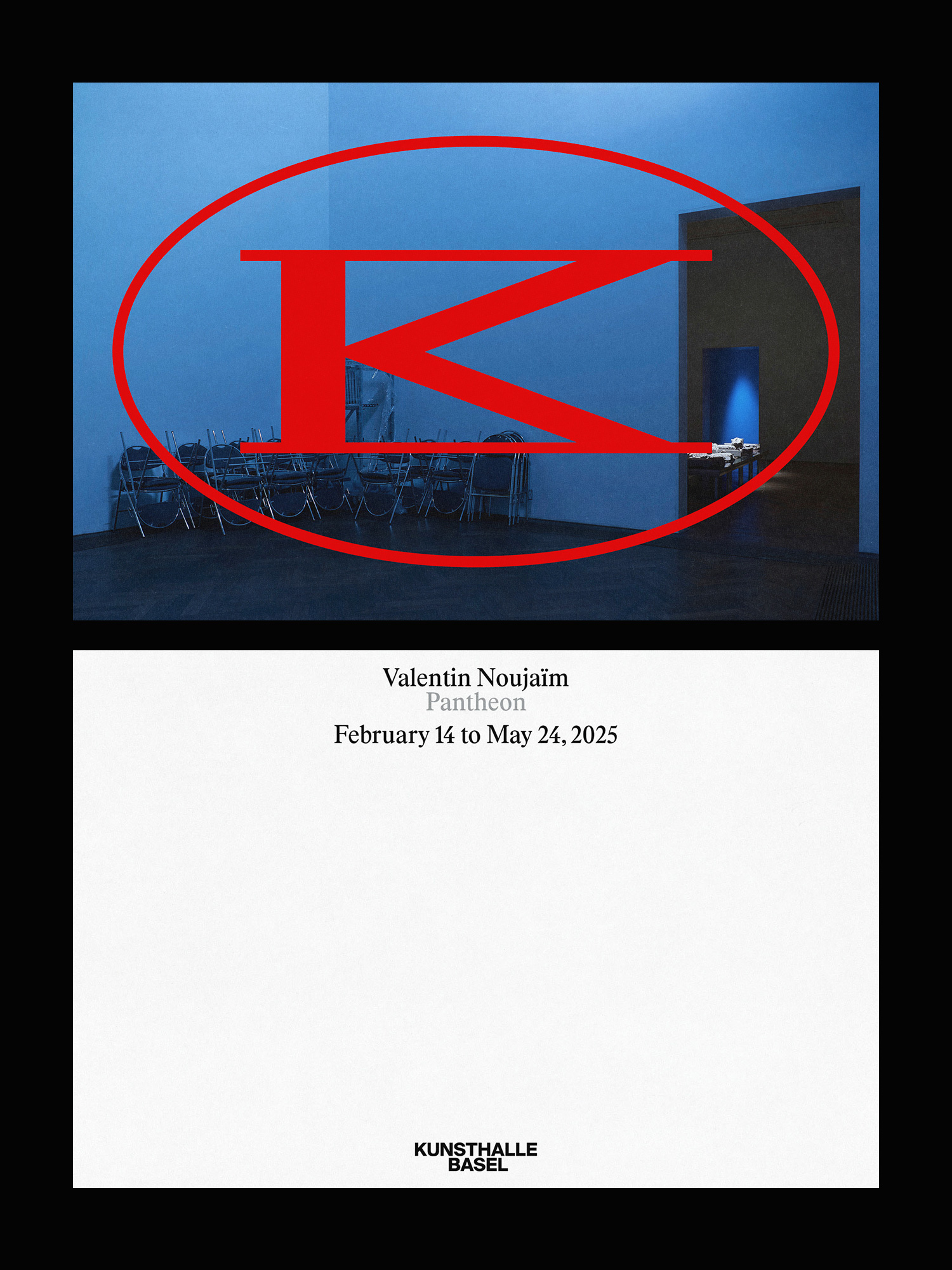
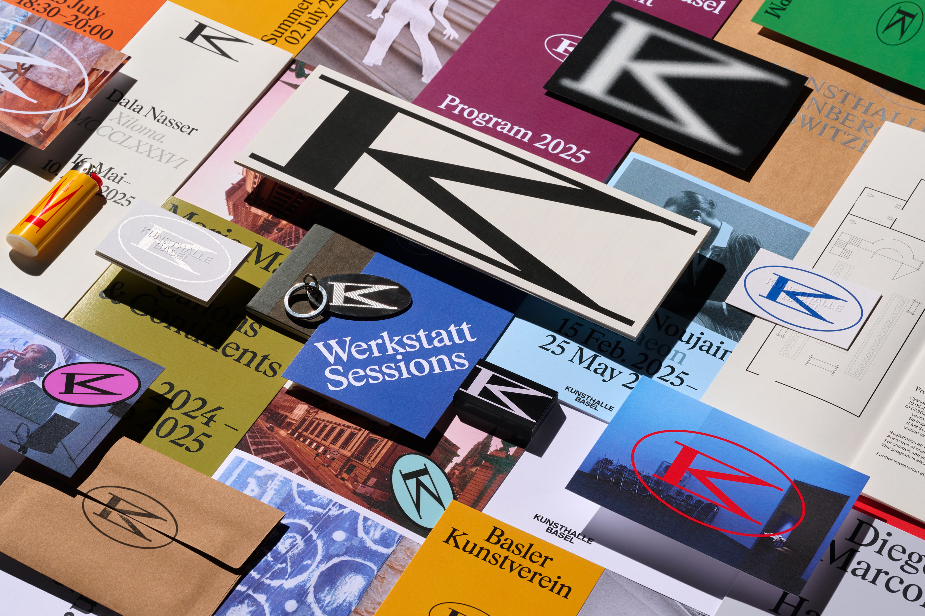
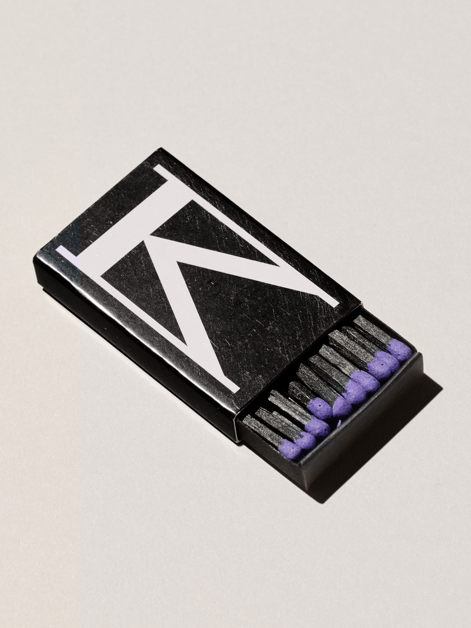
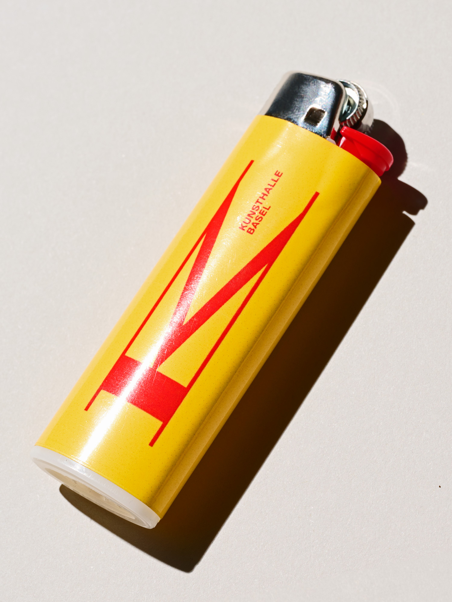
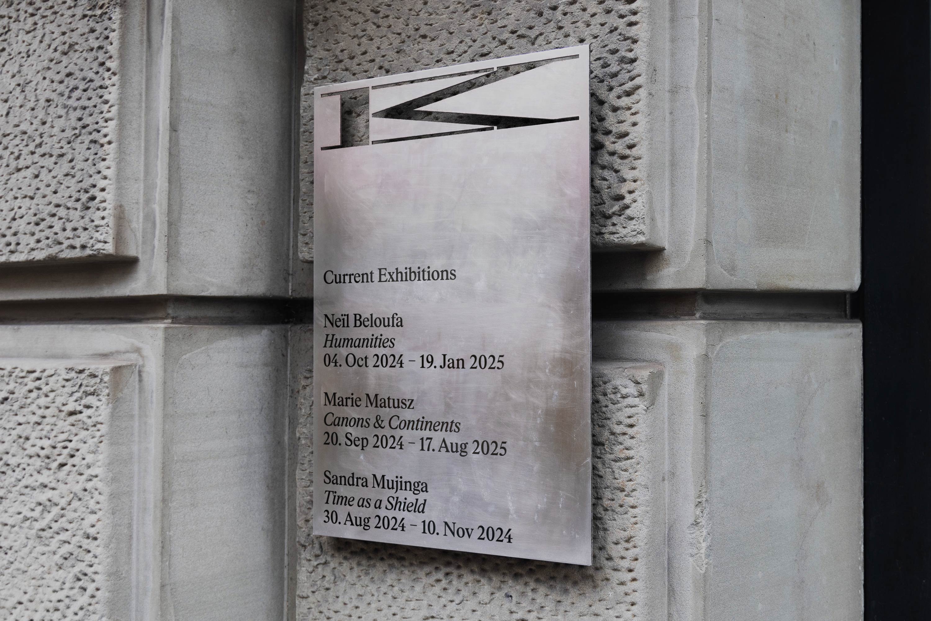
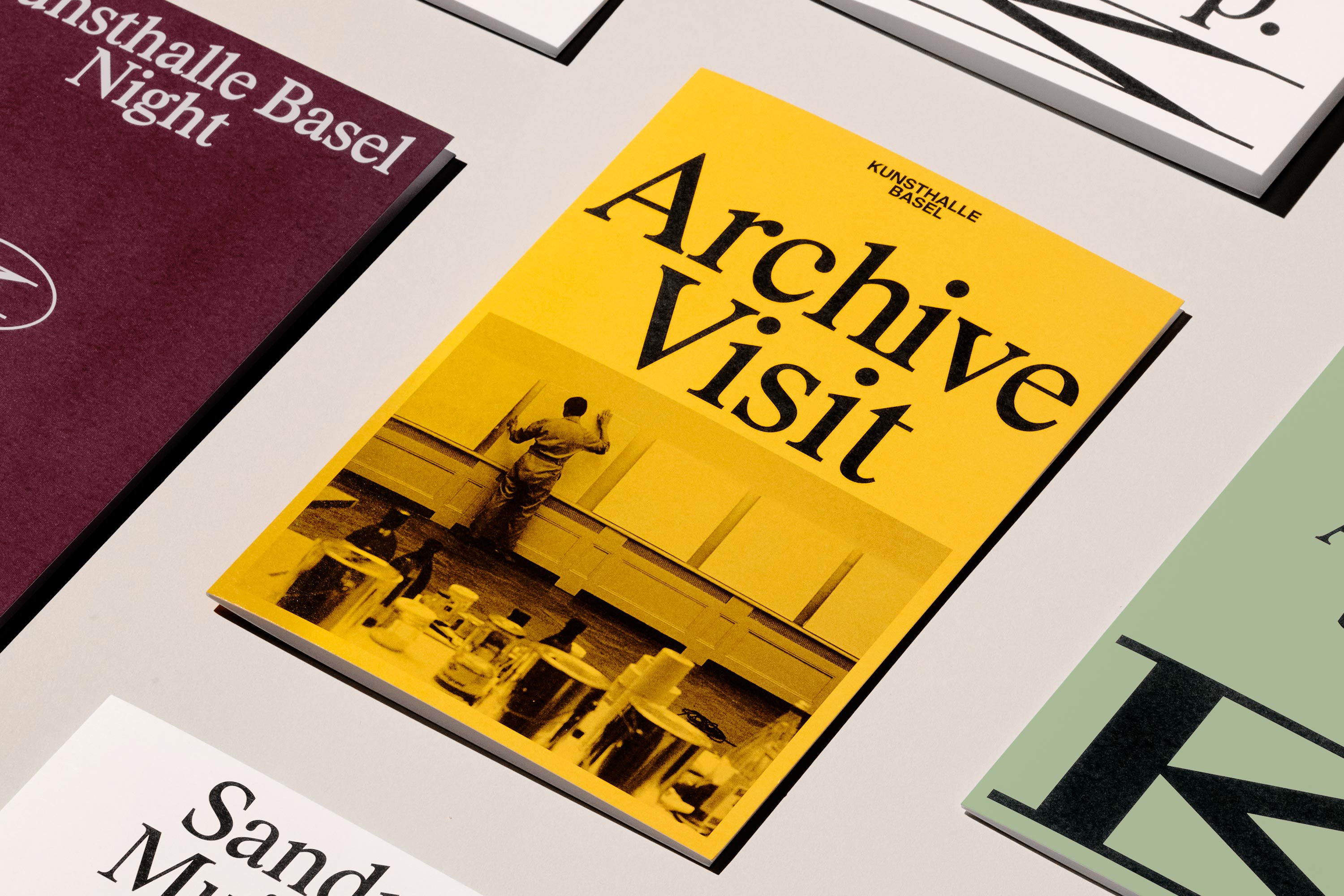
The new identity features a monogram merging K and B into a versatile graphic that balances permanence and change. It serves as a bold signature for Kunsthalle Basel, allowing for playful variations in context. The motion language draws from the geometry of the monogram, enhancing transitions between content and imagery across digital platforms.
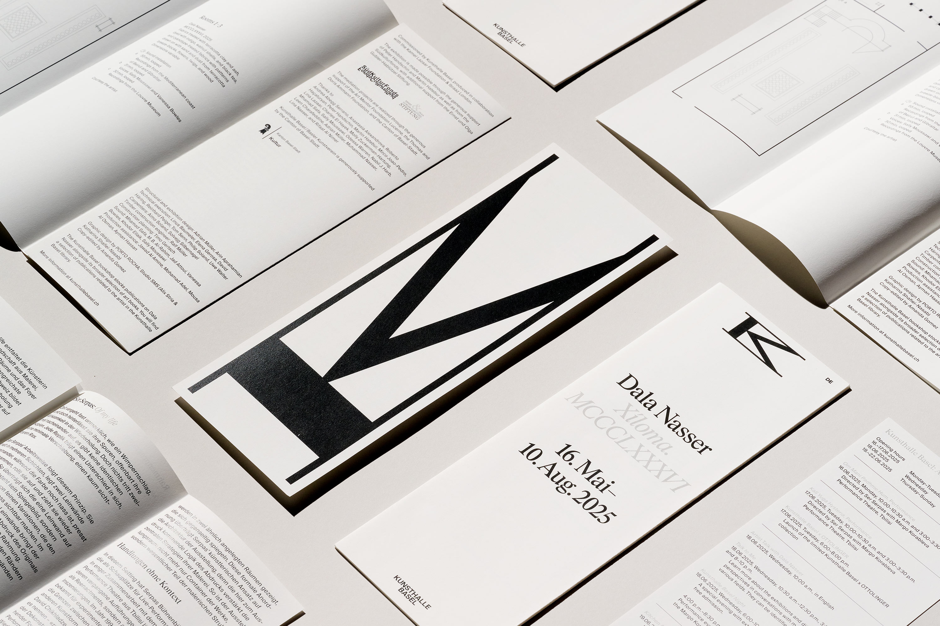
The website design prioritizes clarity and user experience, making navigation intuitive for exploring programs and archives, while incorporating a scalable UI system. Full-bleed imagery and editorial layouts create an engaging environment with unexpected interactive elements.
Typography plays a crucial role, utilizing a customized serif typeface, KB Rhymes, alongside the legible Suisse International, to create a balance of sophistication and approachability. The brand uses a dual color scheme: neutral with artwork and vibrant in type-focused designs, introducing a secondary palette for added expression.
The identity is designed for collaboration, allowing artists to remix elements for exhibitions, ensuring its relevance and fostering dialogue between the brand and the artistic community.
CREDITS
Design: Porto Rocha
Creative Direction:
Felipe Rocha, Leo Porto
Graphic Design:
Gabriela Carnabuci, Etienne Murphy, Latoya Breu
Interactive Design:
Marcos Rodrigues, David Fiz, Giovana Yahiro
Motion Design:
Thales Muniz, Josh Krauth-Harding, Charles Carlos
3D Design:
Pedro Veneziano
Strategy:
Natalee Ranii-Dropcho, Claren Walker
Project Director:
Luciana Thiesen
Project Management:
Hamilton Yu, Natalie Kilic
Copyright @ Porto Rocha
ABOUT GOODSIDE
Porto Rocha is a New York-based agency uniting strategy and design to make work that evolves with the world they live in. Working closely with people and companies to craft branding systems, products, and experiences, they seek to provoke meaningful change through their work, from large-scale projects that reach significant audiences to socially and culturally-motivated initiatives.
Discover more
The Design Blog
We highlight and uplift interesting works, ideas, and voices within the creative industry, ranging from graphic design and branding to art, interior, product design, digital and web experiences.
The Design Blog
We highlight and uplift interesting works, ideas, and voices within the creative industry, ranging from graphic design and branding to art, interior, product design, digital, and web experiences.