Festif is a charming aperitivo duo with its mission in its name: To bring an undeniably “festive” spirit to those unforgettable nights with friends you never want to end.
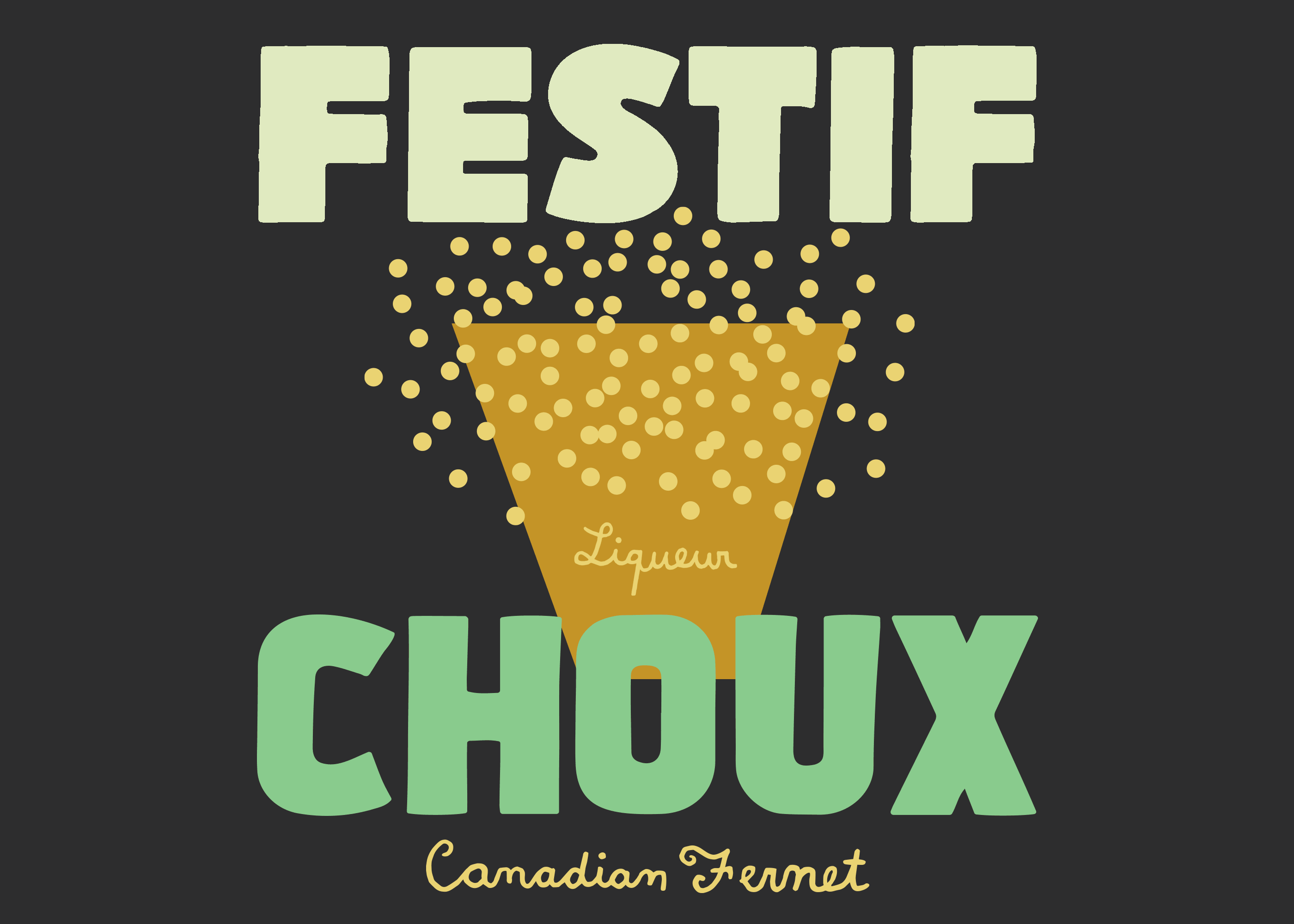
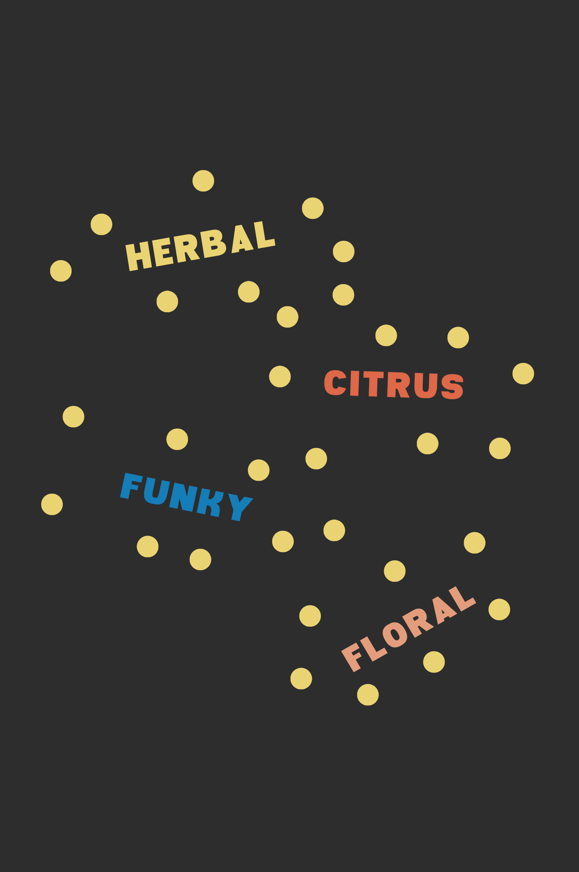
Behind the design—Wedge’s identity and packaging for Festif is inspired by 1920s European posters where artworks pop against dark black backgrounds with strong typographic intentions.
Behind the design—Wedge’s identity and packaging for Festif is inspired by 1920s European posters where artworks pop against dark black backgrounds with strong typographic intentions.


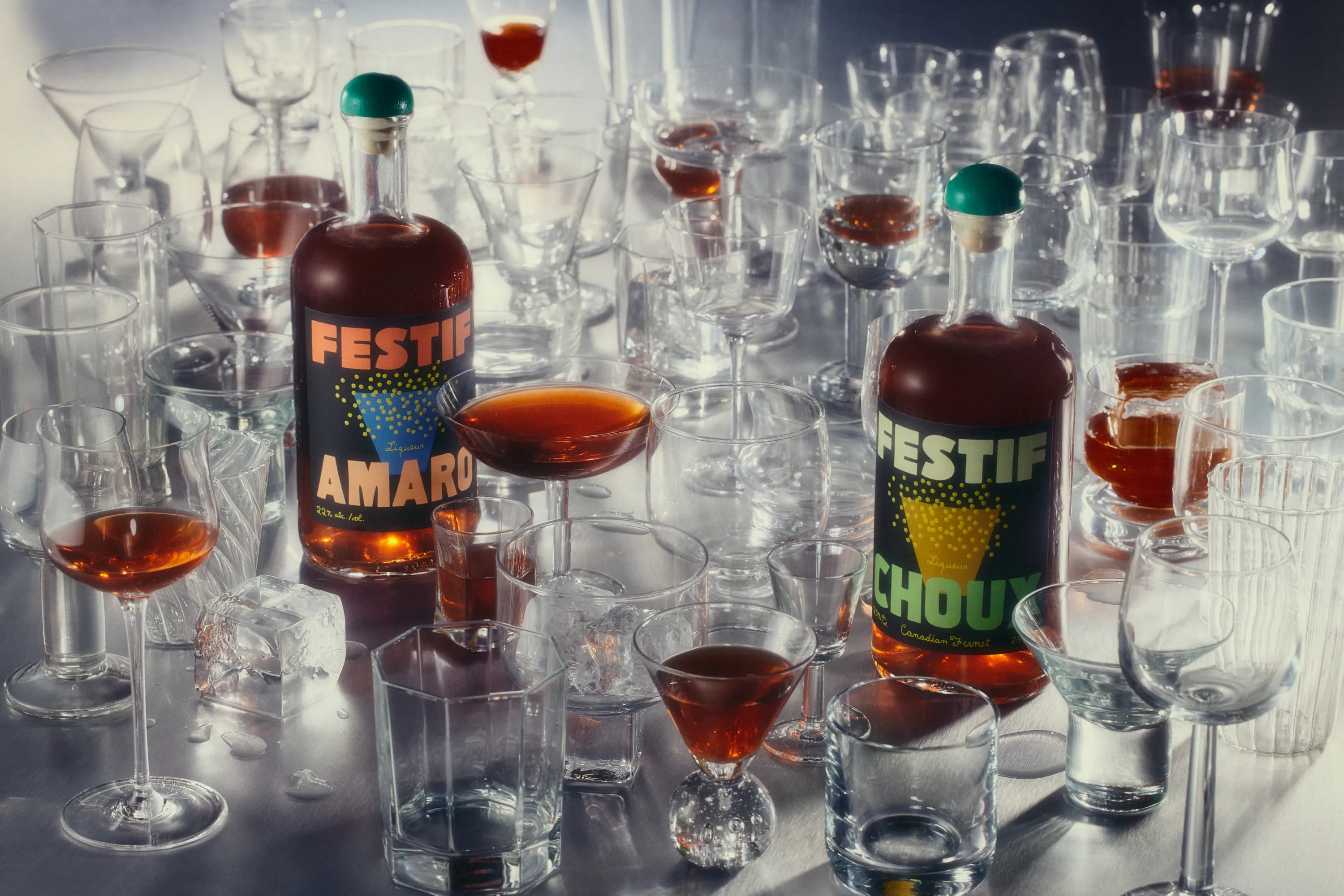
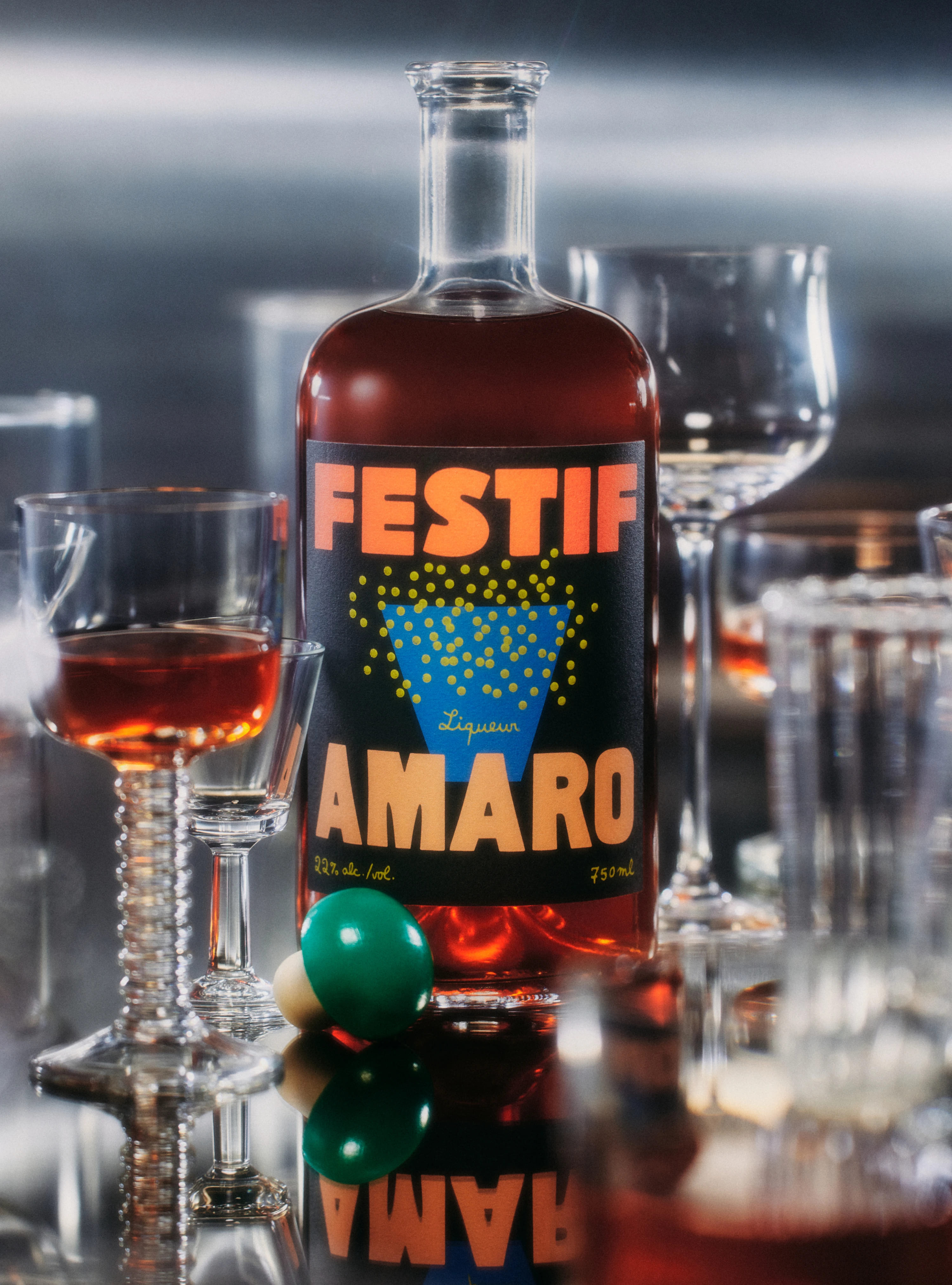
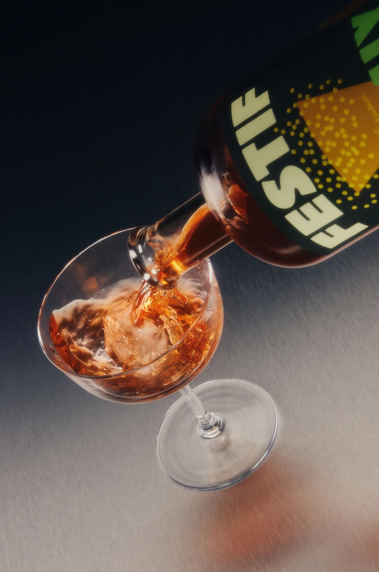
This bespoke typographic boldness (drawn in-house) against the dark label, paired with a delightful script, and ‘sparkles’ of energy that a great glass brings, come together to create a unique signature that makes the mission sing. The bottle carries strong rounded shoulders evoking a presence on the table or shelf.
Strong products often feature a singular unique detail in their design, recalled by memory. It can be a color, a shape, a symbol. For Festif, this is the green button cap, as a fun (and festive) distinctive feature.
Strong products often feature a singular unique detail in their design, recalled by memory. It can be a color, a shape, a symbol. For Festif, this is the green button cap, as a fun (and festive) distinctive feature.

ABOUT WEDGE
Wedge is an independent brand agency for distinct character, strategic narrative & enduring spirit. Their holistic approach combines strategic narrative and æsthetics, where design is a tool to communicatea distinct point of view.
Discover more
The Design Blog
We highlight and uplift interesting works, ideas, and voices within the creative industry, ranging from graphic design and branding to art, interior, product design, digital and web experiences.
The Design Blog
We highlight and uplift interesting works, ideas, and voices within the creative industry, ranging from graphic design and branding to art, interior, product design, digital, and web experiences.