
BRANDING
Parker Revives A Rich History with Branding for DTC Mattress Brand Ostermoor
As one of the most innovative American mattress makers of the mid-1800s, Ostermoor provided modern amenities like order-by-mail, doorstep delivery and a satisfaction guarantee — long before any of these offerings were en vogue.
Seeing an opportunity to reclaim that history of innovation, they turned to design studio Parker for a rebrand, steeped in heritage and craft but with the ambition to chart a new path for the DTC mattress industry.
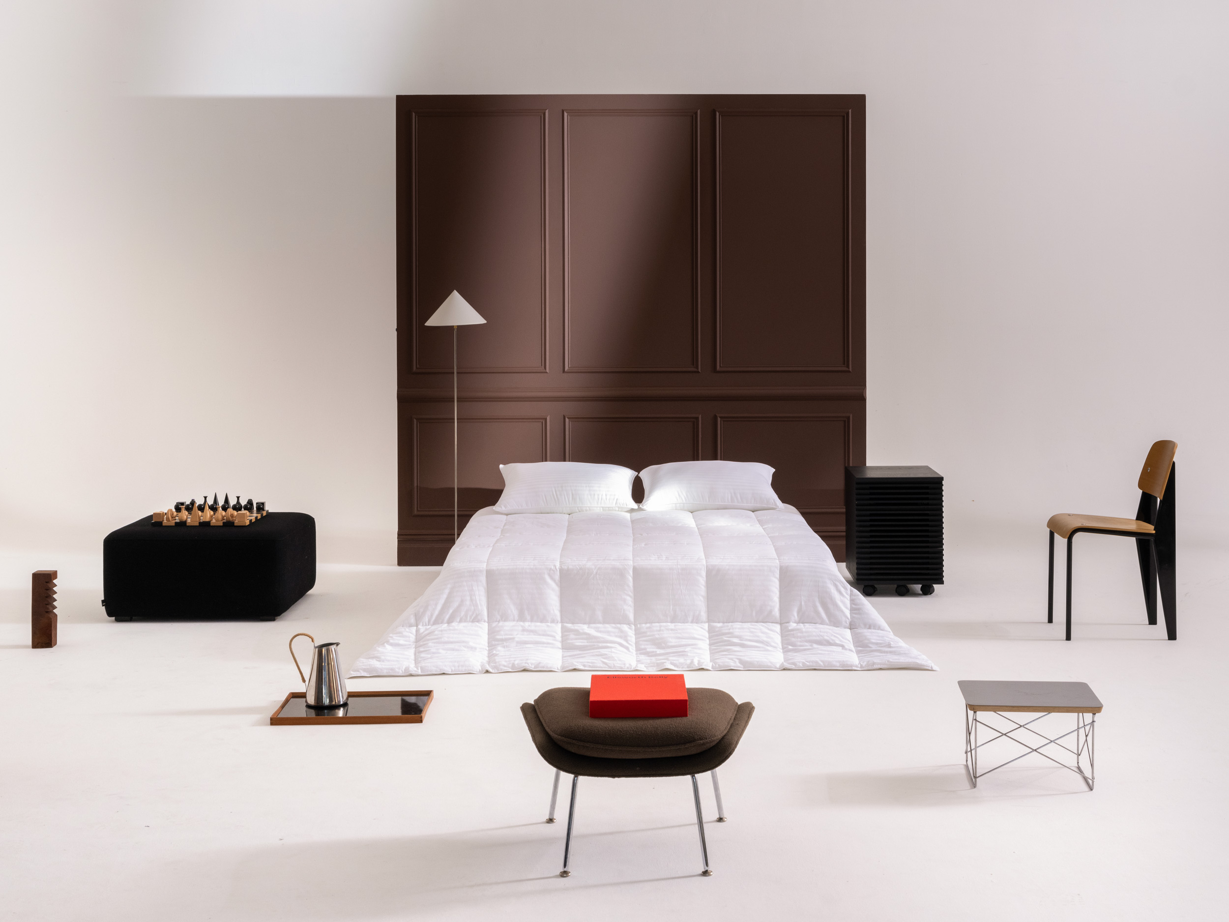
In building the new brand, Parker worked to maintain Ostermoor’s equity and differentiate it from the existing market. Taking inspiration directly from the company’s original customer-facing literature – featuring drop-caps, ornate typography, illustrations and timeless colors – they looked to give a nod to the past while making something fresh and interesting.
Seeing an opportunity to reclaim that history of innovation, they turned to design studio Parker for a rebrand, steeped in heritage and craft but with the ambition to chart a new path for the DTC mattress industry.
In building the new brand, Parker worked to maintain Ostermoor’s equity and differentiate it from the existing market. Taking inspiration directly from the company’s original customer-facing literature – featuring drop-caps, ornate typography, illustrations and timeless colors – they looked to give a nod to the past while making something fresh and interesting.


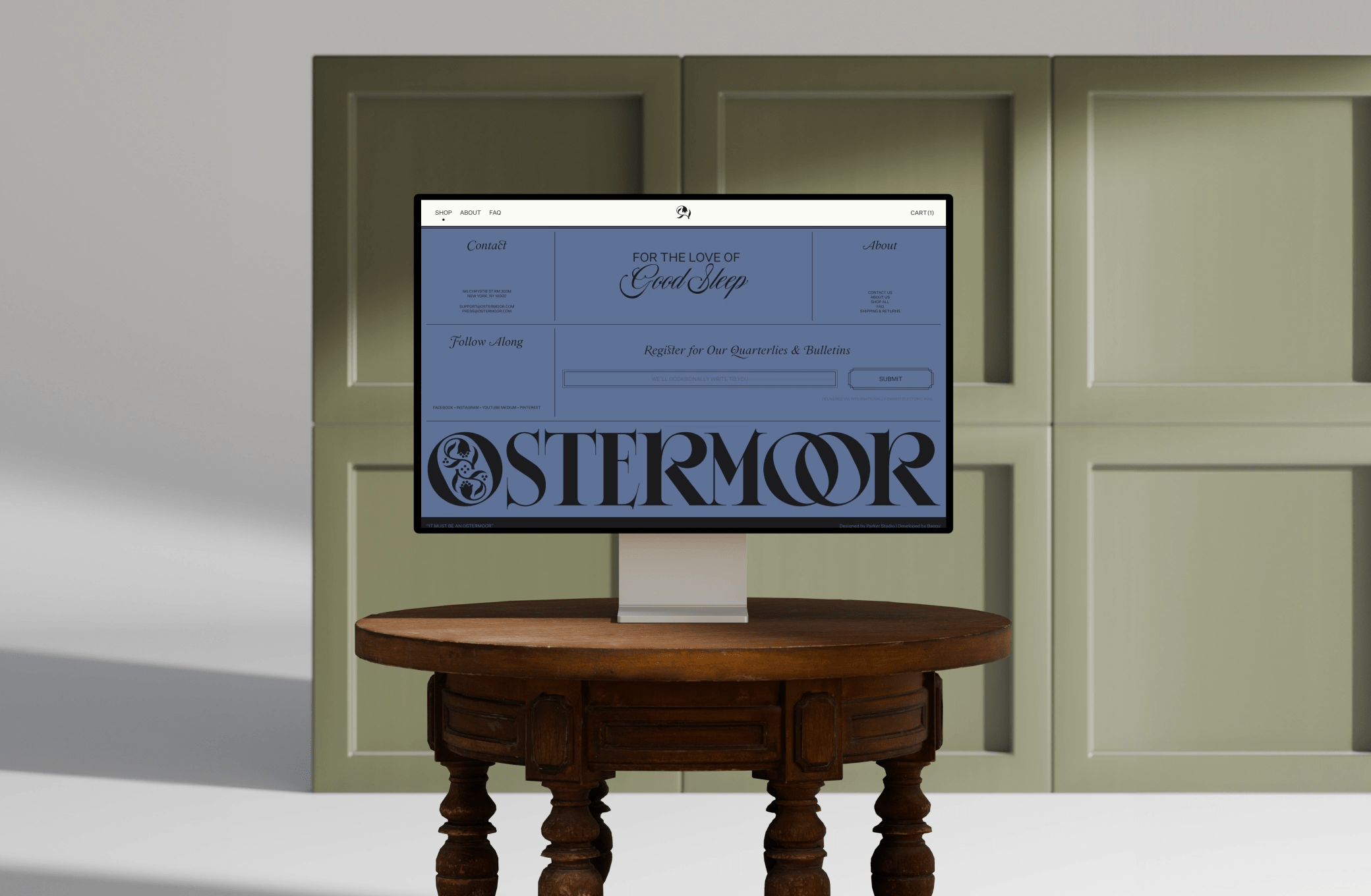

This not only resulted in a new brand identity but verbal identity, art direction, photography and content, as well as an all new ecommerce website (created alongside development partner Baggy).
The overall visual direction references Willard Moyer’s The Witchery of Sleep – originally published by Ostermoor in 1903 as a study on the importance and value of sleep and rest. Parker found this inspiration rich with allegory about the phenomenon of sleep and the significance of dreams – lending the brand a subtle mystical quality.
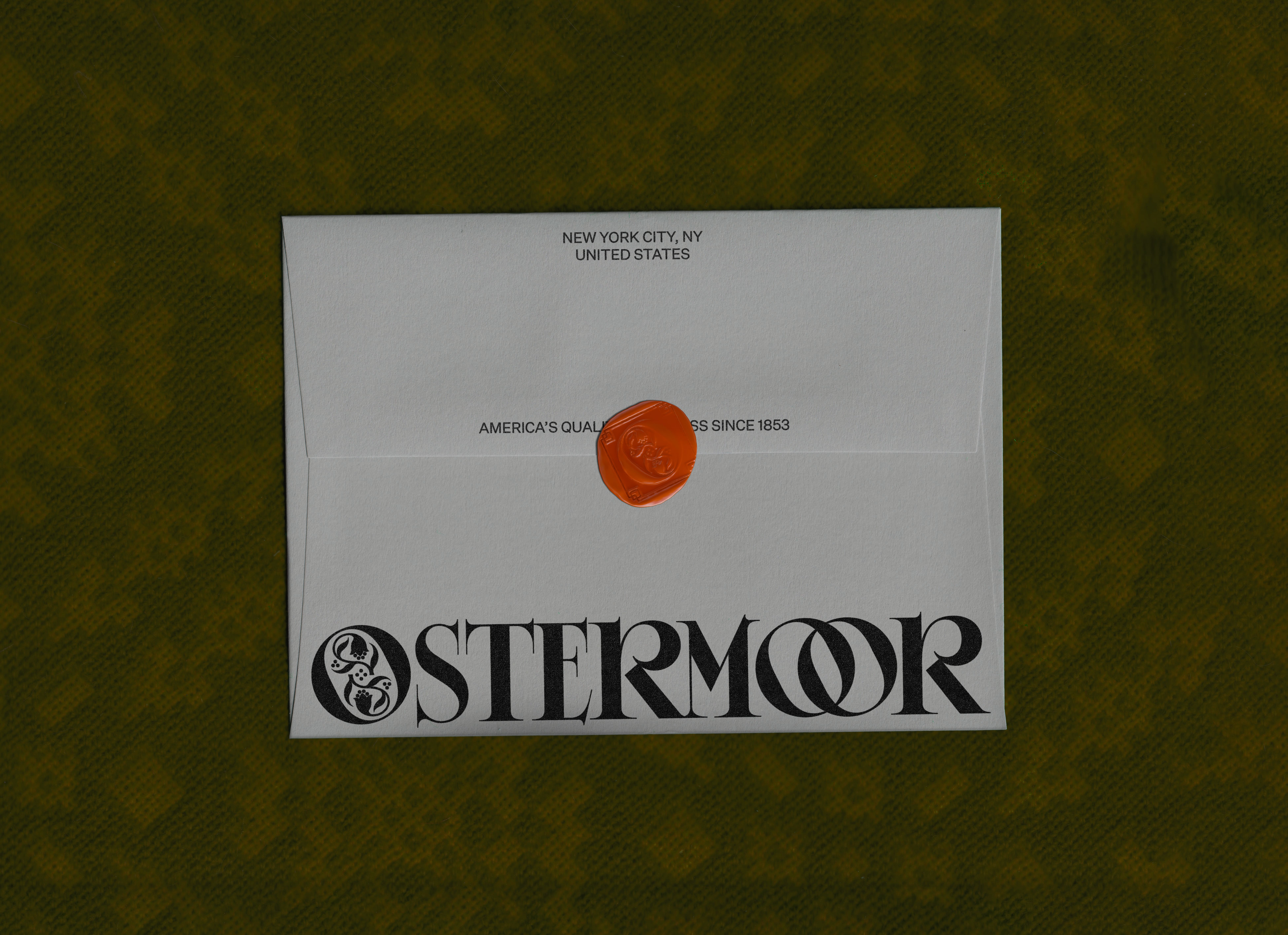
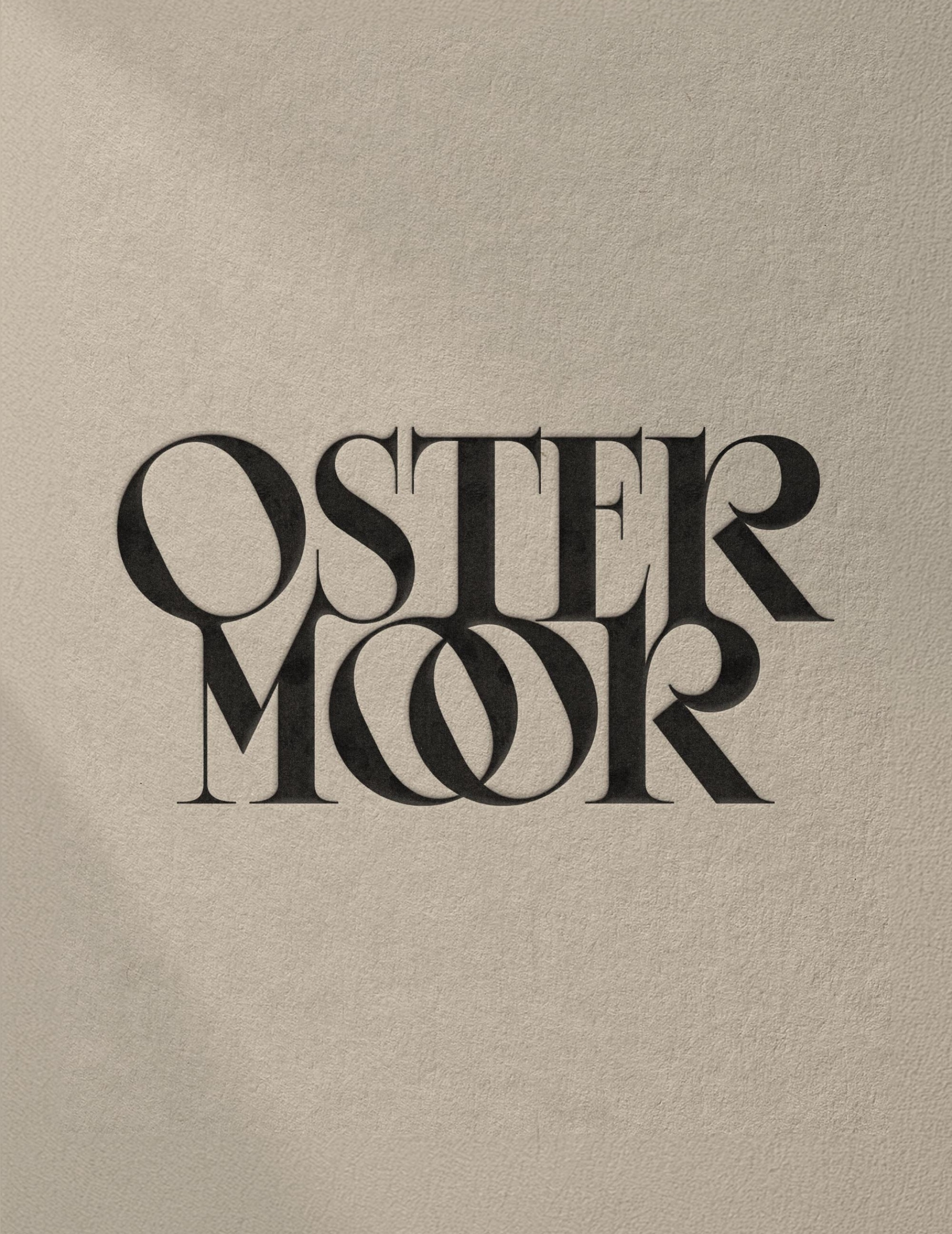
For example, the wordmark is a classically refined and enchanting custom serif that features interlocking “O”s and brims with personality. The shapely letterforms are also abstracted and used throughout the visual identity, including in an assortment of graphics used across product packaging and beyond. The monogram, similarly inspired by the ornate filigrees found in The Witchery of Sleep, is a fittingly sleepy flower and brand colors include various earth tones ranging from warm creams and pale greens to rich reds. Ornate frames and a classic drop cap punctuate the overall identity.
The overall visual direction references Willard Moyer’s The Witchery of Sleep – originally published by Ostermoor in 1903 as a study on the importance and value of sleep and rest. Parker found this inspiration rich with allegory about the phenomenon of sleep and the significance of dreams – lending the brand a subtle mystical quality.
For example, the wordmark is a classically refined and enchanting custom serif that features interlocking “O”s and brims with personality. The shapely letterforms are also abstracted and used throughout the visual identity, including in an assortment of graphics used across product packaging and beyond. The monogram, similarly inspired by the ornate filigrees found in The Witchery of Sleep, is a fittingly sleepy flower and brand colors include various earth tones ranging from warm creams and pale greens to rich reds. Ornate frames and a classic drop cap punctuate the overall identity.

ABOUT PARKER STUDIO
Parker is a holistic design studio based in Seattle. Their work speaks to the belief that design has a job to do. They believe brands need to understand their place within today's culture, and their impact on our planet's future.
Discover more
The Design Blog
We highlight and uplift interesting works, ideas, and voices within the creative industry, ranging from graphic design and branding to art, interior, product design, digital and web experiences.
The Design Blog
We highlight and uplift interesting works, ideas, and voices within the creative industry, ranging from graphic design and branding to art, interior, product design, digital, and web experiences.