BRANDING
Refreshed Visual Identity for Modern Shed by Parker
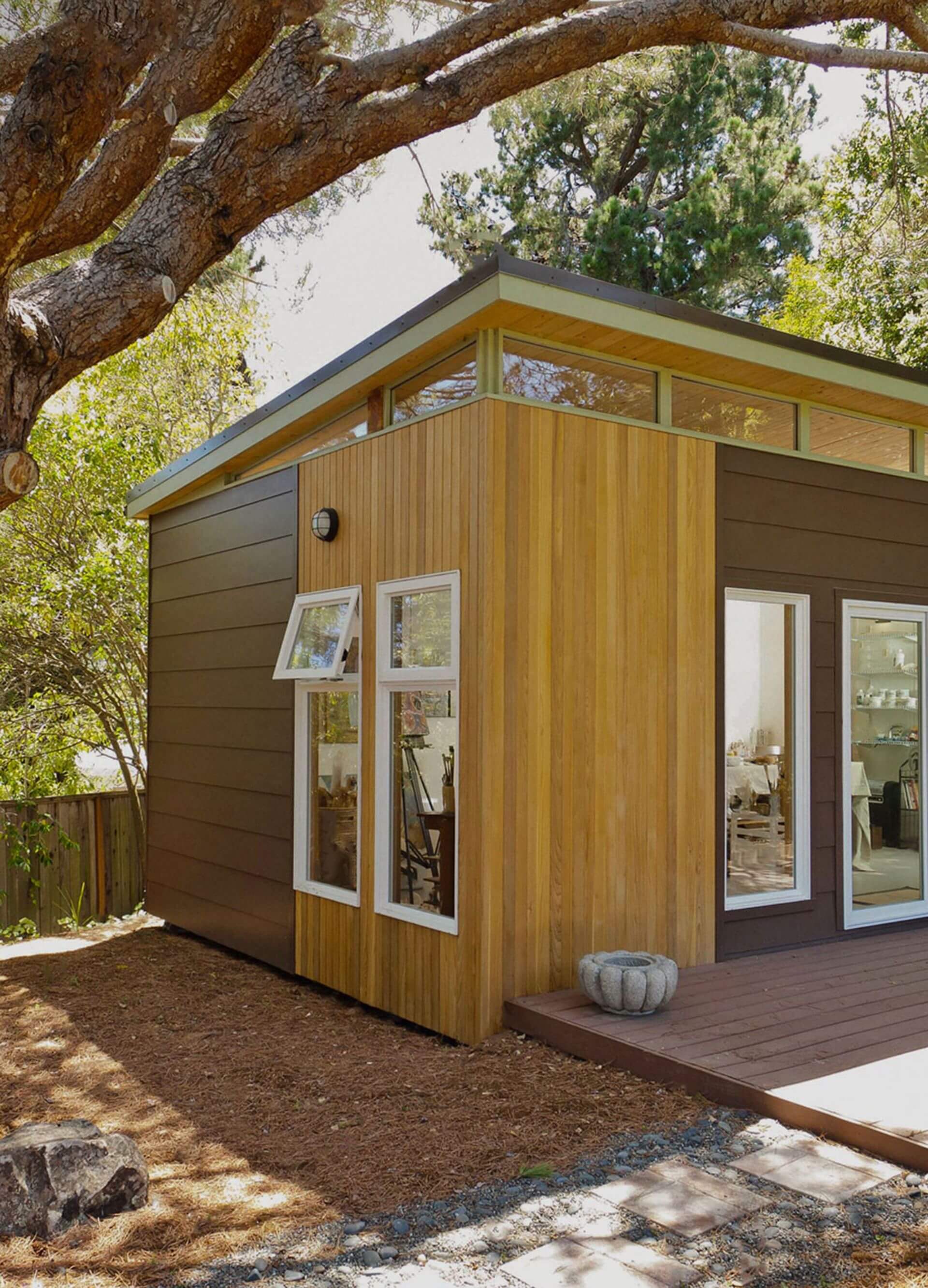
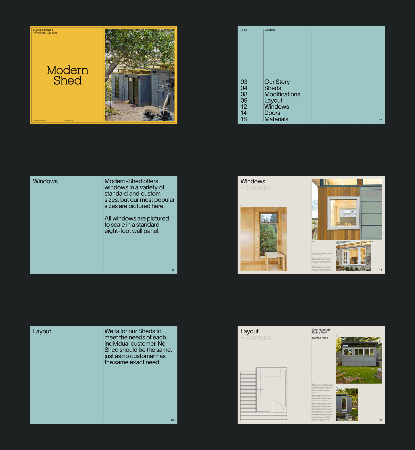
Modern-Shed builds intentionally crafted, prefabricated backyard studios that connect the dots between form and function.
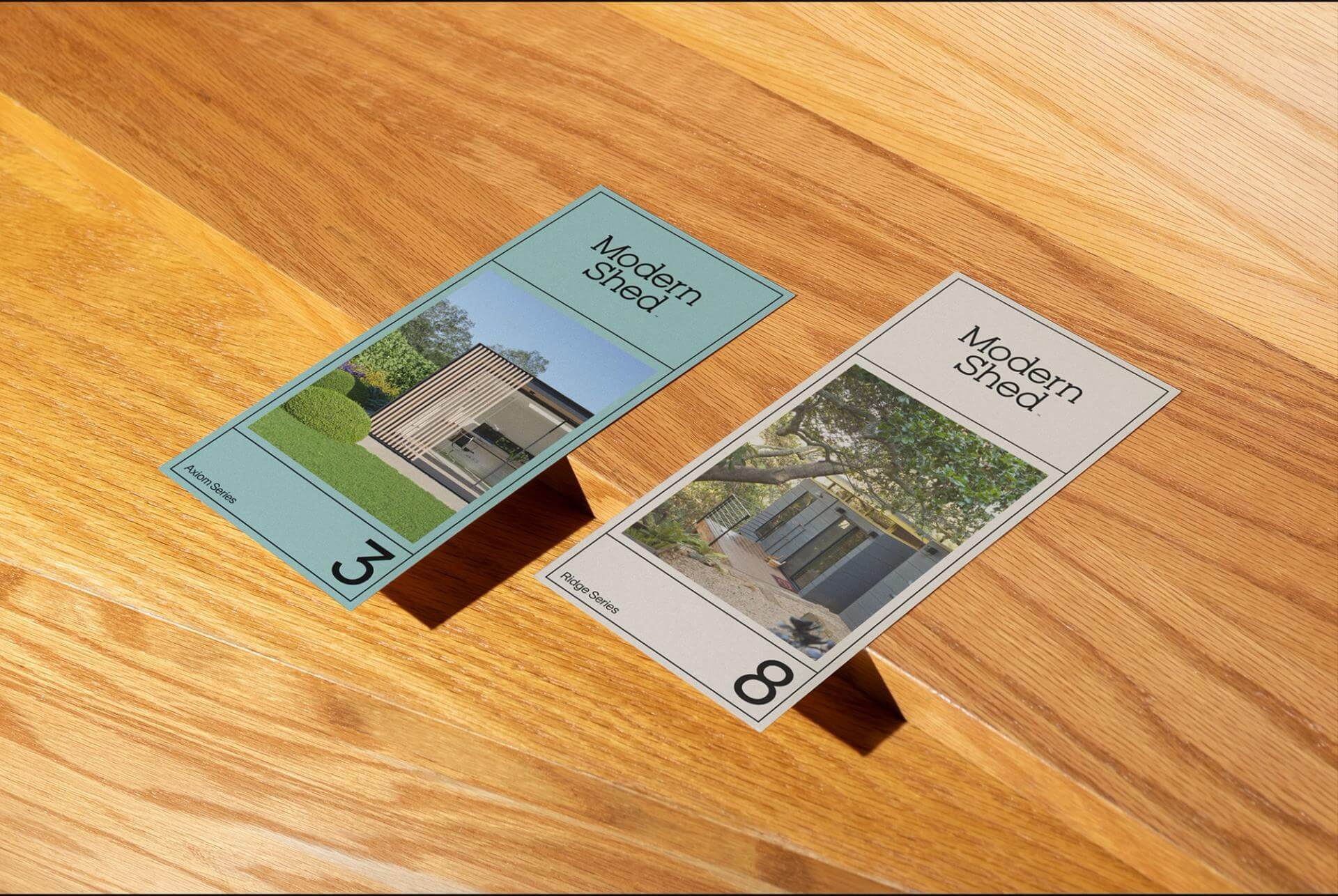
Seeking to stand out in an increasingly noisy market, they reached out to Parker for a refreshed visual identity.
Parker reworked Modern Shed's existing logo to better align with the new wordmark and visual system. In addition, refinements to the container and improvements to the geometry help this logo stay legible at smaller sizes.
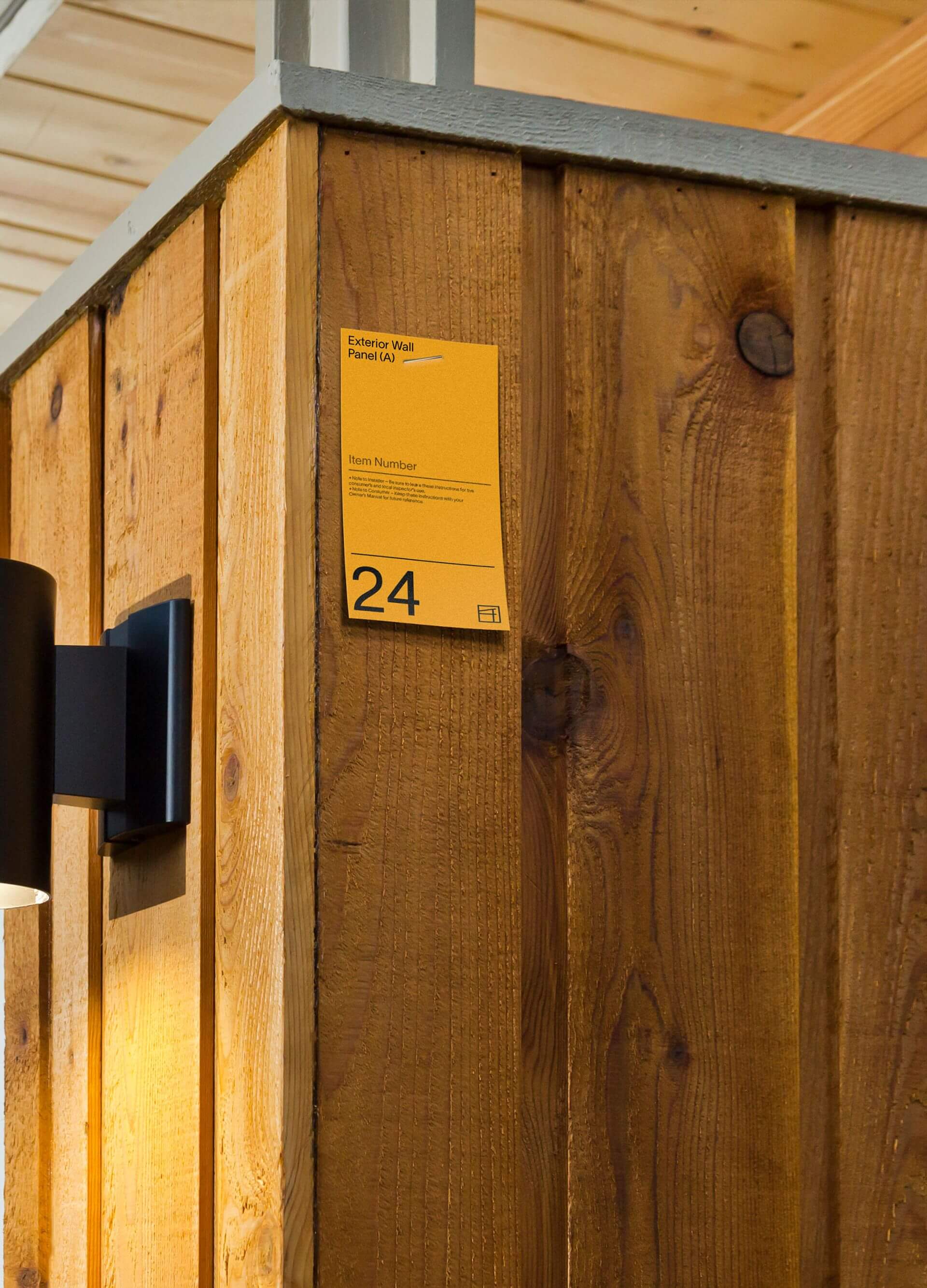
Parker created a tag system intended to be used to help make assembly easier. Modern Shed's product is shipped in pieces and can be assembled on-site by a local contractor. This system helps ensure that things are done right.
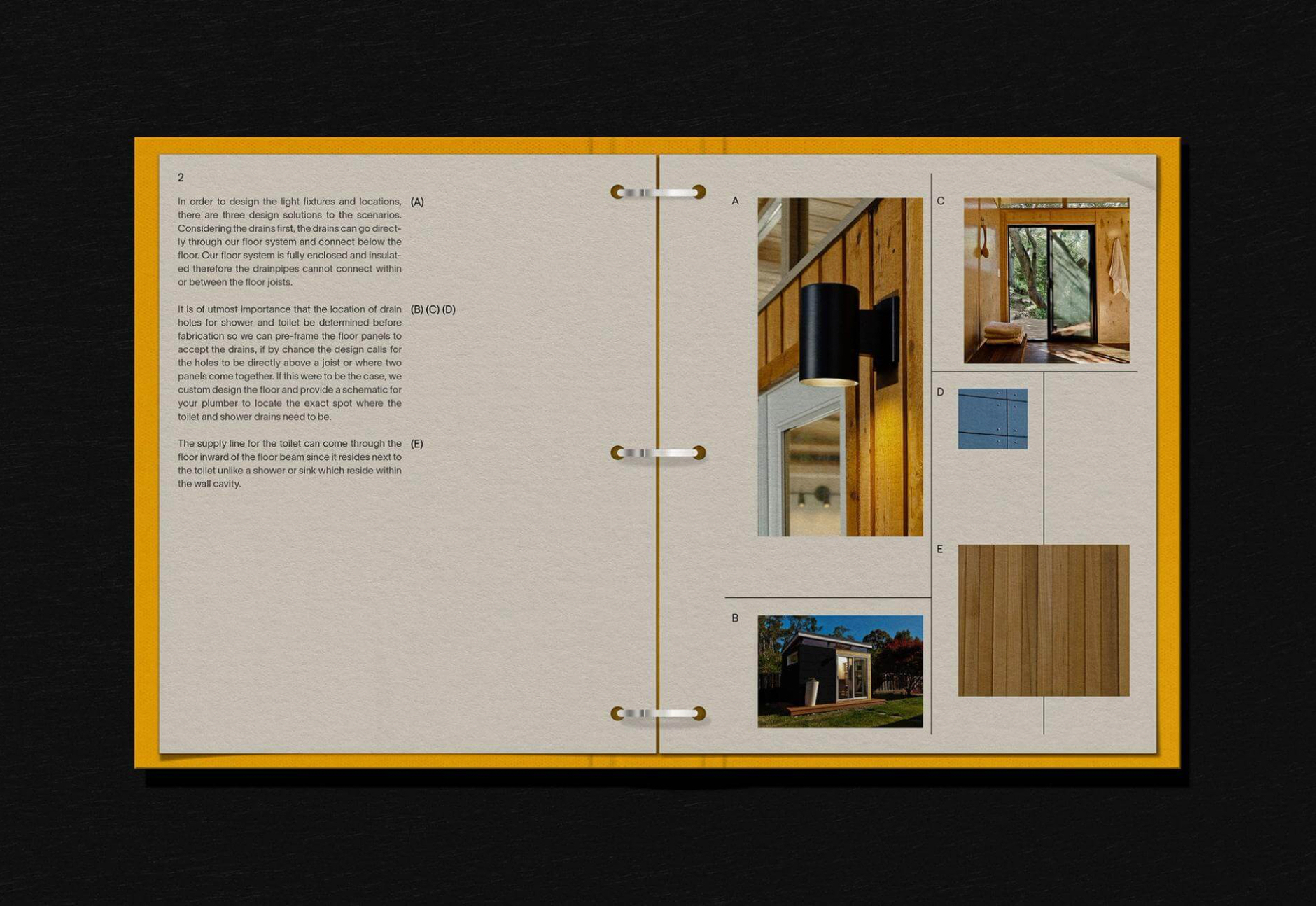
Customers can tailor their own shed by selecting specific components as well as customizing aspects of the Shed through the digital catalog.
Customers can tailor their own shed by selecting specific components as well as customizing aspects of the Shed through the digital catalog.
ABOUT PARKER
Holistic design studio based in Seattle. Their work speaks to the belief that design has a job to do. Parker believes brands need to understand their place within today's culture, and their impact on our planet's future.
The Design Blog
We highlight and uplift interesting works, ideas, and voices within the creative industry, ranging from graphic design and branding to art, interior, product design, digital and web experiences.
The Design Blog
We highlight and uplift interesting works, ideas, and voices within the creative industry, ranging from graphic design and branding to art, interior, product design, digital, and web experiences.
