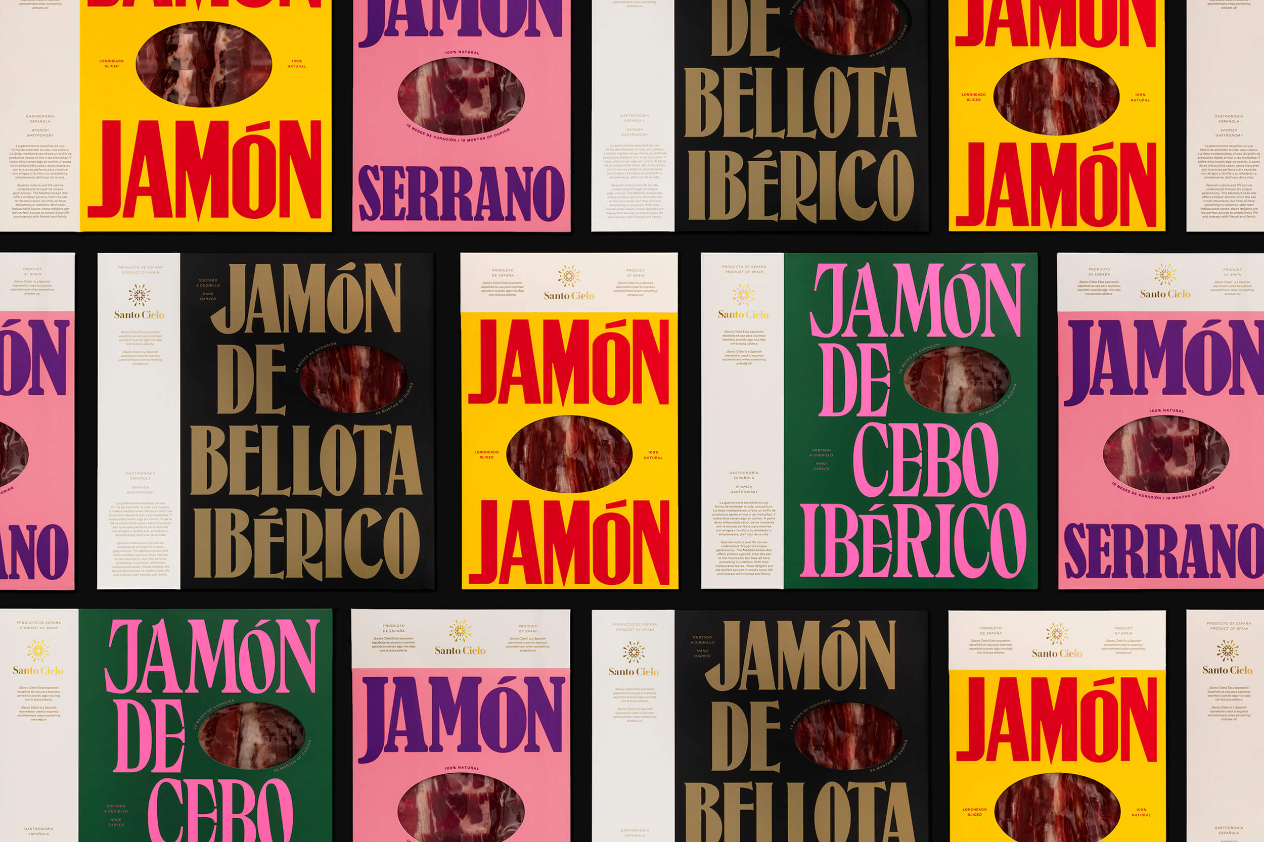
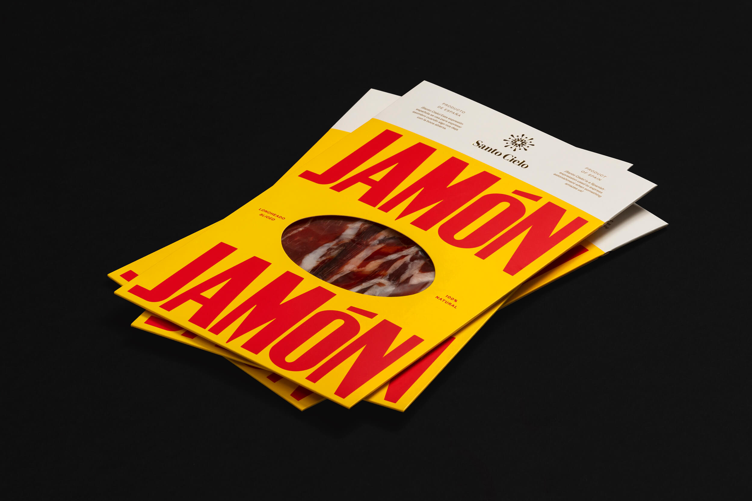
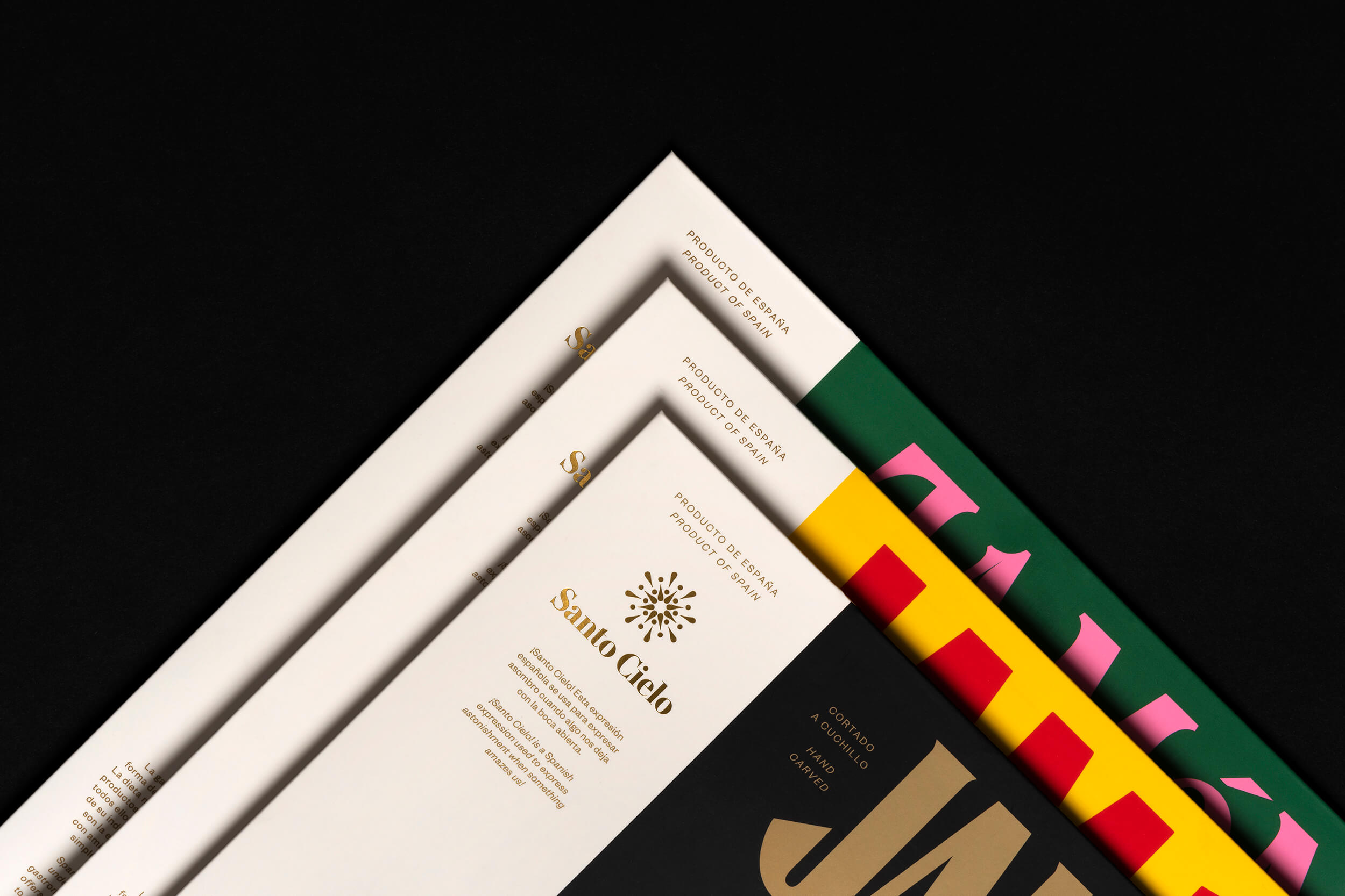
Visual Identity and packaging line for Santo Cielo, a Chinese delicatessen brand that imports traditional Spanish products into China. The project aims to celebrate Spain’s culture by capturing the vibrancy of its character.
“¡Santo Cielo!” (similar to Oh My God! in English) is a Spanish expression used to show astonishment when something amazes us. The symbol is made out of exclamation marks to play with this idea, representing a holy halo.
“¡Santo Cielo!” (similar to Oh My God! in English) is a Spanish expression used to show astonishment when something amazes us. The symbol is made out of exclamation marks to play with this idea, representing a holy halo.

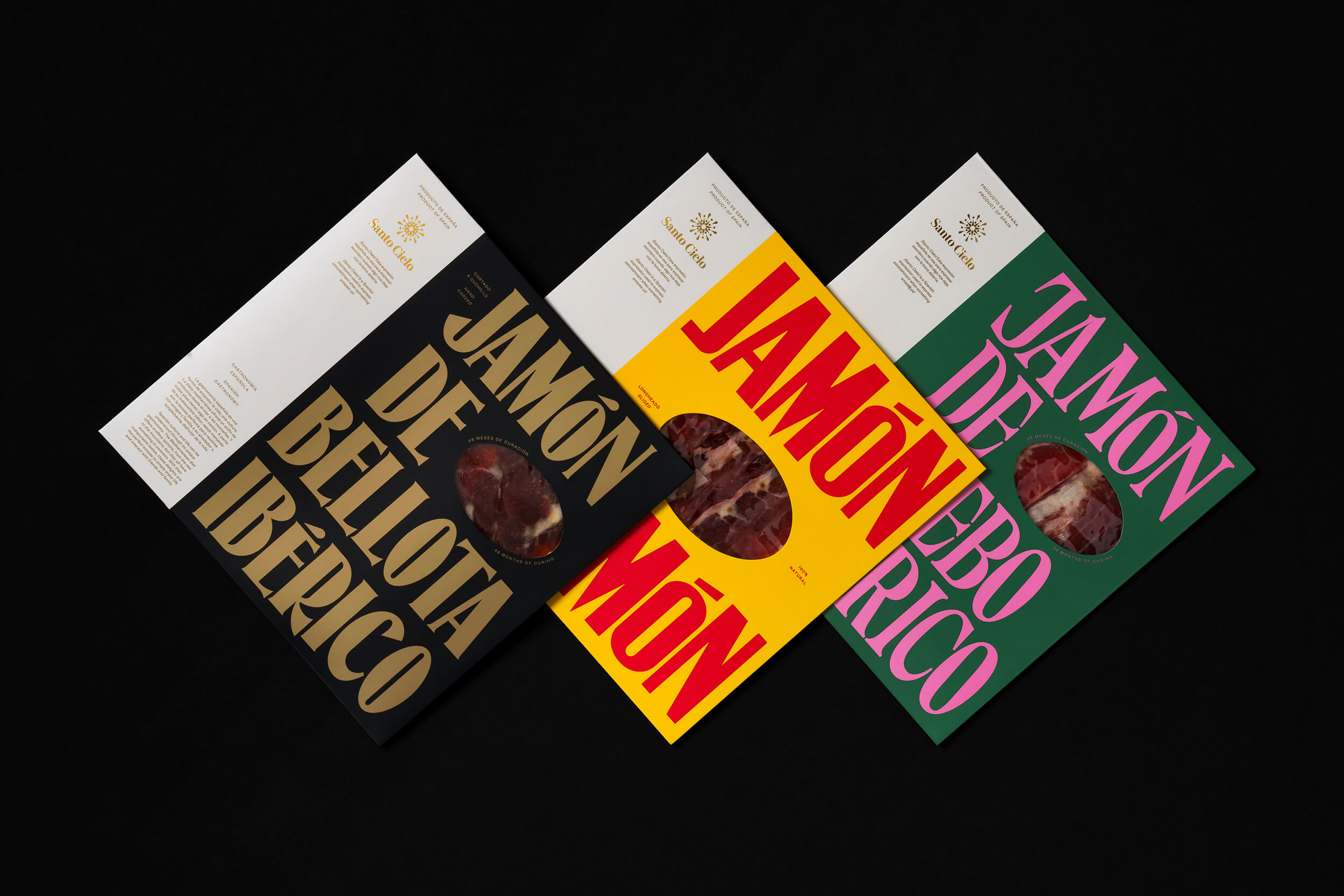
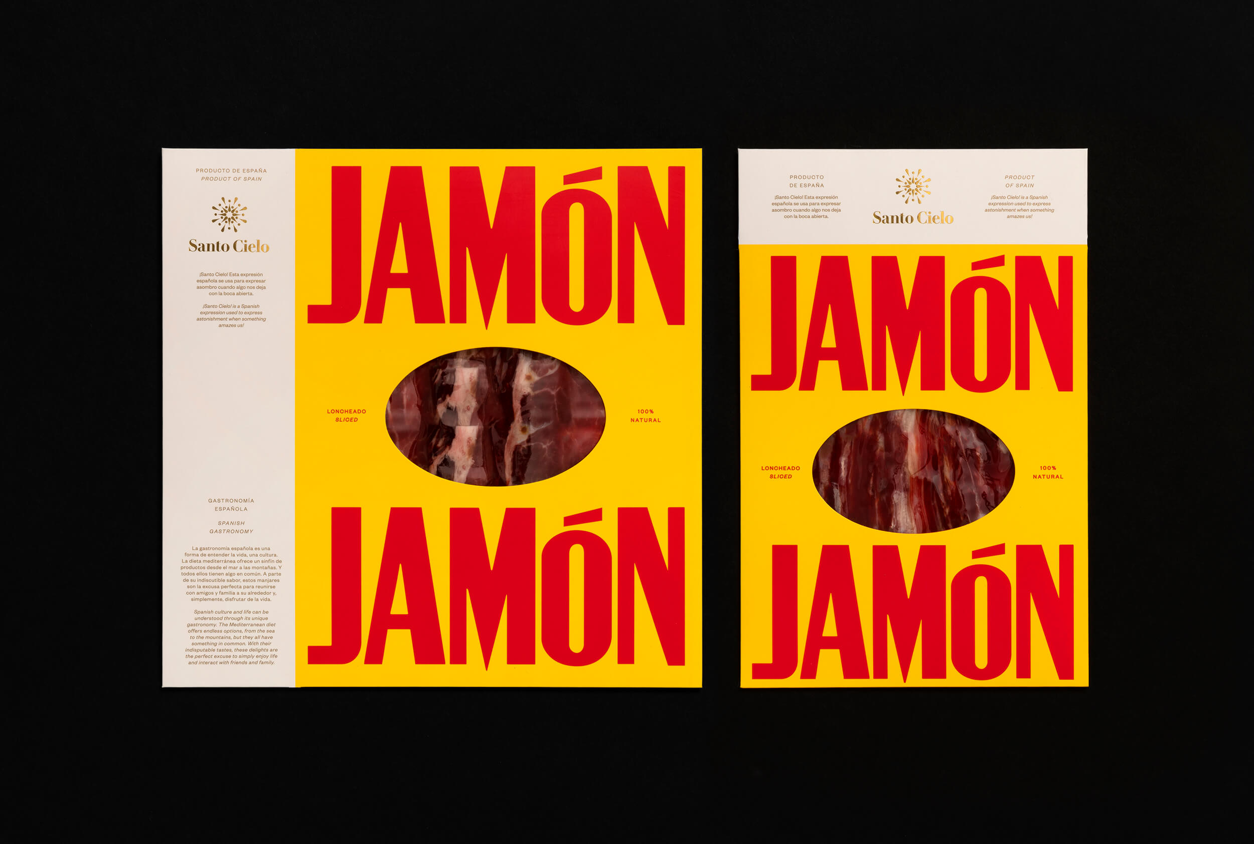

Given the nature of the naming, the packaging system consists of two parts: one reserved for the brand's sacred use, and the other used to reinforce the Spanish character through the diverse use of typefaces and colors.


CREDITS
Design: SMLXL
Naming and copy: Usted
Done as: Pràctica
Photography: Enric Badrinas
Copyright @ SMLXL
Design: SMLXL
Naming and copy: Usted
Done as: Pràctica
Photography: Enric Badrinas
Copyright @ SMLXL
ABOUT SMLXL
SMLXL is a full-service design company based in New York and Barcelona. From a large-scale visual identity system for a sports event to a small bookstore, from a cover for the New York Times Magazine to Seth Rogen's Houseplant home goods packaging line, SMLXL creates projects that influence contemporary visual culture and provide meaning for brands and individuals.

Discover more
The Design Blog
We highlight and uplift interesting works, ideas, and voices within the creative industry, ranging from graphic design and branding to art, interior, product design, digital and web experiences.
The Design Blog
We highlight and uplift interesting works, ideas, and voices within the creative industry, ranging from graphic design and branding to art, interior, product design, digital, and web experiences.